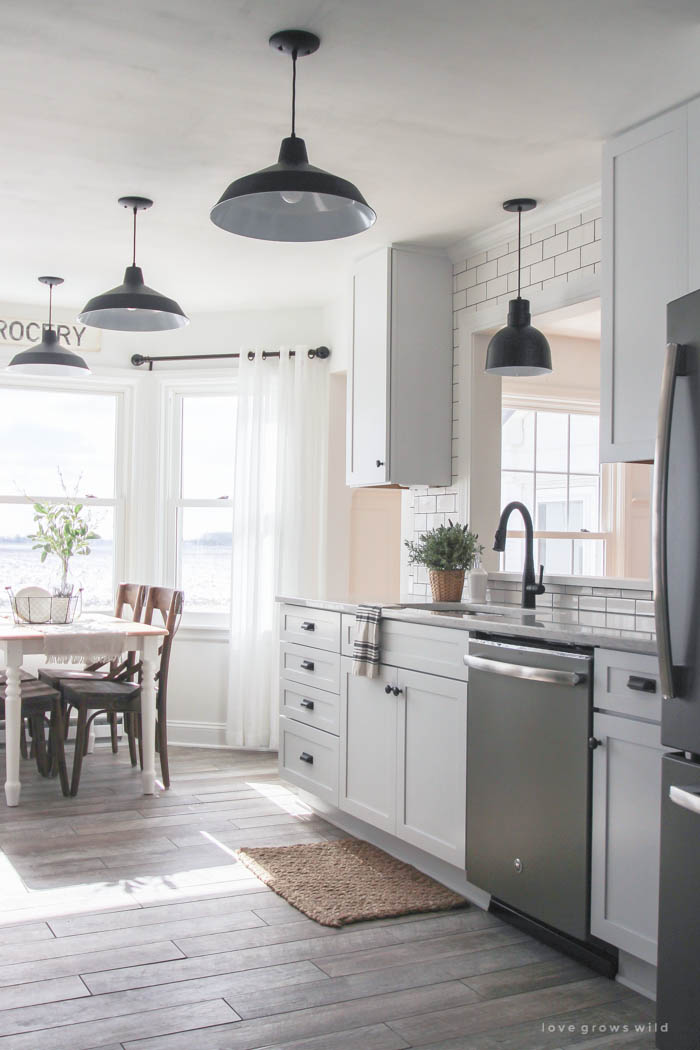
The beginning of 2016 started off with a bang in our house (literally), as we began renovations on our dated farmhouse kitchen. This was by far the biggest and most expensive project we’ve tackled in this house, and I carefully designed every single detail to give us a functional, spacious, family-friendly kitchen on a budget that we could afford.
We opened up the wall between our kitchen and living room, which instantly made the kitchen feel so much bigger, brighter, and more open. We replaced all the cabinets, flooring, countertops, and lighting, and we even tore out the old chimney behind one wall to make room for a large pantry cabinet. I’ve posted about each step of our renovations over the last few months (you can see them all here!), but today I thought it would be fun to end our incredible kitchen makeover journey with some great before and after photos, which REALLY give you an idea of how far this little kitchen has come! It still shocks me how big this transformation was!
Let’s take a trip down memory lane…
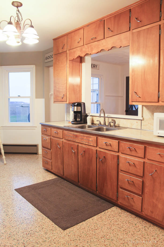
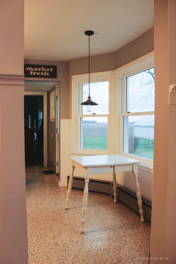
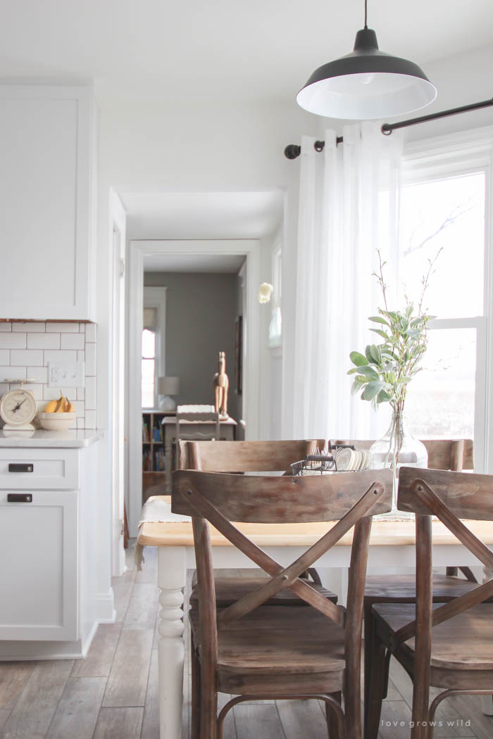
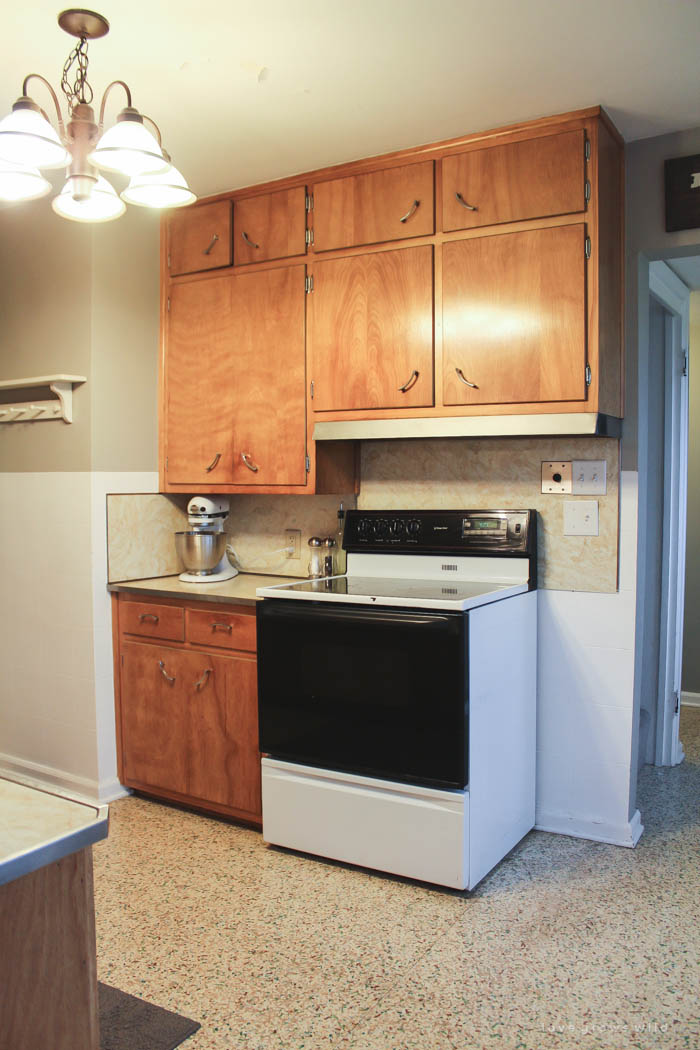
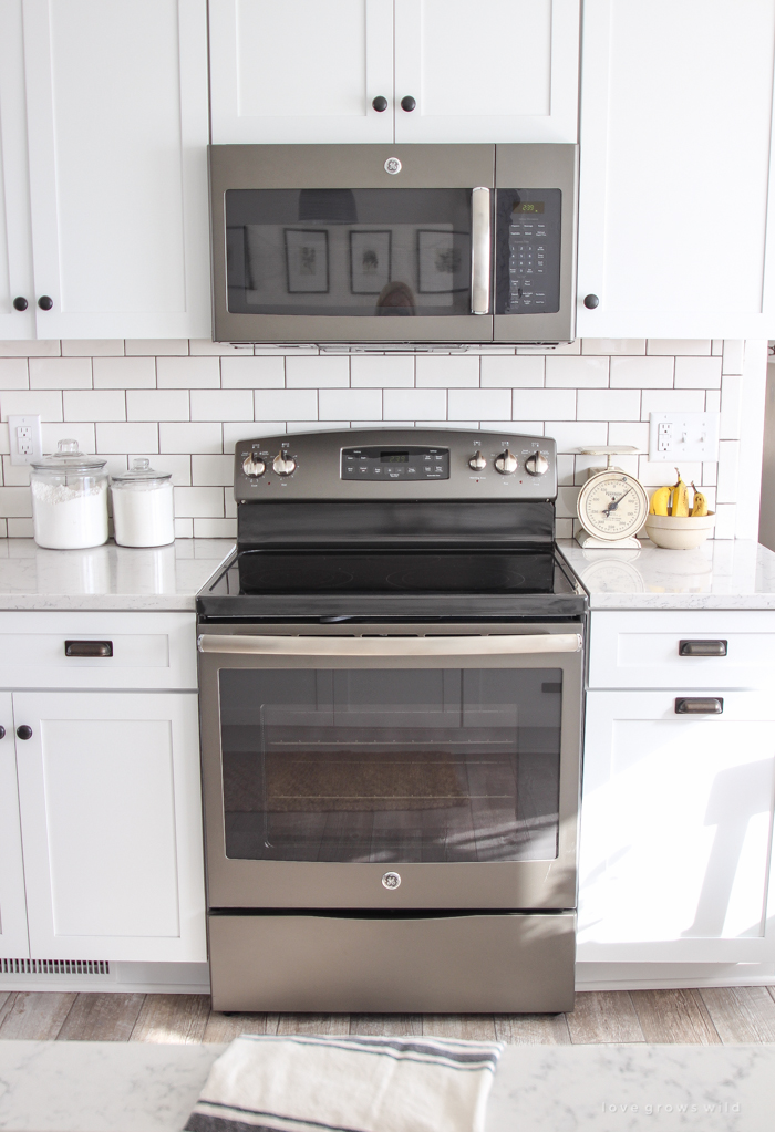
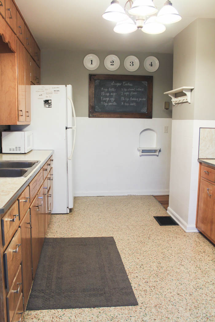
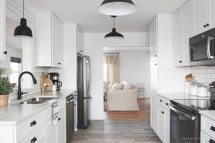
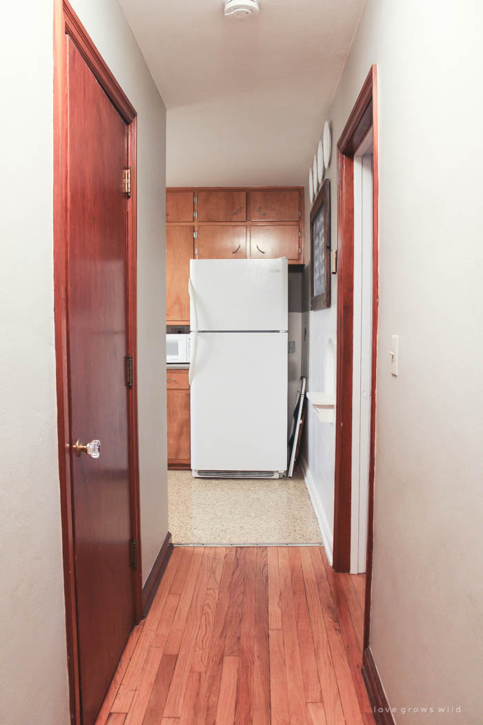
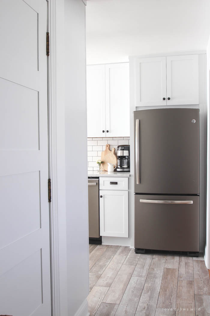
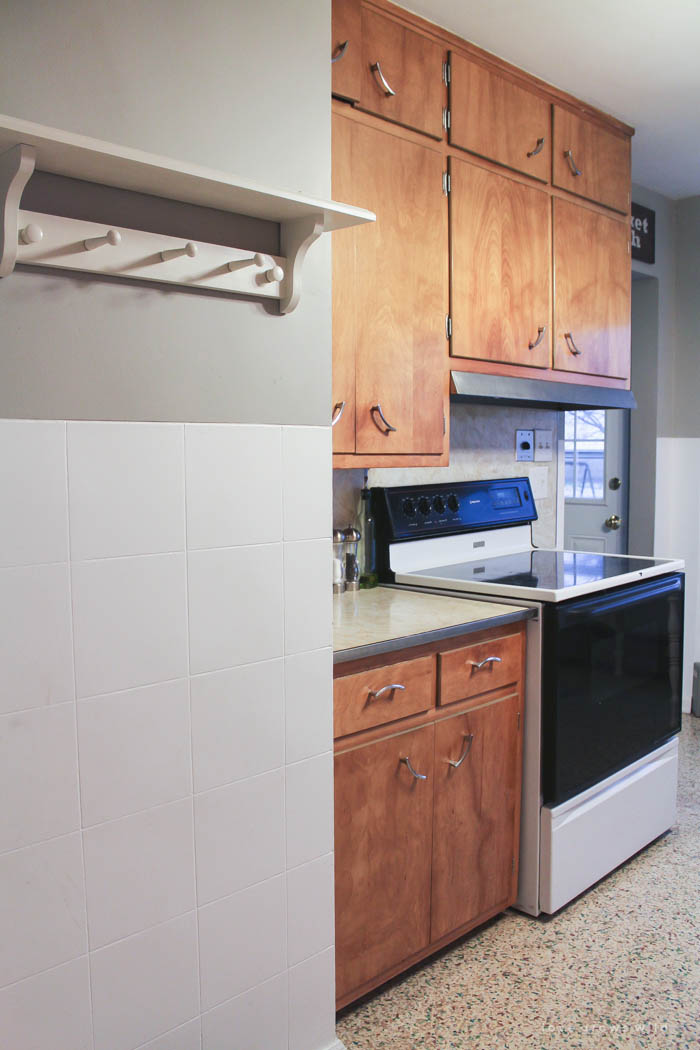
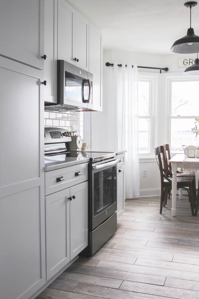
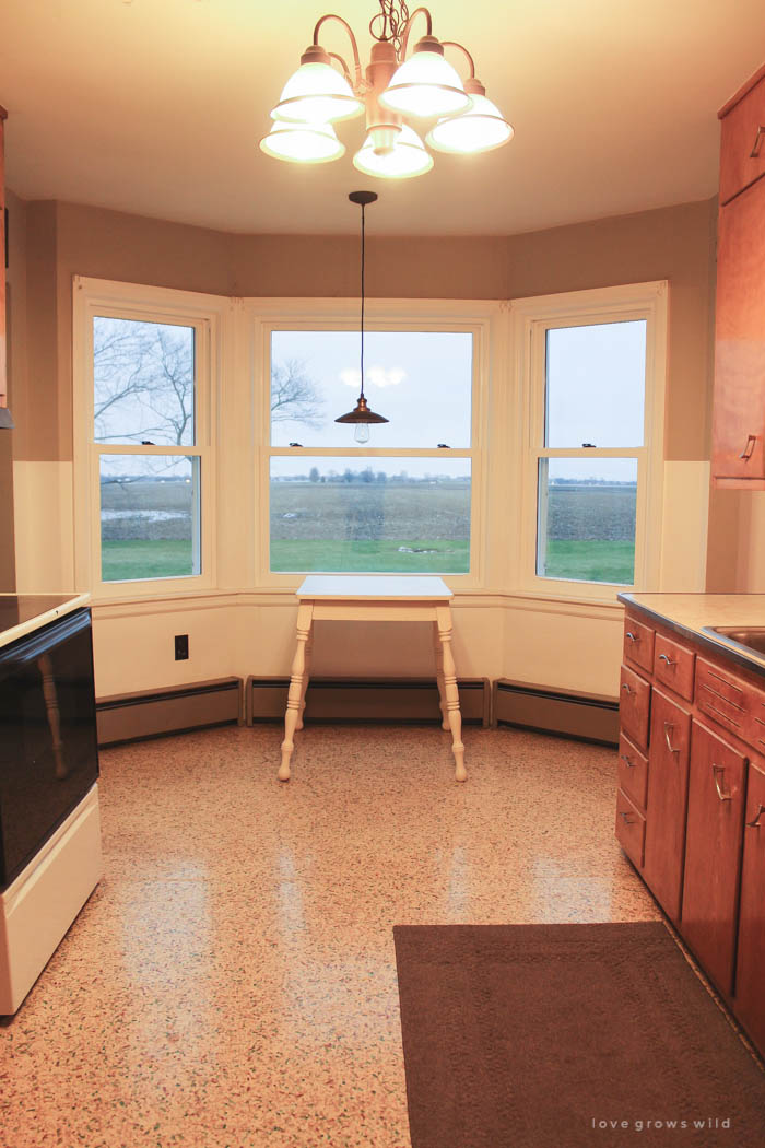
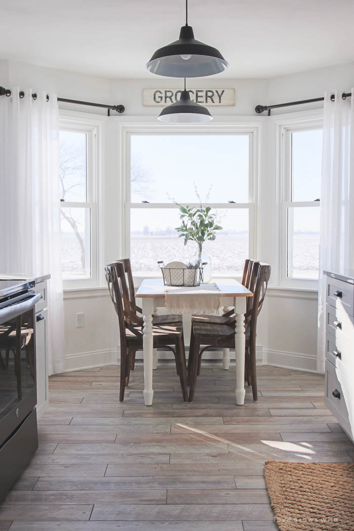
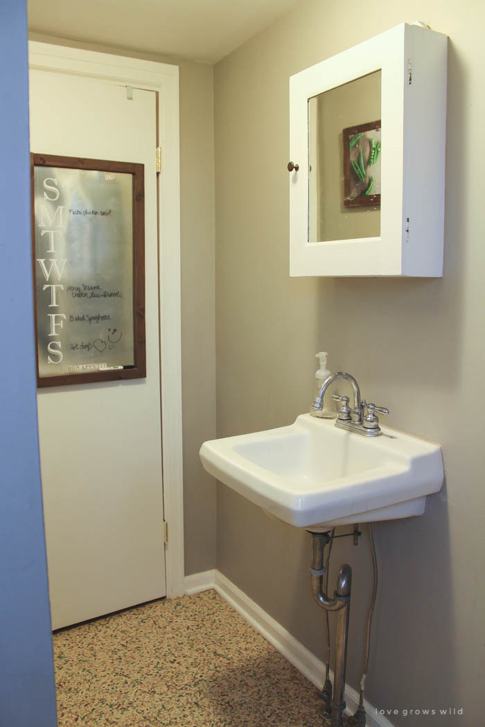
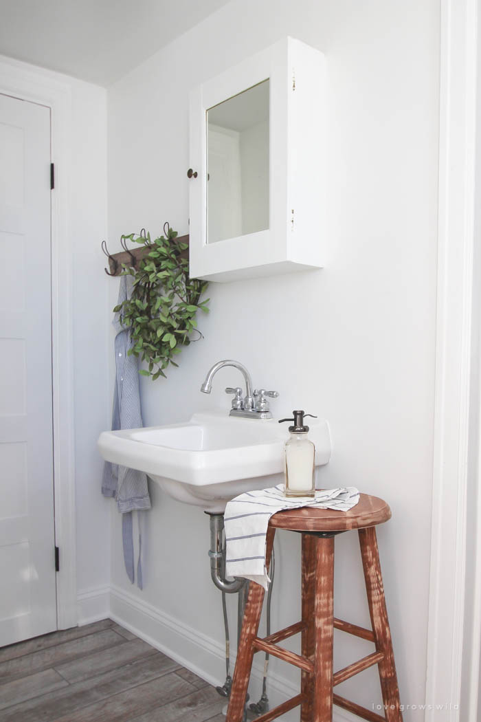
I am so happy we finally decided to tackle this project, and I’m equally as happy that the days of construction noise and dust are behind us! We have been enjoying our little farmhouse kitchen more than ever, and I wanted to say thank you guys for following along with this makeover!
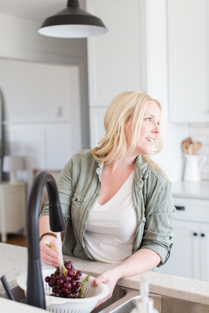
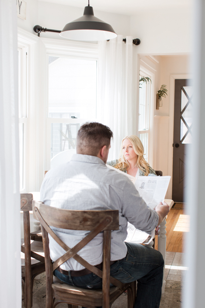
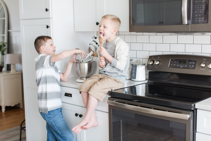
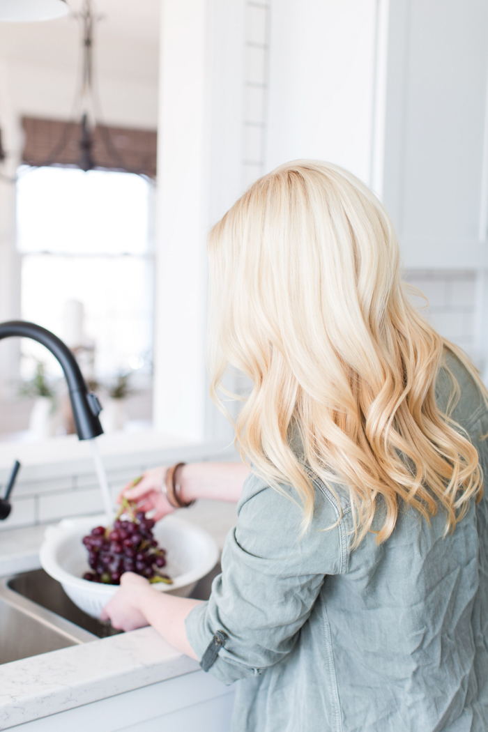

SOURCES
Dove White cabinets – KraftMaid purchased at Lowe’s
Cup cabinet pulls – Hickory Hardware
Cabinet knobs – Hickory Hardware
Quartz countertops – Silestone by Cosentino purchased at Lowe’s
Natural timber porcelain tile flooring – Lowe’s
Gray grout for tile floor – Lowe’s
Wall color – Du Jour by Valspar
Slate electric range – GE Appliances
Slate dishwasher – GE Appliances
Slate bottom freezer refrigerator – GE Appliances
Slate over-the-range microwave – GE Appliances
Matte black pendant lights – Amazon
Pendant light above sink – Wayfair
X back wood dining chairs – World Market
Sheer white curtains – Walmart
Bronze curtain rods – Walmart
Small jute rug by sink – Home Goods
Matte black sink faucet – Delta
Stripe kitchen towel – World Market
Woven plant pot – IKEA
KitchenAid coffee maker – Amazon
White pitcher with cooking utensils – IKEA
Glass canisters – Target
Round wire basket – Walmart
Faux greenery in glass jug – Hobby Lobby
Hallway lantern light fixture – Lowe’s
Soap dispenser by wash sink – Target
Blue striped towel by wash sink – IKEA
Blue stripe apron – tutorial
ANTIQUES, SECONDHAND FINDS, AND HANDMADE ITEMS:
white and wood dining table, drop cloth table runner, glass jug, grocery sign, wood cutting boards, antique scale, wood stool, blue glass bottles
MORE FROM OUR KITCHEN MAKEOVER
Kitchen Makeover Plans + Before Photos
Kitchen Makeover Reveal
Kitchen Makeover – Demo Day
Kitchen Makeover – Flooring
Kitchen Makeover – Cabinets
Kitchen Makeover – Countertops
Kitchen Makeover – Backsplash
Kitchen Makeover – Appliances
LET’S KEEP IN TOUCH!
Subscribe to Blog | Follow on Instagram
Follow on Pinterest | Follow on Facebook


HI Liz. I have been reading your blog for a while now and enjoy every post. Thanks for sharing with us the remodeling of your farmhouse on a “normal” person’s budget. I love your kitchen and that you gave us a source list. I wish you the best with your upcoming book and look forward to buying a copy. Regards, Sue
Love your renovation. One quick request, do you have a source for your interior doors?
Hi Robin, they actually are original to the house! 🙂
What a wonderful home. It is a nice house to begin with and neat how you modernized it too!!! I’m partial to how you made it appear bigger everywhere. Hmmm and you added yet took away cabinets!!! You must just want to pinch yourself!!!! It is neat to see it all at once as it makes better sense in my head how the layout is. Enjoy!!!!!
Beautiful down to every last detail….Very nice fresh and welcoming! Love it
It’s just beautiful! I LOVE everything!
It’s just gorgeous!!!! And very functional!!! Isn’t it amazing how remodeling can completely change the look and “feel” of a house??? Blessings to you!!!
My goodness!!! Doesn’t even look like the same kitchen! I love all your finishes!! Fantastic! Job!
It’s just beautiful! Great job and transformation!
Oh my goodness, that transformation is amazing! I have such kitchen envy right now – your kitchen is PERFECT! Wonderful job on the renovation!!
Jess
http://www.JessExplainsItAll.com
Looking at your kitchen redo. Wondering why there is now only one hot water radiator instead of three in the breakfast nook under the windows where your kitchen table is located.
Great eye, Arlene! We decided to reduce the three heaters down to one during the renovation for a few reasons. One, it is visually more appealing to not have heaters along the entire wall. Two, it gave us a little extra space for a table and chairs in that nook. Three, I wanted to be able to hang curtains at least on the two outside windows without having to hem them up over the heaters. The new heater we installed under the center window is much more efficient than the old ones, so it has worked great for us so far!
Wow! This looks amazing. I just love your style. I love the modern farmhouse look!