In partnership with Walmart | I love looking back on how much this little home of mine has changed over the years. The design has evolved throughout different moments and milestones in my life, and my style today looks a little different than it did when I first moved in 9 years ago. It’s no secret that I am a lover of light, bright, calm, neutral, cozy spaces, but this past year I’ve slowly added a little more contrast and drama that has really changed the look and feel of our home…
first with my office…
then with Alec’s bedroom makeover…
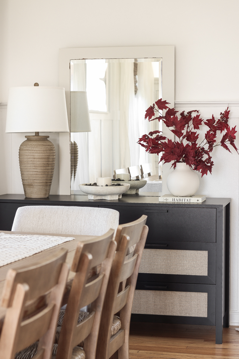
and now, with this beautiful vignette in my dining room.
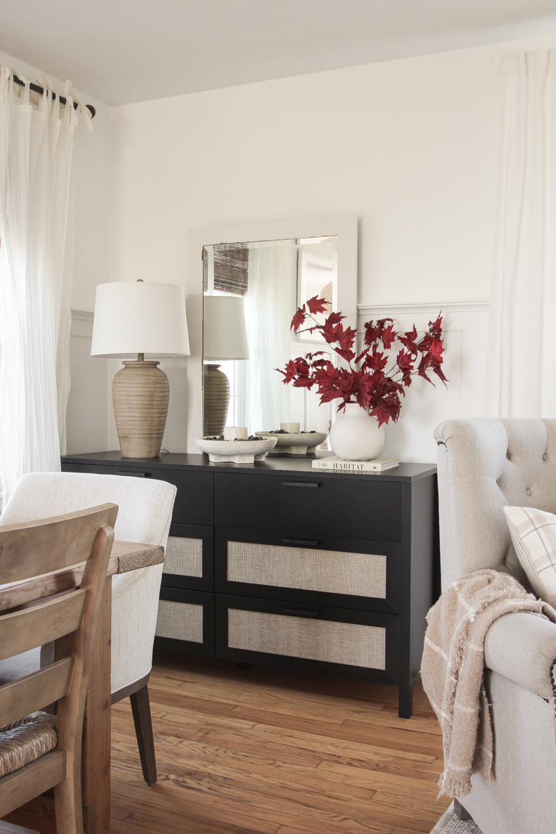
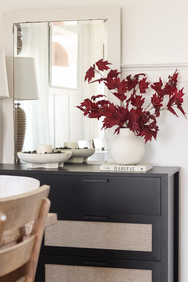
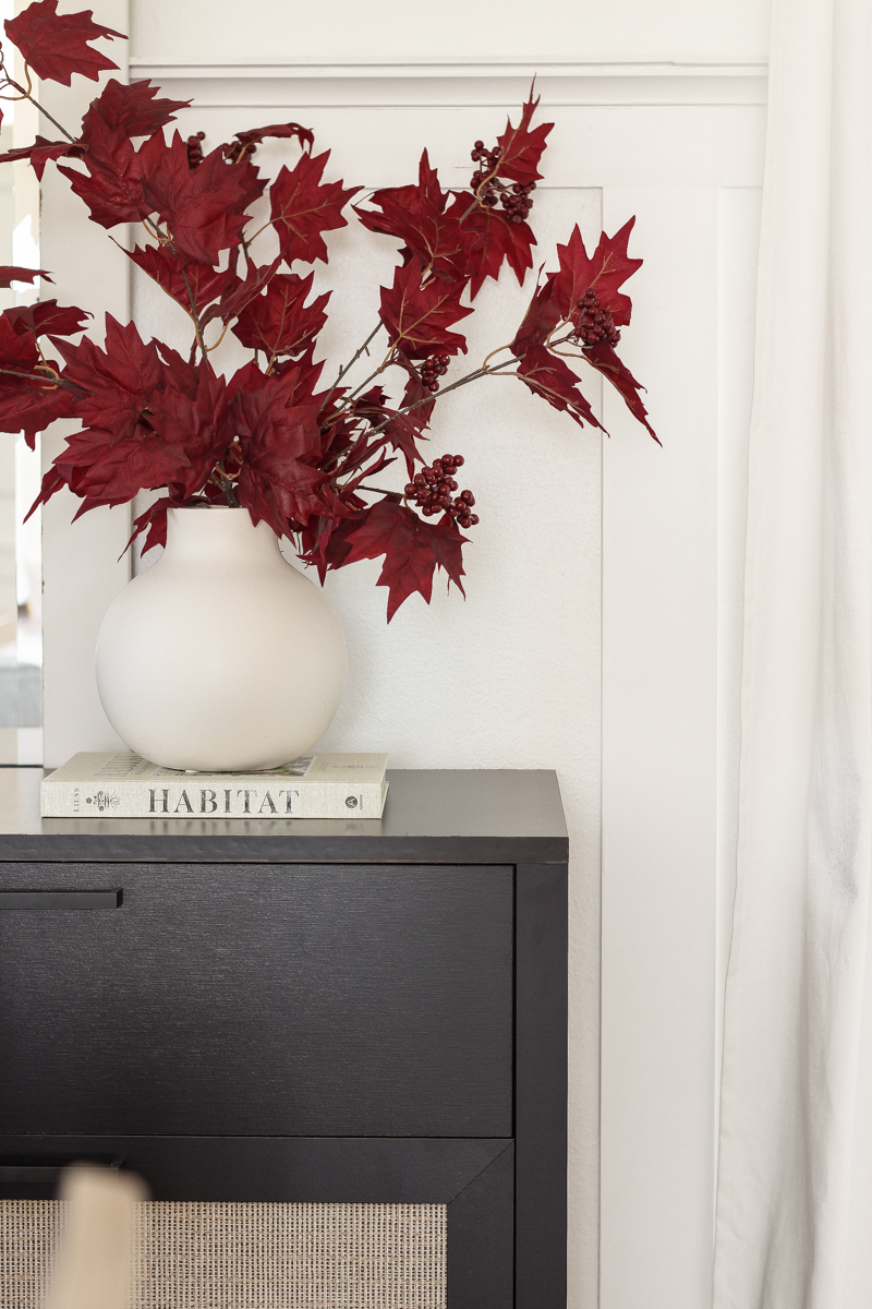
A beautifully bold and sophisticated black dresser with a stunning high-end look… minus the high-end price.
Want to know where it came from?

Walmart Home. Yes, Walmart. And for less than $270, my friend.
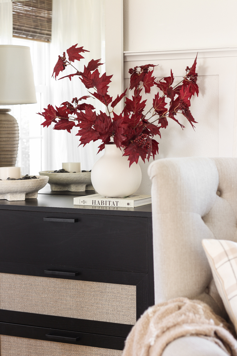
I was honestly shocked to see such a chic piece of furniture on their website, but I’m telling you, don’t sleep on Walmart’s home section! This dresser has the look of black oak woodgrain and faux rattan inserts, with sleek metal handles and linen look paper lining the inside of every drawer. The faux rattan drawer fronts look very realistic, giving the piece some beautiful texture and warmth to contrast all the sleek lines and solid black finish. The box it was delivered in was large and heavy, and it was definitely a two person job to assemble. I can’t say this was the quickest or easiest piece of furniture I’ve ever put together, but the extra time and attention to detail was well worth the end result.
This design is part of the new Queer Eye collection at Walmart and also comes in a nightstand and a taller 5-drawer dresser version. The nightstand is absolutely stunning and extra wide, which I think gives it an even more upscale feel. There were quite a few pieces that caught my eye from this collection (including a really fun locker storage cabinet that I bought for my youngest son’s room), and I will share a few more of my favorites at the end of this post.
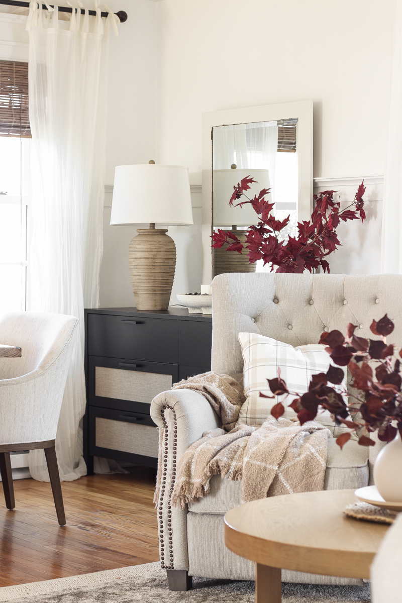
When I moved some things around in the entryway last month, I lost the gray console table I had sitting here behind the dining table previously. If you’re new here, my living room and dining room are open to each other… it’s all one big room, really. You can see more of the layout here.
When I found this black dresser I thought it might be the perfect piece to replace the console table, and I love the way the dark, moody black breaks up all the soft, light neutral colors and really grounds the space.
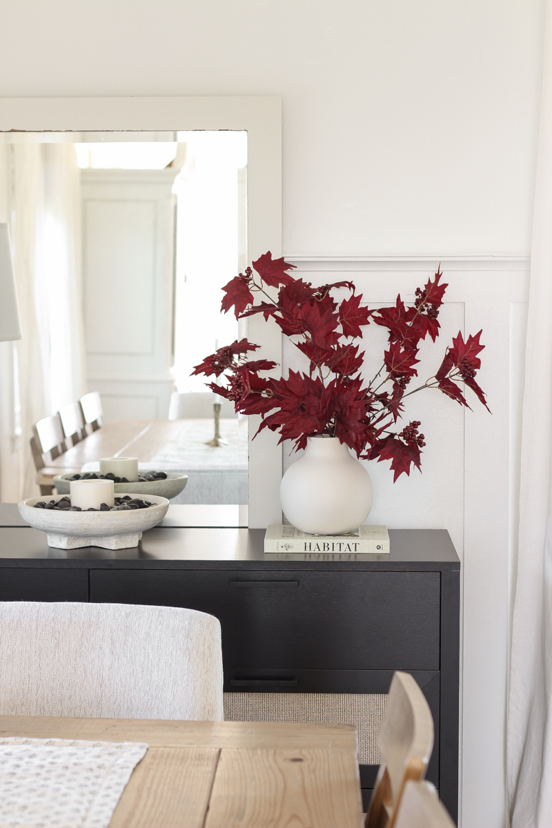
I placed my huge floor mirror behind the dresser… I really had no where else for it to go, but it ended up being the perfect size to go above the new piece of furniture.
I styled the top of the dresser very simply for fall using a classic combination that never fails me…
- a large lamp – this is the one I snagged from Walmart when I updated the entryway (sold out)
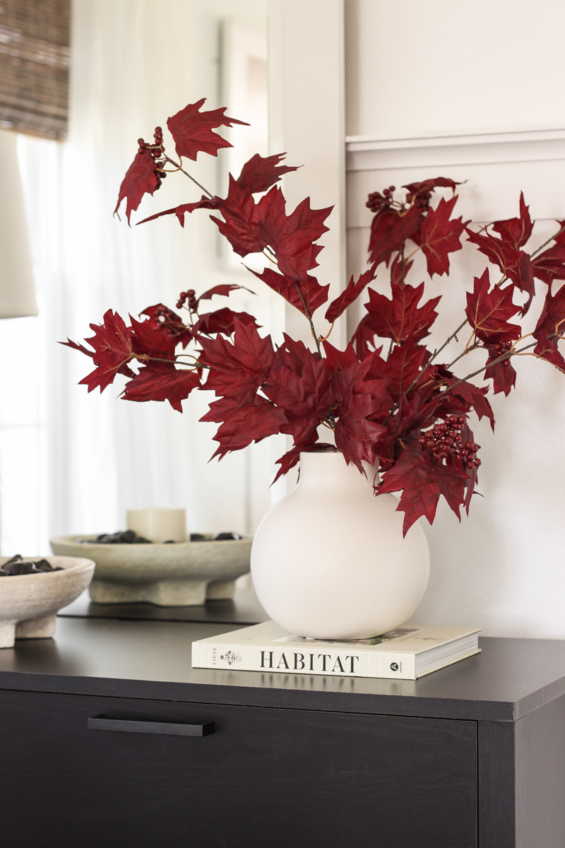
- a vase with seasonal flowers or greenery – don’t you think that deep red is absolutely stunning against the black and white? … swoon
- some kind of tray, bowl, or vessel with a candle
- books – used as a base for other objects
I usually lean towards more of a minimalist style when decorating, and to me this piece of furniture just screamed for simple sophistication. But to keep the space from looking too modern or flat and boring, I incorporated pieces with lots of texture and natural elements such as river rock and faux fall branches.
TIP:
If the opening of your vase is too large and allows your stems to fall all over the place, one quick and easy way to fix that problem is by using a rubber band or hair tie to hold the stems together right inside the top of the vase. This gives you a little more structure to help keep your longer stems in place!
Want to know my favorite design books to decorate with? You can check them out here. I love adding to my book collection throughout the year, both to read and inspire me and also to decorate with!
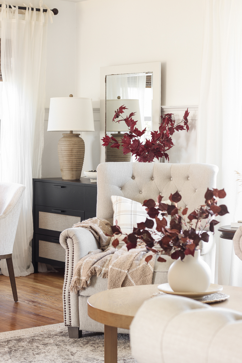
I know I always preach this, but it’s worth repeating. One of the many reasons I love designing our home in a neutral color palette is how easy it is to add just a few little touches of more colorful seasonal decor to completely change the feel of a room. It can be as simple as swapping out the florals you have in a vase, changing a piece of artwork, or adding a cozy throw pillow or blanket to bring your home into a new season. These beautiful red branches are probably the most red my house has ever seen (even during Christmas, lol). But I just love the impact they make in this space when everything else is simple and neutral.
And the best part? When I get tired of red, it will take just a quick second to change this to something more wintery! Some bare branches or fresh evergreens perhaps?
Over the next few days I plan on continuing these moody fall vibes into the rest of the living/dining room, and I can’t wait to show you how the whole space looks together. Fall is always such a fun opportunity to add lots of layers, a dash of color, and tons of coziness to your home. I hope you are enjoying decorating for the season too!
I can’t wait to hear what you think about this dresser and the pop of red for fall!
I partnered with Walmart on this post, but as always the thoughts and opinions shared are 100% my own. Thank you for supporting our blog and brand partners! As always, I sincerely appreciate you shopping through the links I share, which allows me to make a small commission from your purchase while your purchase price stays the same. When you use my affiliate links, I’m better able to create content for this blog as well as support my family, and I thank you from the bottom of my heart for supporting what I do!
– SOURCES –
wall color: Du Jour by Valspar
black dresser | recliner | maple leaf stem
boucle throw blanket | handwoven rug | medallion rug
vase | design book | tie top sheer curtain
bamboo roman shade | upholstered dining chair | floor mirror
wood dining chair | plaid pillow | terra cotta bowl
– SHOP THE POST –
– MORE WALMART FURNITURE FINDS –



I love the red. It really does pop against your neutrals.
I love everything. The cabinet is amazing