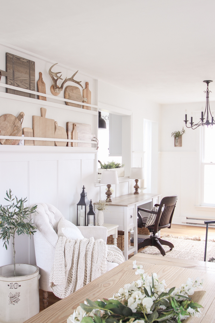
A few weeks ago, I shared some changes in our entryway that all started with a little bit of spring decorating and ended up snowballing into hours of projects and furniture rearranging. This space has been craving a fresh, new look for quite some time, so when inspiration struck me that day, I just went with it! I’ve shared one half of our entryway by the front door many times here on the blog, but it’s been awhile since I’ve shared what the OTHER side of the entryway looks like… mostly because I haven’t fully loved the way it looked and couldn’t figure out what I wanted here. I know, I know… I should practice what I preach and embrace the journey. Decorating is a wonderful never-ending process for me, and I should document all the stages of our adorable, little farmhouse, even if it isn’t “perfect” in my eyes just yet.
But after my late night styling session a few weeks ago, I’m ridiculously happy with how this side of the entryway (which is right next to the kitchen) is starting to look!
(You can find links for all the items in these photos at the bottom of the post!)
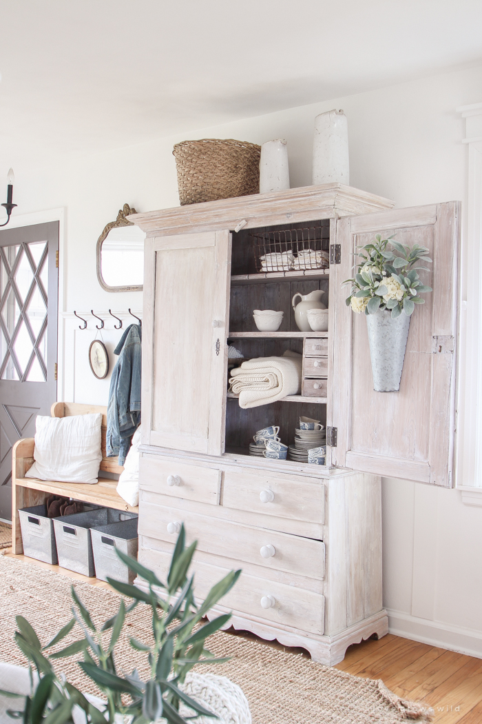
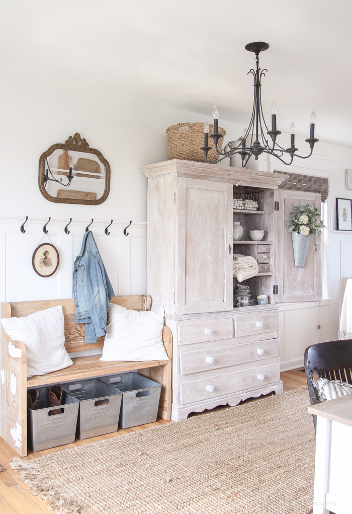
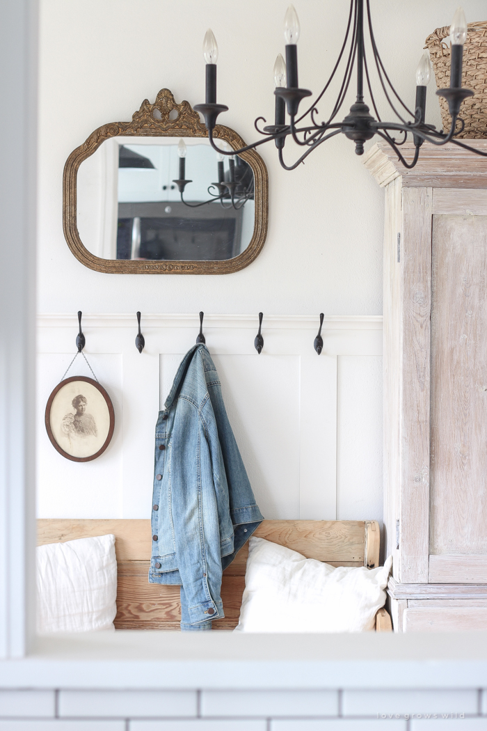
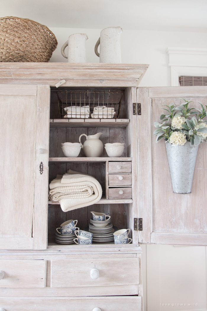
Just as a reminder, here is how the “entryway” side of this space looks now… coat hooks and a sweet wooden bench and an armoire for storage and metal bins for shoes and plenty of pretty antiques…
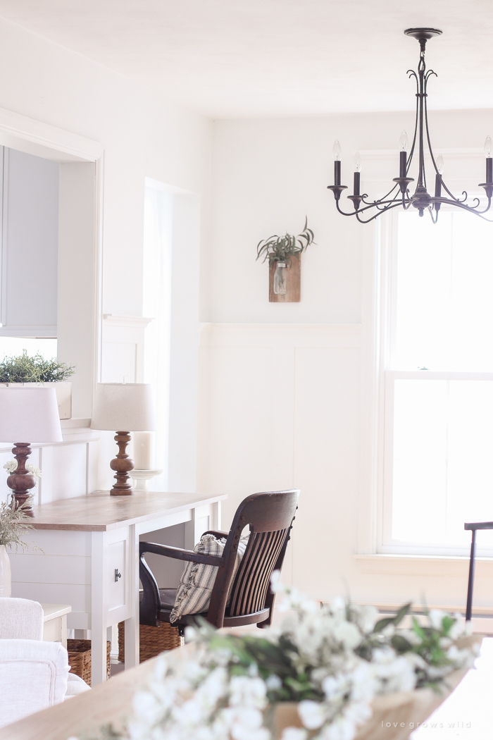
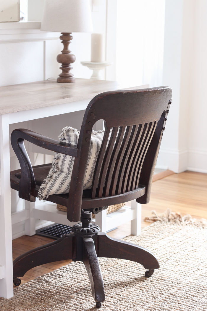
… and here is how the other side is used. I’m calling this area a “mini office”, but it’s mostly used by my boys for doing their homework. It’s in the main part of the house, so I’m close enough to help them with dreaded math homework when I’m in the kitchen cooking, but it’s also separated enough that they have a little bit of peace and quiet to focus on their work. The desk now sits right underneath the opening that looks into our kitchen, which is really helpful when I’m in cooking dinner and I can still keep an eye on them. The desk chair is an old banker’s chair I picked up at an antique store, and I love the character it adds to the space. Even though the desk is new, sprinkling in a few vintage pieces can really make a big difference.
I built this plate rack on the wall last year while I was writing my book, and it’s one of the first things you see when you walk in the front door. I use it to hold my collection of cutting boards instead of plates, and I love the warmth and texture it adds to all the white walls. It is probably one of my favorite tutorials in the book! It was relatively simple and inexpensive and can really make a big impact on a wall in your kitchen or dining room. I added some mounted antlers in the center for a little bit of depth, and the colors blend beautifully with the wooden cutting boards. I’ve had a hard time getting a nice picture of the plate rack until now, so I’m really excited to share these with you!
Underneath the plate rack, I tried several different pieces of furniture before settling on this beige beauty. I even carried the little couch that was upstairs in my bedroom down here to see if it would work, but it was just a little bit too long, so back up it went. My boys are such troopers for helping me move furniture pointlessly up and down the stairs! This pretty tufted chair is actually the same design as the gray ones in our living room, just in a lighter beige fabric. To be honest, I like the beige better than the gray, but I figured with kids and a dog in the living room, gray would hold up better over time. But moving this chair here has created a sweet, little reading nook for the boys to do their nightly reading in… when the dog hasn’t taken it over as his napping place that is.
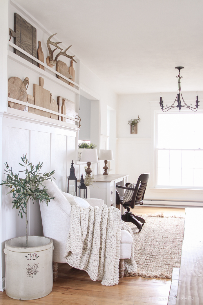
This room has always been a big challenge for me since the day we moved in. It’s technically considered the dining room, but the space is so small and is also a walkway to the living room. So even though we tried to make it work for a few years, eventually I came to the realization that both a dining room and entryway with storage for our shoes, coats, gloves, etc. was not going to all fit in here. So I slid our big farmhouse table we built down into the living room and found a way to make the best use of this awkward space. That’s what I love/hate the most about our little farmhouse… it’s not always easy to fit all of our needs into these small spaces, but it forces me to get creative and think outside the box to find what works best for the house and for our family. We still have plenty of space for a walkway to the living room, we have a ton of storage for our belongings in the entryway, and the boys have a comfortable place to work on their homework. One puzzle piece at a time, our little farmhouse is feeling more and more like home.

SOURCES
Note: Some of the links in this post are affiliate links, which allows me to make a small commission from your purchase, but your purchase price stays the same. Thank you for helping support our blog!
- Door color – Rust-Oleum Door Paint in Rustic Pewter
- Wall and trim color – Du Jour by Valspar
- Desk – Sauder
- Striped pillow – World Market
- Wooden lamps – Target
- White box with greenery – tutorial
- Plate rack – tutorial in my new book!
- Cutting boards – Wayfair: 1 2 3 4
- Tufted chair – Target
- Throw blanket – Birch Lane
- Olive tree – Wayfair
- Wooden bench – tutorial
- Jute rug – Rugs USA
- Entryway bench – tutorial
- Coat hooks- IKEA
- Metal bins – Walmart
- White pillows – IKEA
- Cream sweater blanket – Target
- Ceramic pitchers – Wayfair & Wayfair
- Metal vase – Hobby Lobby
- Faux flowers – Hobby Lobby
- Round woven basket on top of armoire – Joann Fabric
- Hanging vases beside window – tutorial in my new book!
- Board and batten trim – tutorial
- Chandelier – DelMar Fans (no longer available)
- Faux olive tree – Wayfair
- Roman shade – Home Depot
Antiques: armoire (see paint tutorial), desk chair, crock, side table, mirror, wire basket, dinnerware/dishes
LET’S KEEP IN TOUCH!
Subscribe to Blog | Follow on Instagram
Follow on Pinterest | Follow on Facebook



Leave Your Comments