A few months ago I started thinking about the spaces in our home and how they function for us. I think it’s so important to reassess every once in awhile, especially as your family and needs change. Maybe you are getting ready to have a baby, or you have children who are moving out and you’re considering downsizing, or you realize you never use a formal dining room and could better utilize the space… whatever your situation is, you want your home to grow and change with you. For us, the days of having little babies and toddlers around and needing a playroom for storing toys are gone, and I’m realizing the boys are probably ready for a change. Excuse me while I sob for a minute.
Our playroom has always been downstairs, just past the kitchen and across from my office. When the boys were little, it was easier to watch them while I was cooking dinner and so nice to have all their toys corralled in one spot. Our house really isn’t very big, and they have always shared a bedroom upstairs, which like my bedroom is a converted attic and full of short, awkward angled walls. Fitting two beds up there wasn’t always easy, and my oldest son, who will be turning 13 this year, is more than ready for some privacy from his little brother.

Another thing I’ve been thinking about lately is as the boys get older I want them to have a space where they WANT to be. A space to hang out with friends. A space to be themselves. I admit that I haven’t always been the best about letting them have friends come over for a multitude of reasons… our house isn’t big enough, they just run all over the place, I like when it’s just us, and quite frankly, sometimes my anxiety can’t handle the chaos of a bunch of boys and all their energy. I definitely have some mom guilt about feeling that way. But when I thought about WHY I have those feelings, I realized that it’s because I haven’t created that space for them. We have always tried to live with less and not spoil the boys with all the newest video games and expensive toys. Call me old fashioned, but I would much rather see them playing with a football in the backyard than glued to a screen, even though it’s getting harder and harder to maintain that stance with the way the world is today.
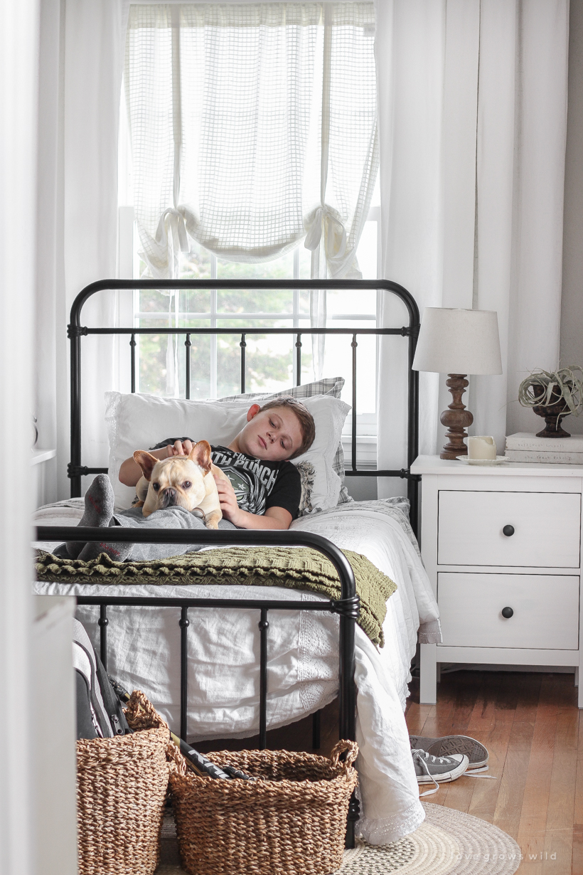
BUT, even in trying to live and teach the boys a simpler life, I still needed to carve out a space that allowed them to be boys and have friends over, and I have made that my mission over the last few months. I first moved my oldest son, Alec, downstairs to what used to be the playroom and kept my youngest, Wyatt, upstairs. Alec is at an age where he doesn’t necessarily play with toys anymore, so he was completely fine with moving all the toys out of his new room. Wyatt is only 9 and definitely still plays with things like Legos and Nerf guns, so his bedroom upstairs, which is the bigger of the two, became the room for toys. I thought that by moving the play area upstairs, the boys and their friends would be more likely to keep the noise and excess energy up there, and I would be much happier to let them have friends come over more often. So far that has worked BRILLIANTLY. I will go into more details about Wyatt’s room and how I created a better play space for them in Part 2 of this post, but today I have Alec’s new room to share with you!
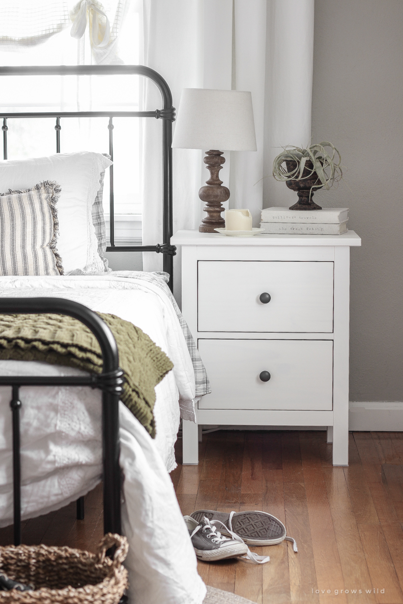
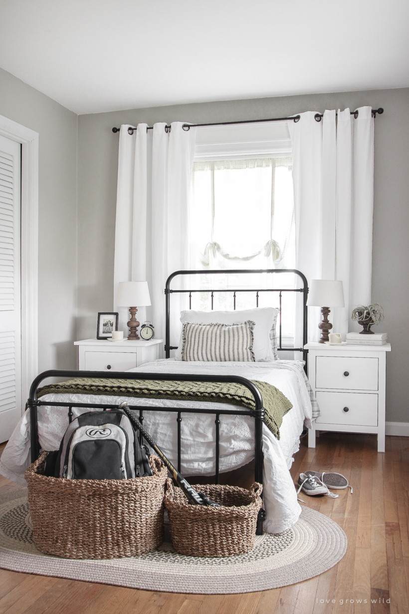
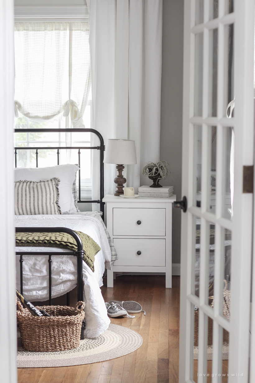
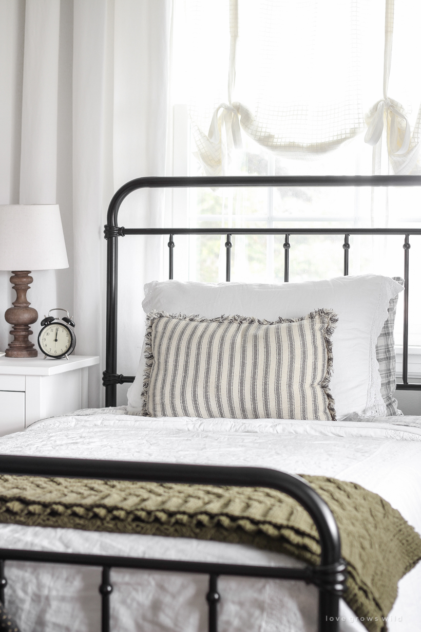
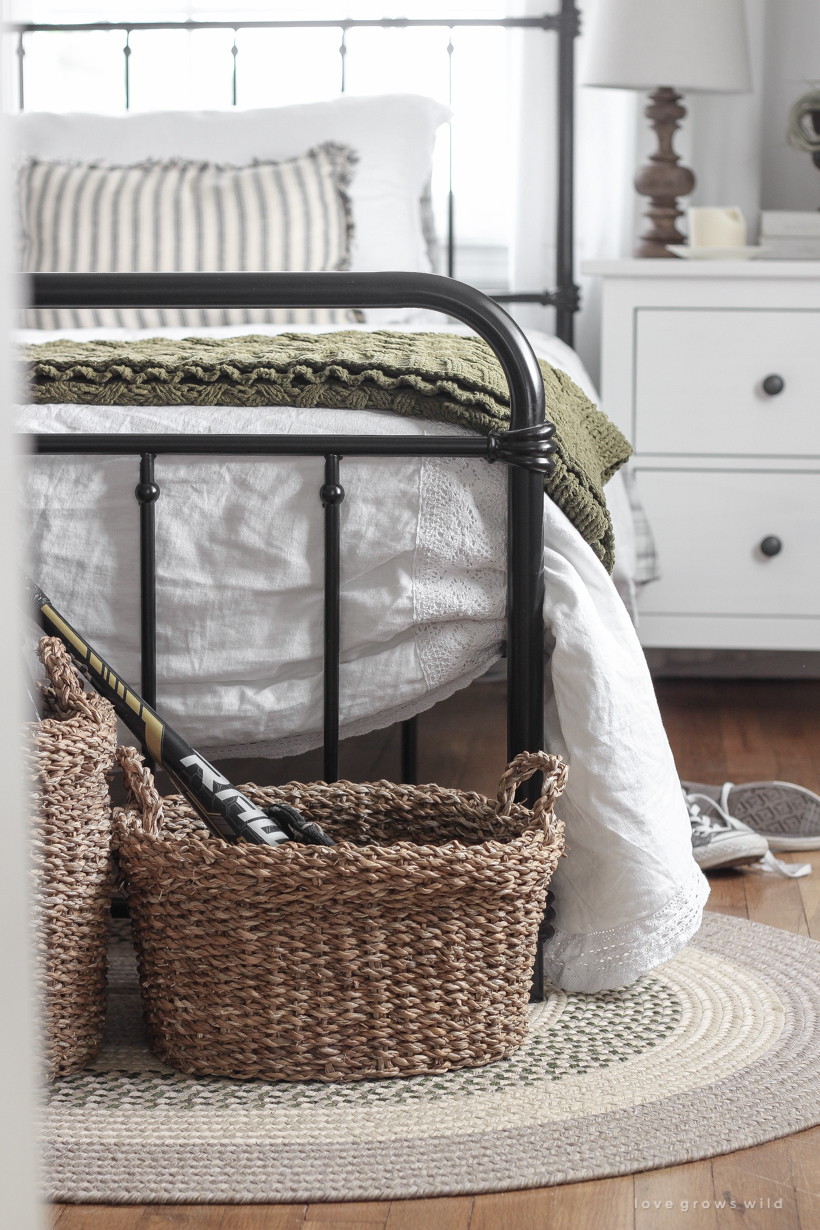
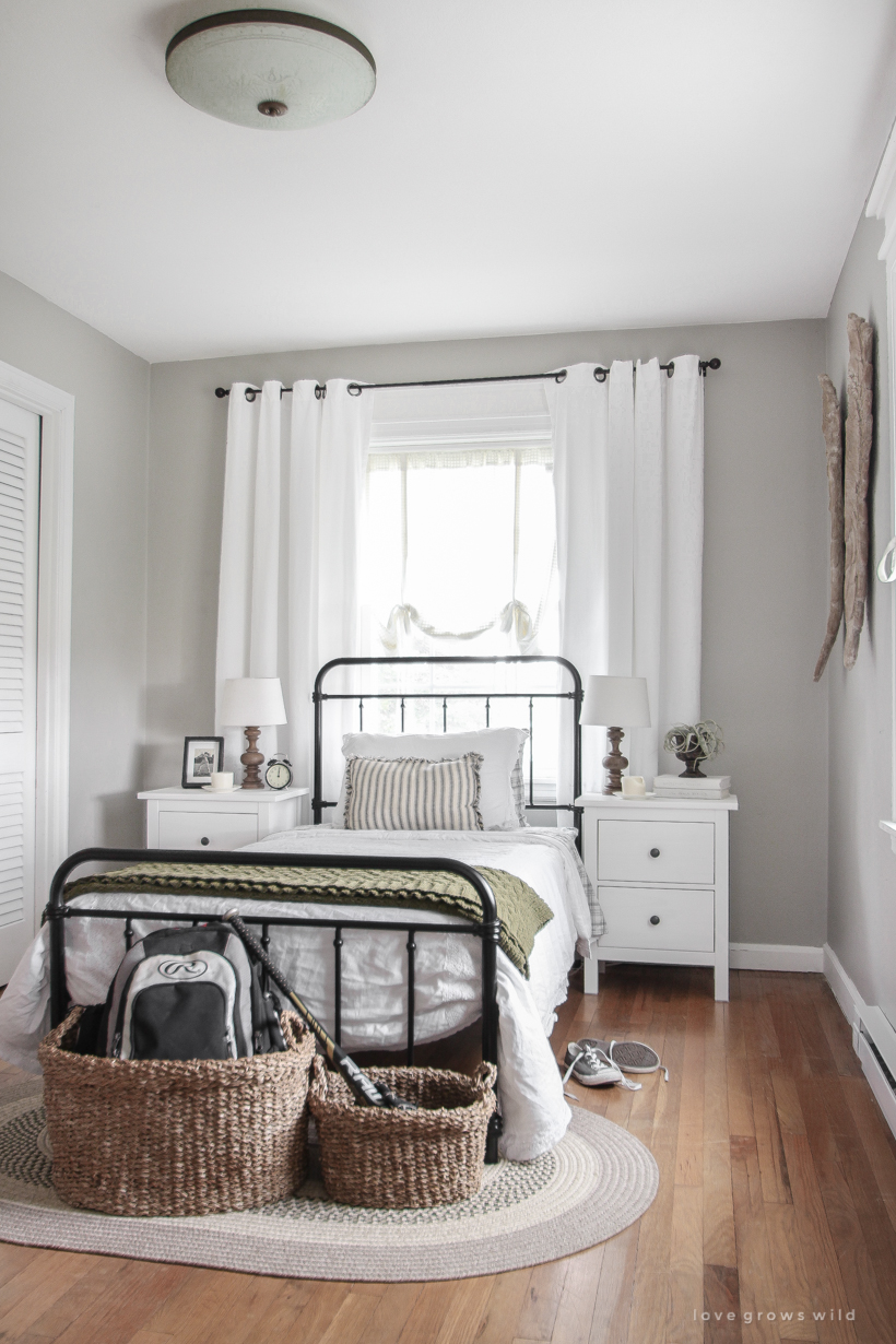
Alec’s requests for his room were simple… something simple (a.k.a. not themed), masculine, and sports-related. We kept the walls gray (Woodlawn Colonial Gray by Valspar, which the entire house used to be painted in!) and brought in plenty of black, metal, and wood elements to make the space feel more masculine. I bought him a new bed frame that is basically a smaller version of mine and two new nightstands from IKEA, but pretty much everything else including the bedding, rug, dressers, most of the decor, and a bookshelf you don’t see in these photos we already had. Because these are kids’ spaces I went with a lot of furniture from IKEA that is inexpensive and easy to replace down the road. Even his new bed was under $100.
Note: Some of the links in this post are affiliate links, which allows me to make a small commission from your purchase, but your purchase price stays the same. When you use these links, I’m able to keep this blog going and make it better, so thank you from the bottom of my heart for your support!
All of the items/sources are linked at the bottom of this post, but I wanted to highlight a few of my favorite things in his new room with you:
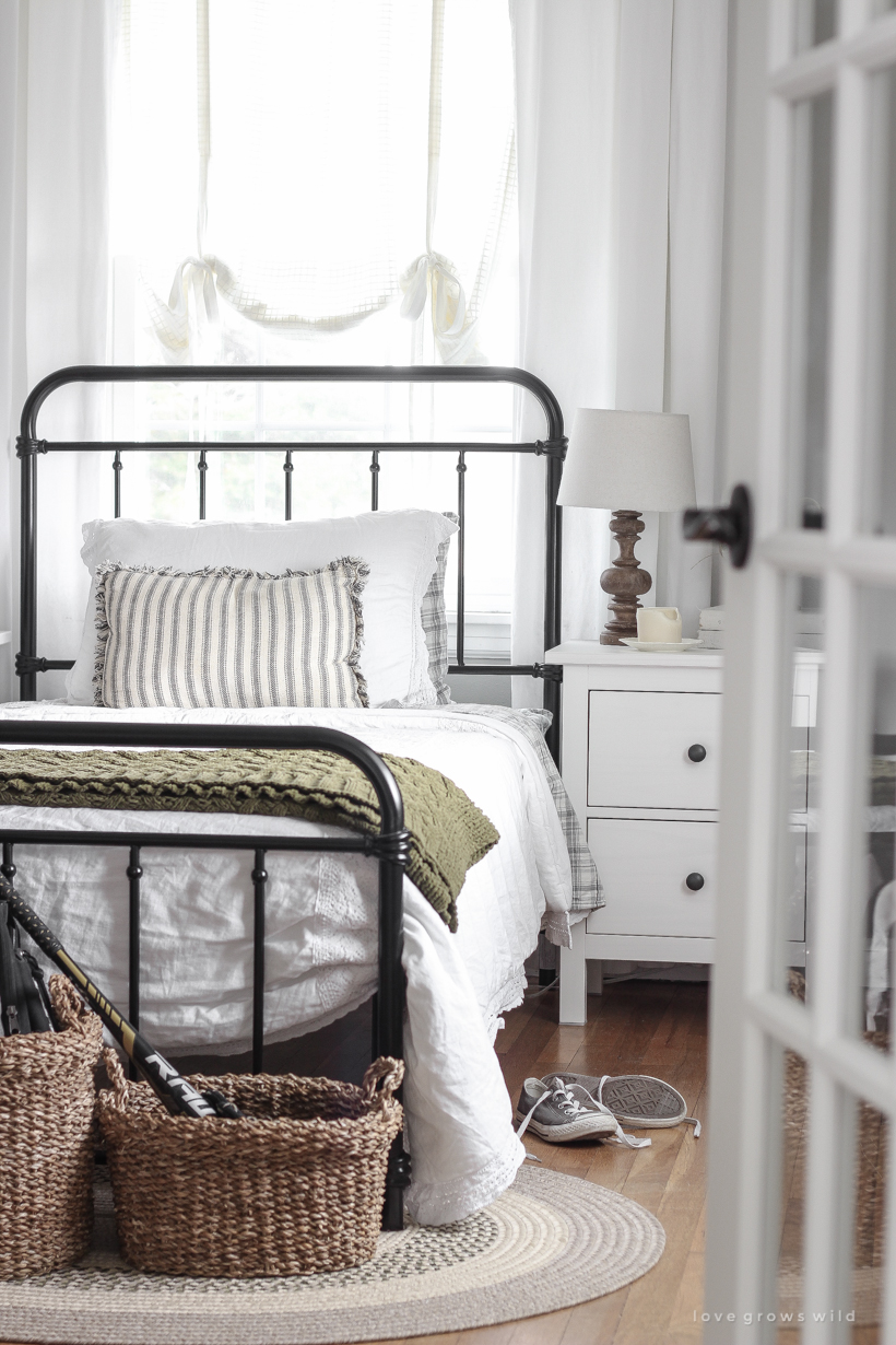
- When you walk into our home, the first thing you see is straight through the kitchen (where the kitchen table is) and right into Alec’s room. So you’ll basically get a view of either a messy boys’ room or a closed door, which would make the house look and feel even smaller. I decided to upgrade his door to one with glass panels because I thought it would be so pretty to see when you come into our home and also let a lot more light flow from room to room. My plan is to most likely frost the glass, which will still let some light through, but also give him privacy. I can’t tell you how much of a difference this small detail added to our home!
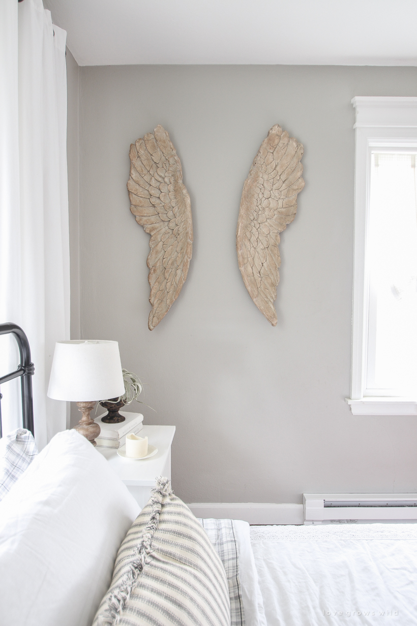
- I wanted to soften the space without making it feel feminine, so I decided to cozy up the windows by adding an extra layer of curtains. I hung basic white curtains both higher and wider than the window, which makes the window look larger and more substantial. Then I hung a tie-up curtain panel inside the window for another layer of softness. I ordered the tie-up curtains here and LOVE the way they drape and look so cozy. There is another window on the right wall that has a baseboard heater underneath, so even though I can’t add a floor length curtain there, these tie-up curtains worked perfect in that window too!
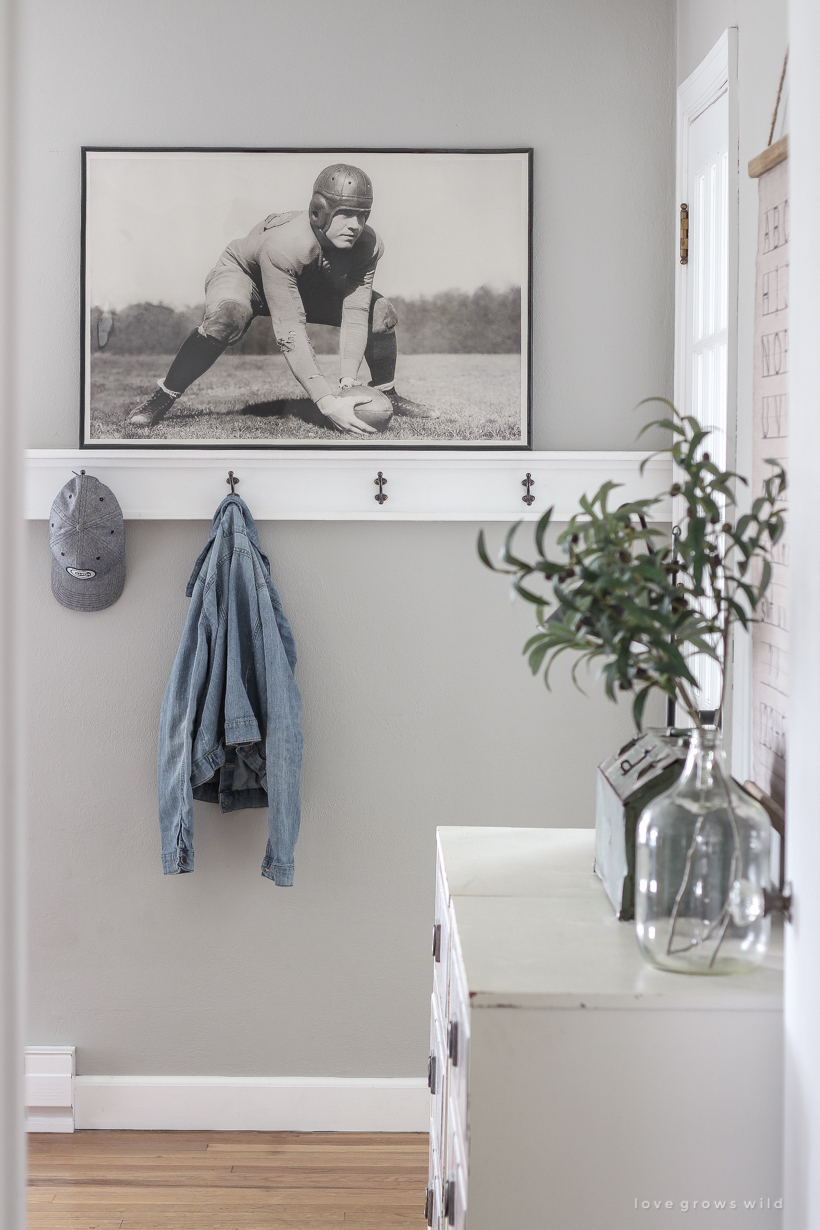
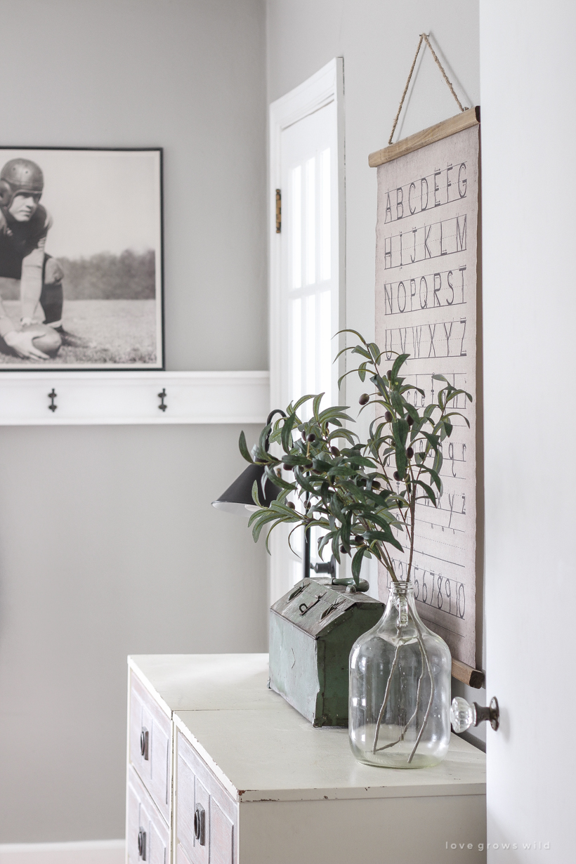
- I try to add as much storage to the boys’ rooms as possible, and the hooks I installed in here a few years ago have been SUCH a lifesaver for hanging up their book bags and coats after school everyday. The tutorial for how I created that is in my book!
- I needed a piece of artwork to hang over the coat hooks and found this one that my son and I are obsessed with. It’s a vintage football photo, and I was able to order it in a nice, big size to fit the space (24″ x 36″). Since I was trying to keep the cost of the bedroom makeovers to a minimum, I picked up a simple black poster frame from Hobby Lobby with a 40% off coupon for just $9.99, and I think it looks stunning. Alec told me over and over again how much he loved it when he got home from school the day it was delivered.
- Someday I will find the words to share the significance behind the angel wings in Alec’s room, but I will tell you that they are even more beautiful in person than they are in photos. I got them a few years ago to go with my Christmas decor, and they eventually ended up in this room. When we started designing their new bedrooms, and I asked them if he wanted them gone, thinking they were too feminine for him. But he said no, I want them to stay. It made my heart so happy to connect something special to him with the decor in his room, and that’s really what I strive for in decorating our entire home. Connection.
– Sources –
wall color – Woodlawn Colonial Gray by Valspar
trim color – Du Jour by Valspar
bed frame – Wayfair
nightstands – IKEA
vintage football print – Etsy
white tie-up curtain – Target
white floor length curtain – World Market
wooden angel wings – Wayfair
wood lamps – Target
green throw blanket – Target
crochet trim white linen comforter & pillow sham – Target
gray plaid sheet set – Target
navy stripe lumbar pillow – World Market
rug – Wayfair
baskets – Wayfair
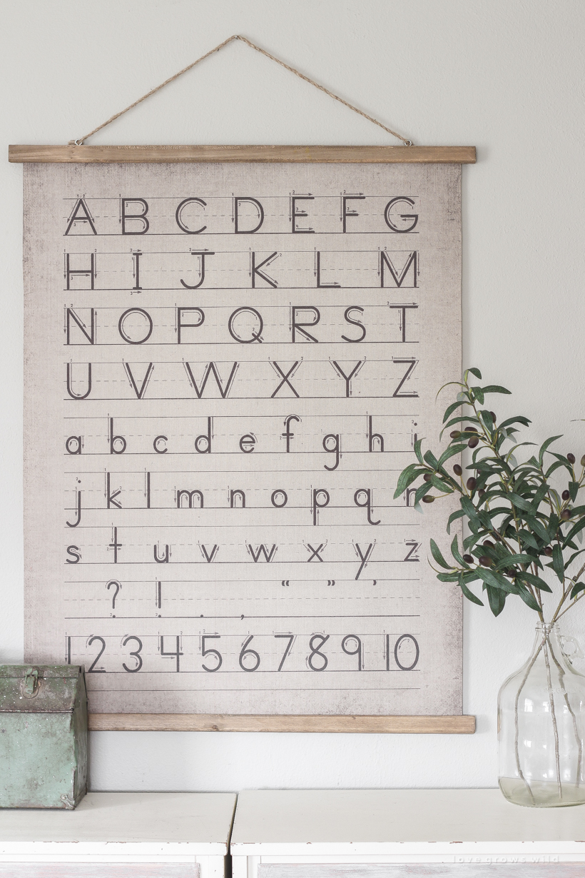
vintage handwriting wall art – Wayfair


I commented on Instagram how I love this room but I forgot to ask. What size is this room?
Thank you, Dawn! The room is about 14′ x 9′.
This room is absolutely lovely. So love the old time football poster and the printing cart on the walls. And hooks are always a “win.” The neutral colors work so well, and the door change was a great choice. You did so well on this room. It is a real haven for your son, I am sure.
I love this room and I would bet your son does as well. I was wondering if the print was of a Notre Dame football player around Knute Rockne’s time? My son works and teaches there and the print just looked so familiar. Love your blog and your home.
What a wonderful job… I know he must just love it!
This room ROCKS…. I have faced this very same dilemma on a bedroom makeover for my twin boys who are now 13. LOVE IT! Not only do you have style, but your son does too!! Hmmmm ? wonder where he gets from ?.
At the end of the day, my boy’s end up always loving what I put together for them and appreciate my love for all things vintage and design. I bet their future wives someday will love all that they learned from their Mama too.
Keep doing what warms your heart ❤. Haters are gonna hate….?? on them!!!!!
Love the room makeover. Your son must be so pleased. It’s masculine and simple in a farmehiydr way. Love the oversized framed pic of the football player. The bedding is so cozy. Living that throw at the end of the bed.
I love the coziness of this room. I can’t wait for part 2.
Lisa
Love this space! Did you just use tension rod to hang target curtain in window?
Yes, I just used a basic white tension rod!
I love the vintage handwriting wall art, and I immediately tried to purchase it. However, it was a canvas print mounted on a wood frame. It lacked the charm that I loved so much. Could you please tell me what you did with the print so it could be displayed with the wooden frame and hanging cord you used in your son’s room? The only thing I know to do would be to actually cut it off of the provided frame, and I fear it would ruin the print. Thanks so much! Love the room!
Hi Audrey! I actually got the vintage handwriting art from my shop, so I tried to find the closest match possible to share in this post in case someone wanted something similar!
Liz you always inspire me. I love your blog. Thank you for sharing your ideas in creating a cozy, inviting home.. I have a question. What color gray did you use to paint your son’s room? I am looking for that exact color.
Thank you so much, sweet friend! His room is painted in Woodlawn Colonial Gray by Valspar. It’s a beautiful warm gray!