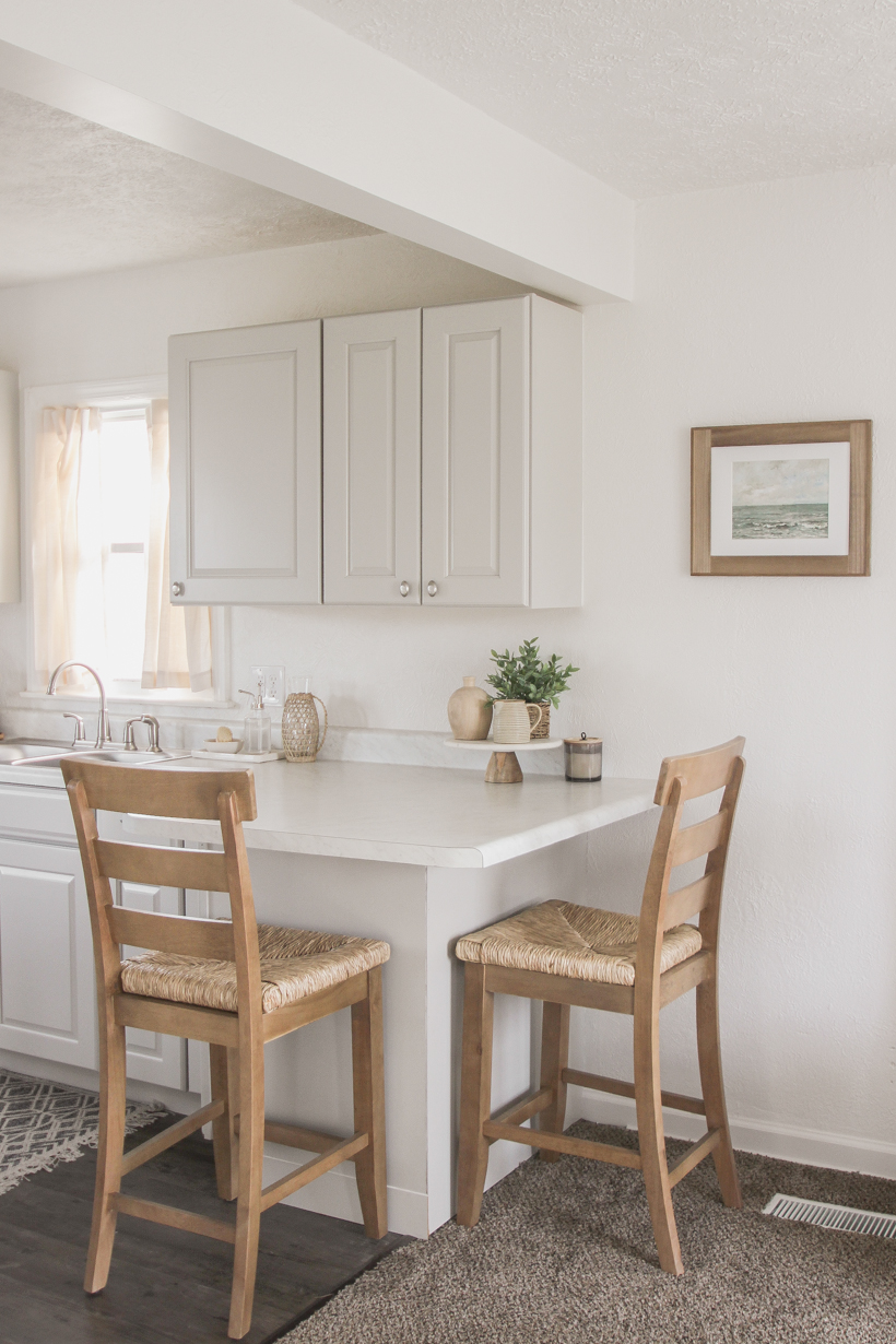
A few weeks ago I shared the first decorated space in the Armstrong House (a.k.a. my mom’s new place!), and today I get to reveal the kitchen to you! Last summer I helped completely renovate this little rental home from top to bottom, and if you haven’t seen the before photos I highly recommend checking out the posts below:
Introducing: The Armstrong House
The Armstrong House: Episode 2
The Armstrong House: Episode 3
The Armstrong House Reveal
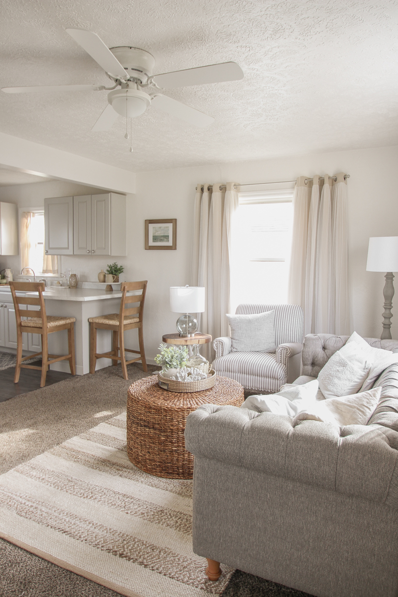
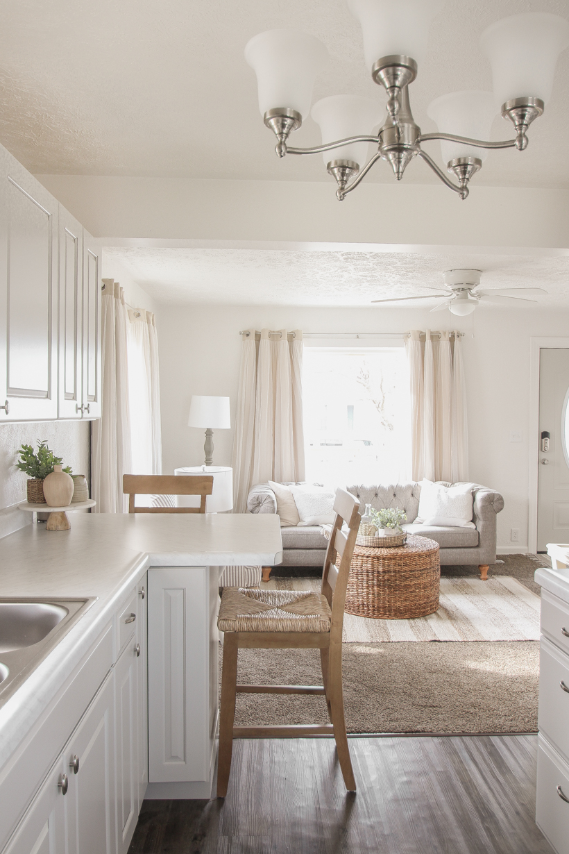
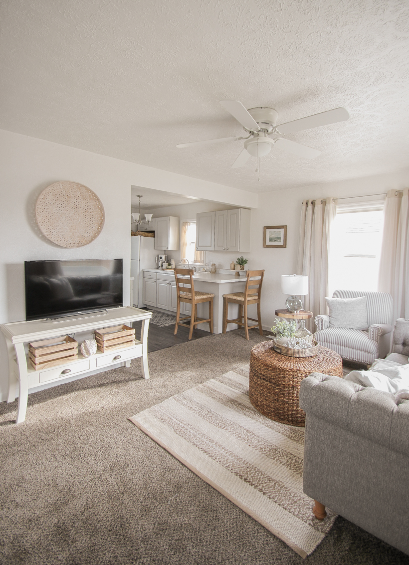
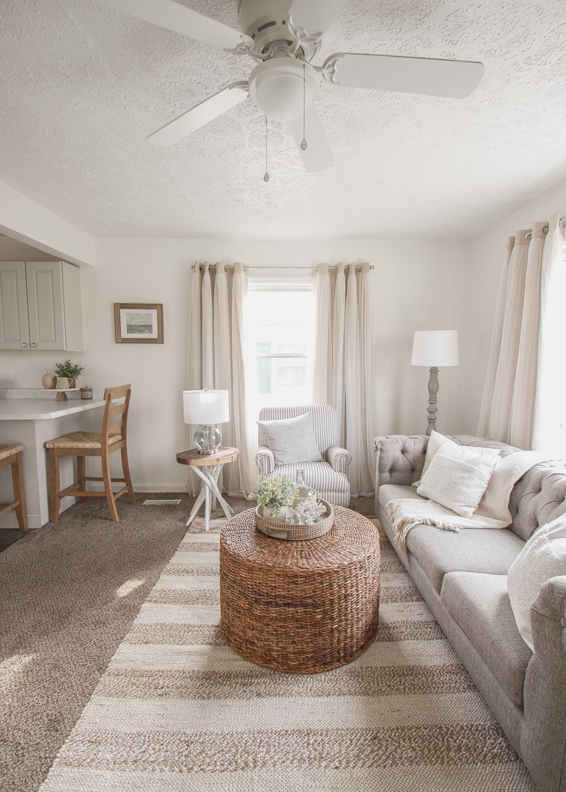
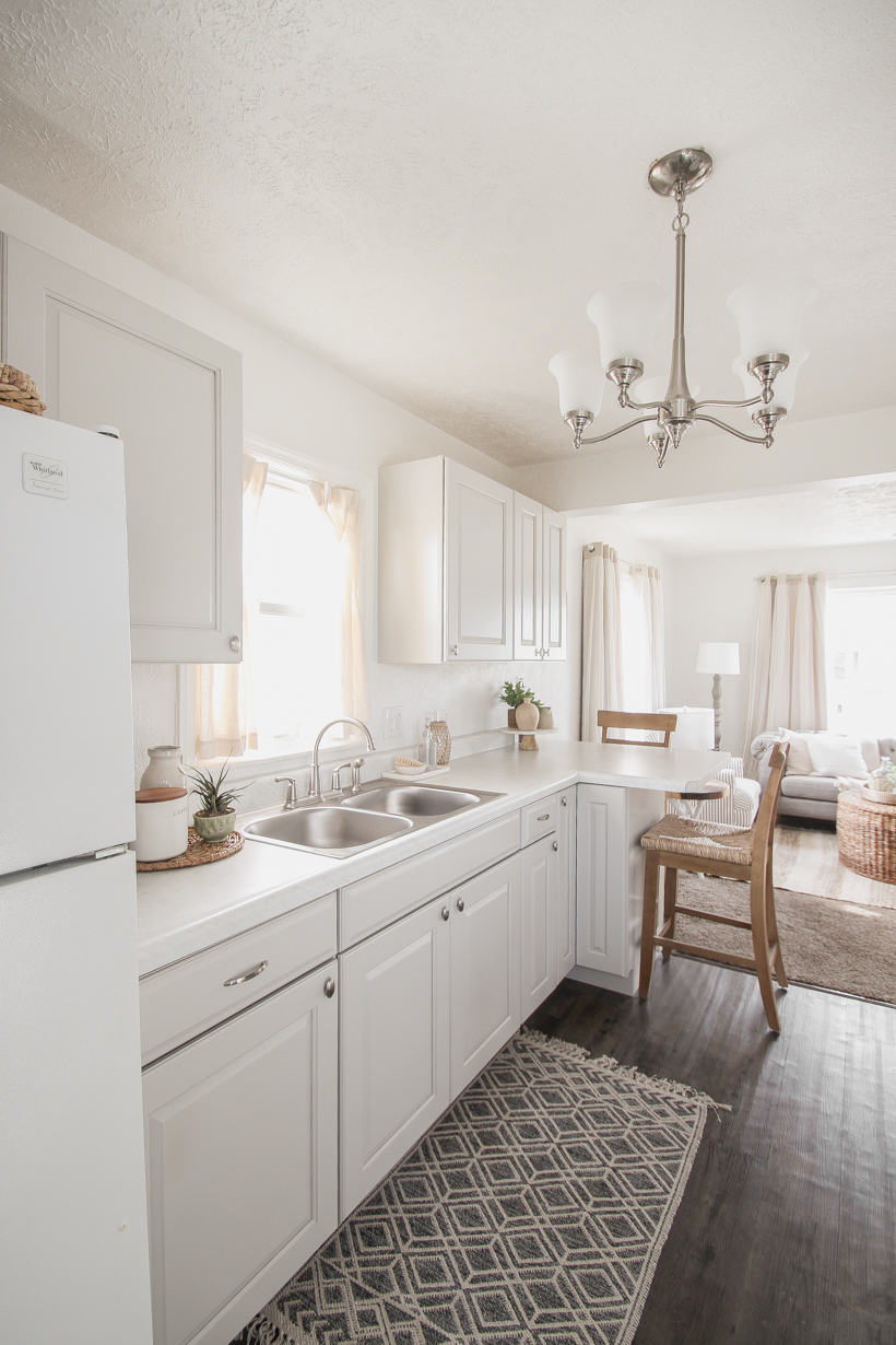
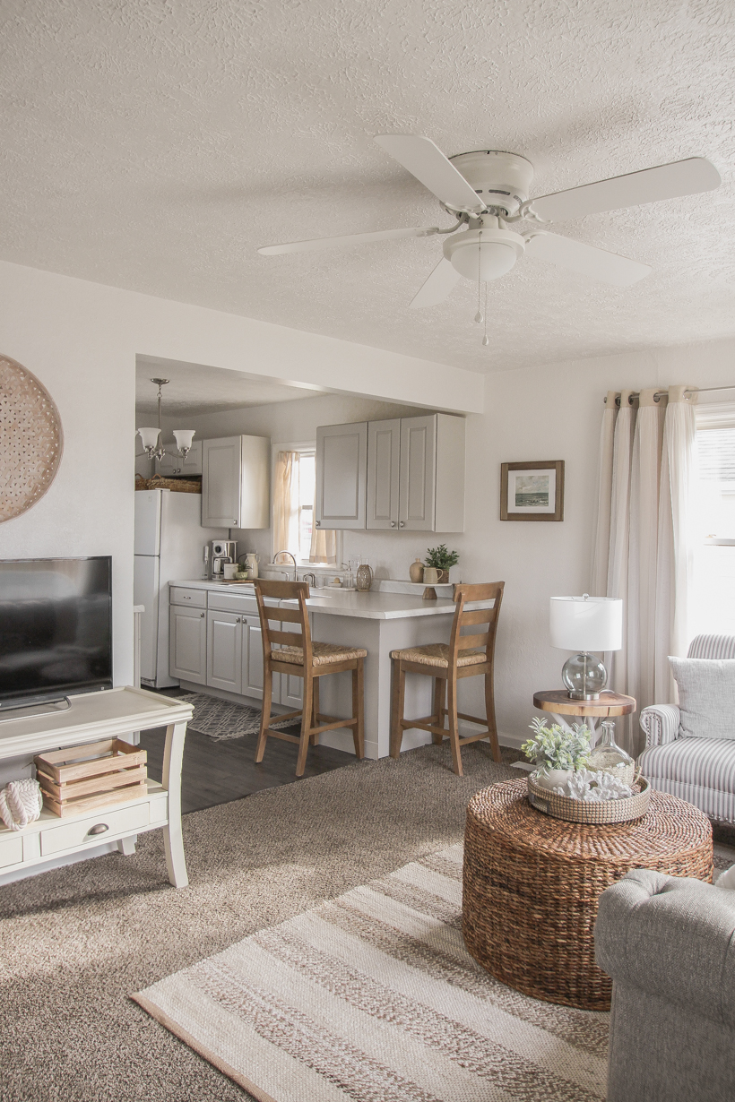
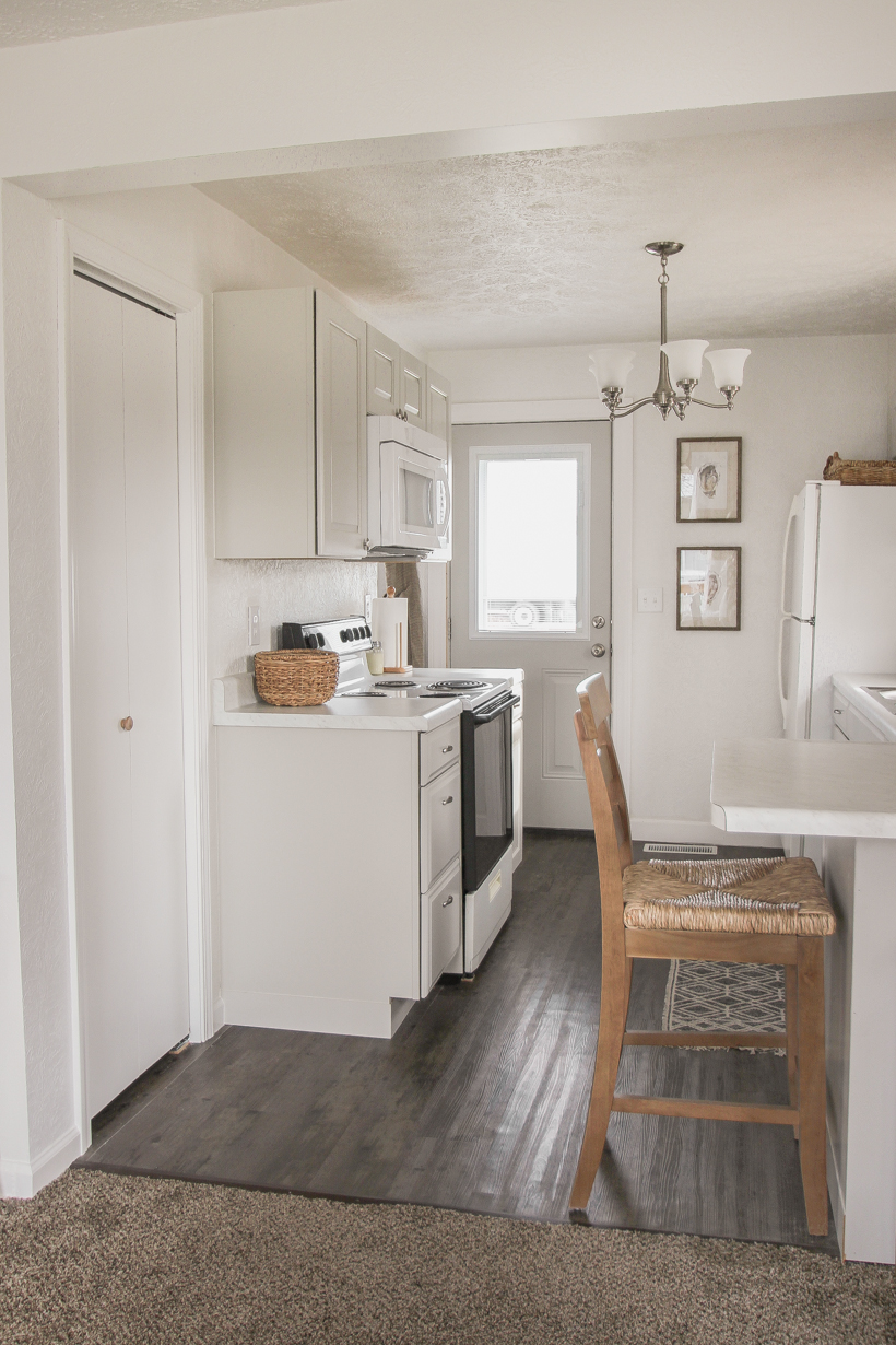
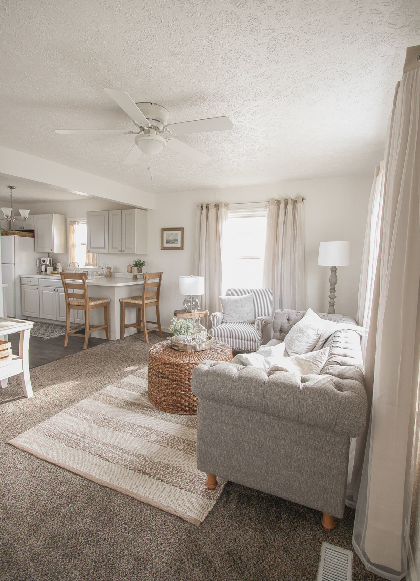
When Mom and I worked on decorating the living room, we wanted to make the kitchen feel connected and just as cozy since they are open to each other. Her biggest dilemma in decorating the kitchen was how to add warmth to all the white and gray on the walls, cabinets and countertops. Kitchens and bathrooms are full of hard surfaces that can feel cold and uninviting on their own, but bringing in just a few softer elements like rugs, window treatments, and kitchen towels can make a big difference. Here is how her cute kitchen turned out!

*everything is linked for you at the bottom of the post
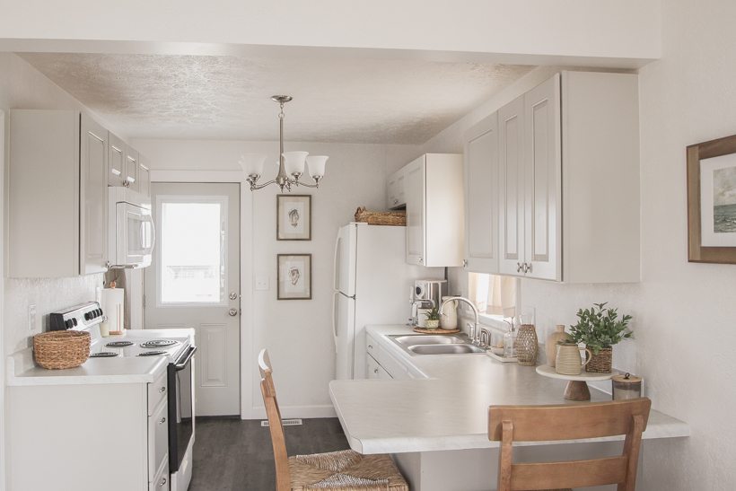
Before we started renovations, there was a small span of wall space across from the sink where you could in theory place a small dining table. We decided to add more cabinets and counter space by moving the oven to the opposite wall and having cabinets on both sides of the kitchen, but we lost any potential dining area as the trade off. This isn’t completely uncommon in small rental homes of this size, but I really wanted to find a way to give the renter at least somewhere to sit and have a meal other than the living room.
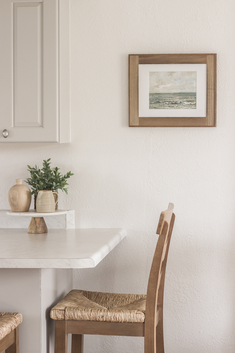
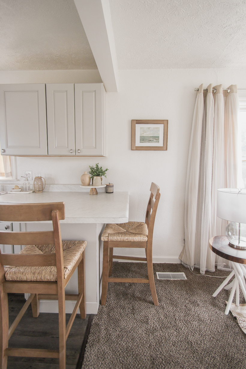
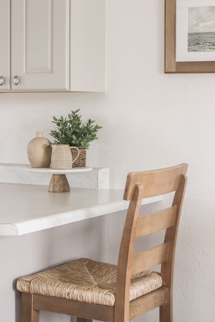
We ended up extending the countertop into an L shape on one side to make room for two or three stools, and I found the perfect ones to bring in some warmth and natural texture to the kitchen. These wood and seagrass stools are actually the exact same as my new dining room chairs, just at a counter height, and I absolutely love the soft wood tone and texture they add to the space.
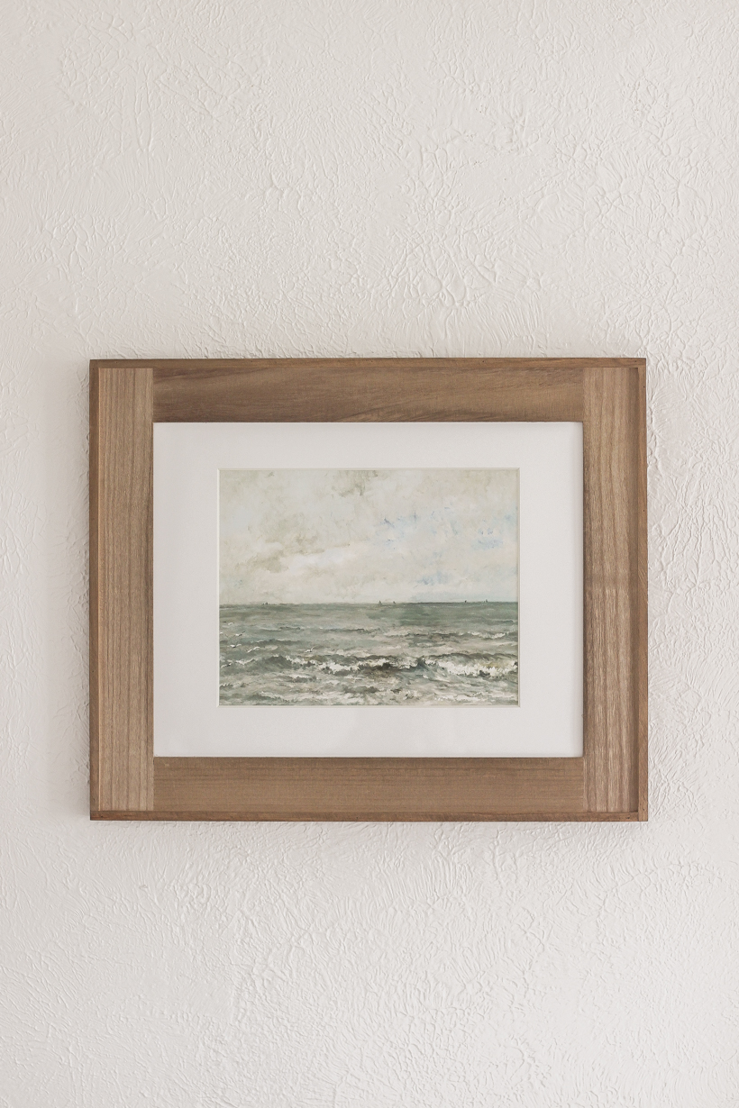
The wall next to the little eating area was the perfect place for a piece of artwork, and I found a beautiful print of ocean waves from here. I bought a frame to match the wood tone of the stools and hung it about eye level.
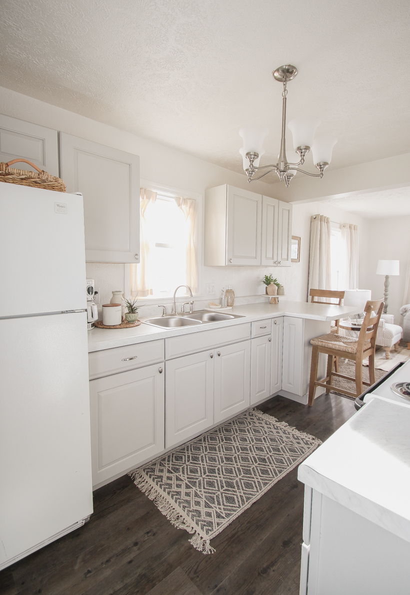
I also hung two framed oyster prints by the back door and found some woven baskets to fill in the space between the top of the refrigerator and the cabinet above. Normally I wouldn’t suggest decorating or adding any unnecessary clutter on top of the fridge, but the awkward empty space bugged Mom, so these pretty baskets were a good compromise. The texture plays off of the stool seats, and she has some bonus hidden storage too.
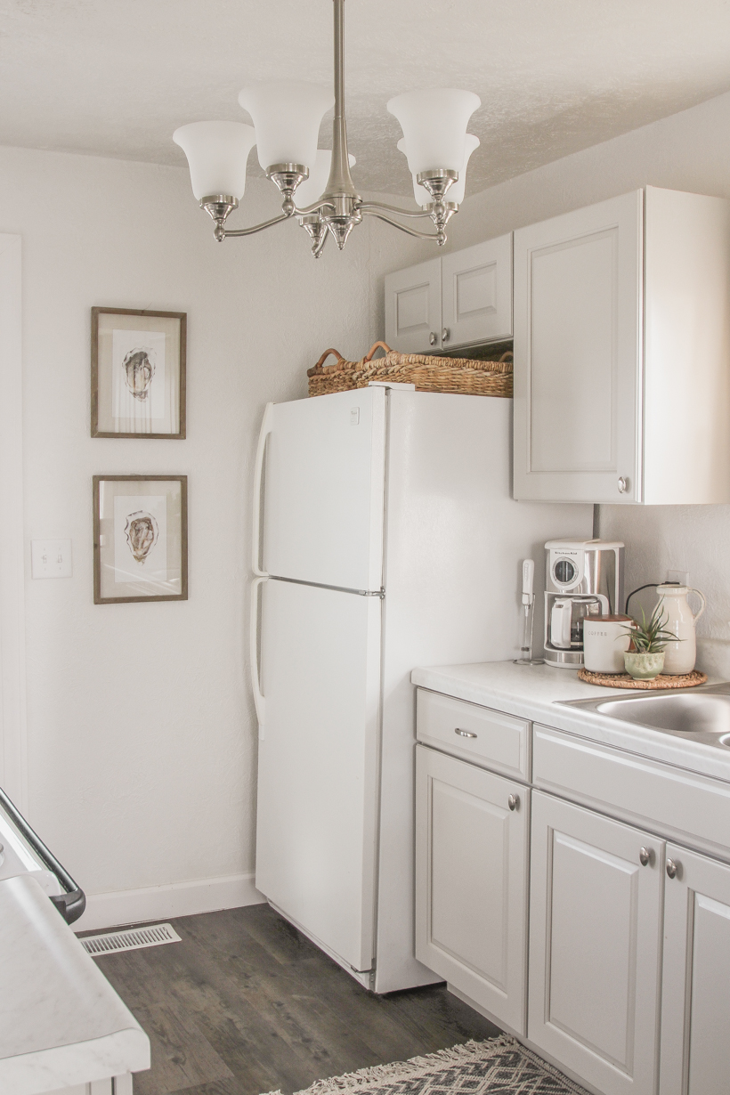
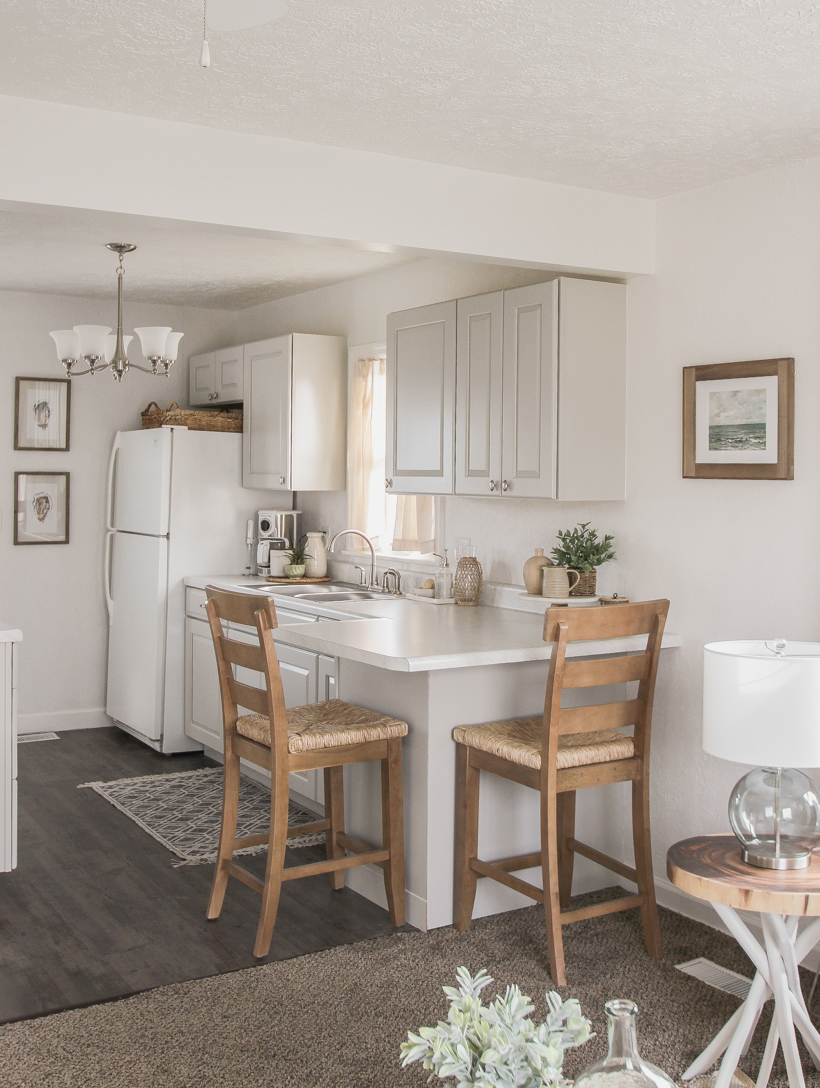
I didn’t want to overcrowd the counters with decor since it’s a small kitchen, but Mom definitely wanted to add a little bit of charm and personality in here. I grabbed a lot of pieces from my shop, Love Grows Wild Market, as well as several finds from Target and TJMaxx. This little area by the sink with a pretty tray to hold soap in a clear glass dispenser and a scrub brush is probably my favorite “moment” in the room.
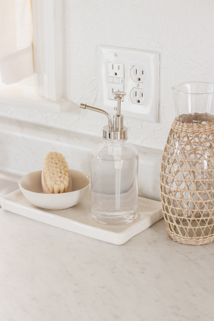
Little touches of woven texture throughout the living room and kitchen really help balance all the cool white, gray and silver tones, and I love the rug we found to add a pop of pattern to the floor.
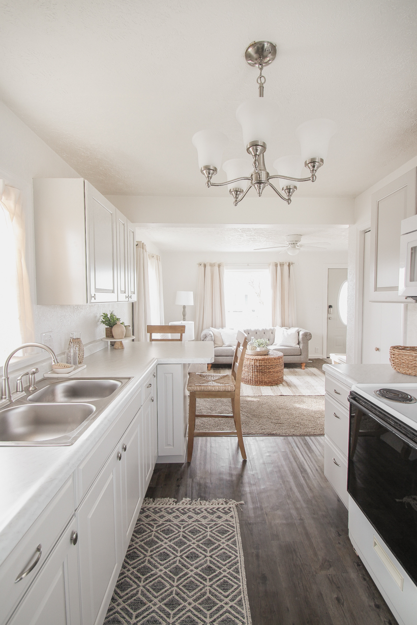
BEFORE/AFTER
Can you believe where this cute little house started? Those smoke stains were awful…
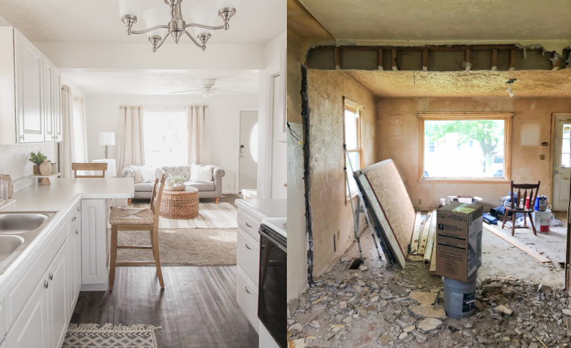
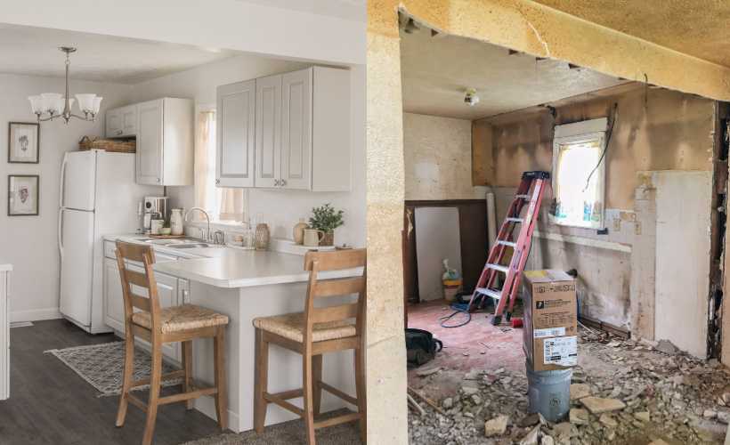
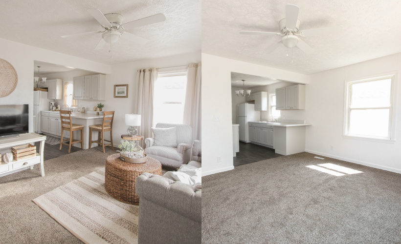
What do you think of how the kitchen turned out? Does it feel warmer to you now that we’ve added some decor? Are you excited to see more of the Armstrong Project all decorated? Thanks so much for being here today! I have provided links to everything I can for you below:
– KITCHEN SOURCES-
stools / wave art print / wood photo frame
marble + wood stand / ceramic tray / soap dispenser
curtains / rug / coffee canister
– LIVING ROOM SOURCES-
curtains / rug / sofa / armchair
coffee table / side table / table lamp
floor lamp / painting / doormat / wall basket
white pillow / beige pillow / blanket / curtain rod
all other decorative accessories:
Love Grows Wild Market
At Home
Target
TJMaxx
As always, I sincerely appreciate you shopping through the links I share, which allows me to make a small commission from your purchase while your purchase price stays the same. When you use my affiliate links, I’m better able to create content for this blog as well as support my family, and I thank you from the bottom of my heart for supporting what I do!


This is remarkable! You transformed the space so beautifully- congrats!
Beautifully done…very tasteful and neutral decor looks so inviting. I would love to see a floorpan sketch of the house with room dimensions.
Very well done. Classic.
WOW!!! It is absolutely fabulous what you’ve done to that place. The kitchen is perfect. Was brilliant doing the L shape to have a spot to sit and sip a cuppa or read a recipe book or eat……..and the decor items are perfect warmth. Well done, Liz! Your mother must be so happy.
Amazing transformation!! All your hard work paid off.
I love seeing what you’ve done for your Mom with this house. It is beautiful. Thank you for sharing it with us.
Oh Liz!! It’s beautiful! I would love to see more rooms.
I just love the living room and kitchen. You make a beautifully decorated space.
Overall looks great for what it began as.
Question, can’t the refrigerator door be changed to open the other direction
to make it much easier?
and the kitchen flooring has a lot of bumps in it. should there have been a new underlayment or
scraped… how could this be amended when having an old floor underneath?
The light colors definitely help brighten such a small space.
thanks for sharing.