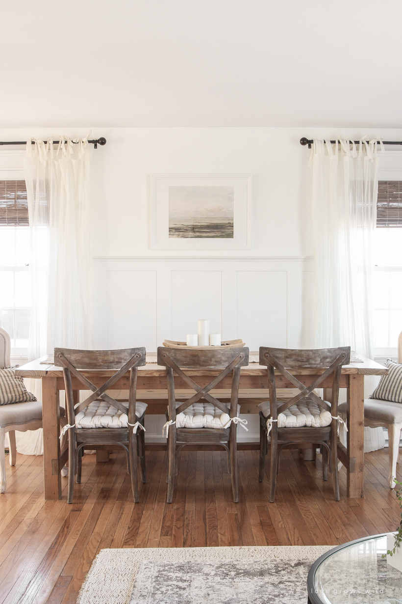
Last month I got the itch to move our living room and dining room around, swapping the two spaces entirely. If you’re not familiar with the layout of our home, these two rooms are open to each other, and most recently I had the dining room closer to the kitchen and the living room taking up the rest of the space towards the entryway. Even though it makes sense to have our dining table right off of the kitchen, it was such a tight fit, and I was ready for a change. So I started scooting some furniture around, relocated a few things, and landed on this layout that is functioning so much better for our family now. Welcome to our new living/dining room!
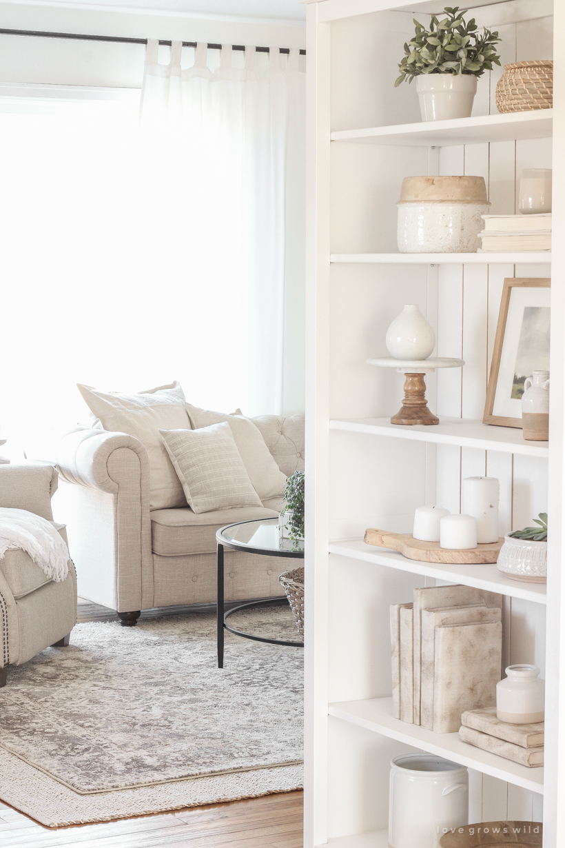
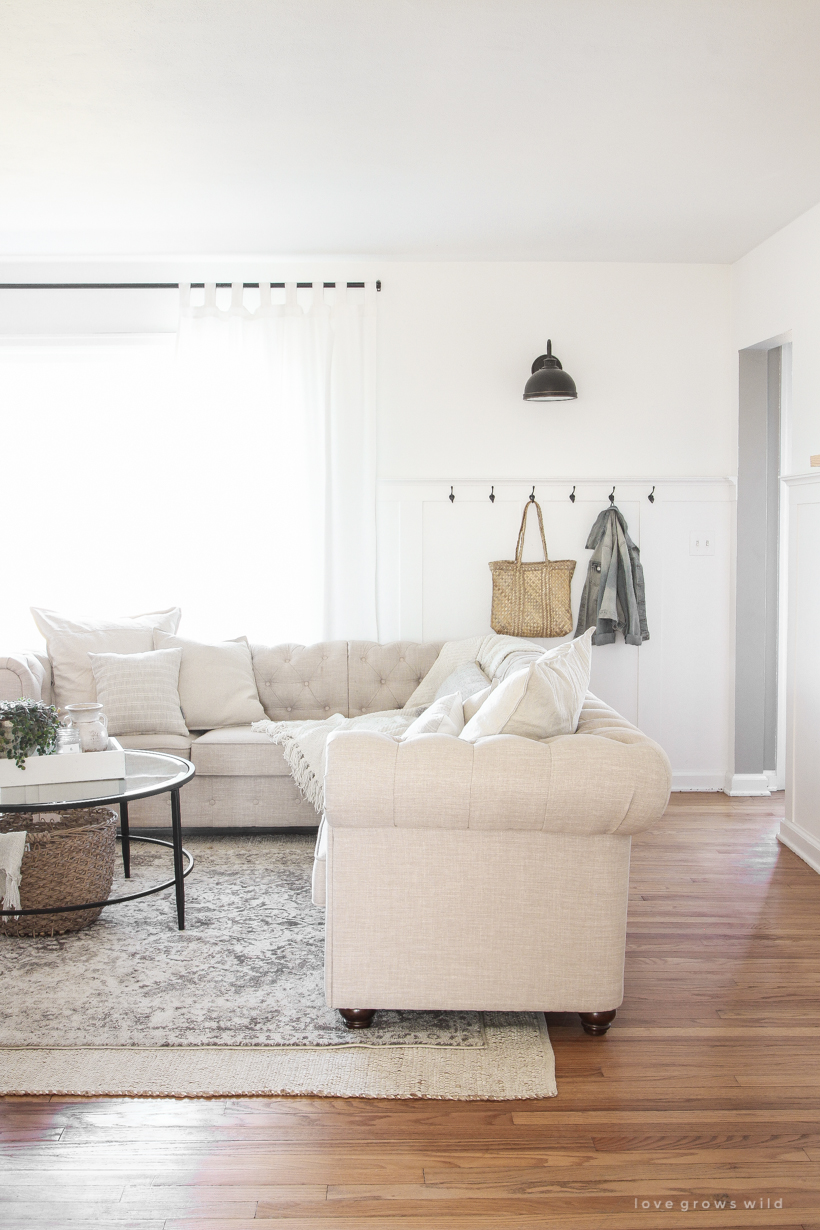
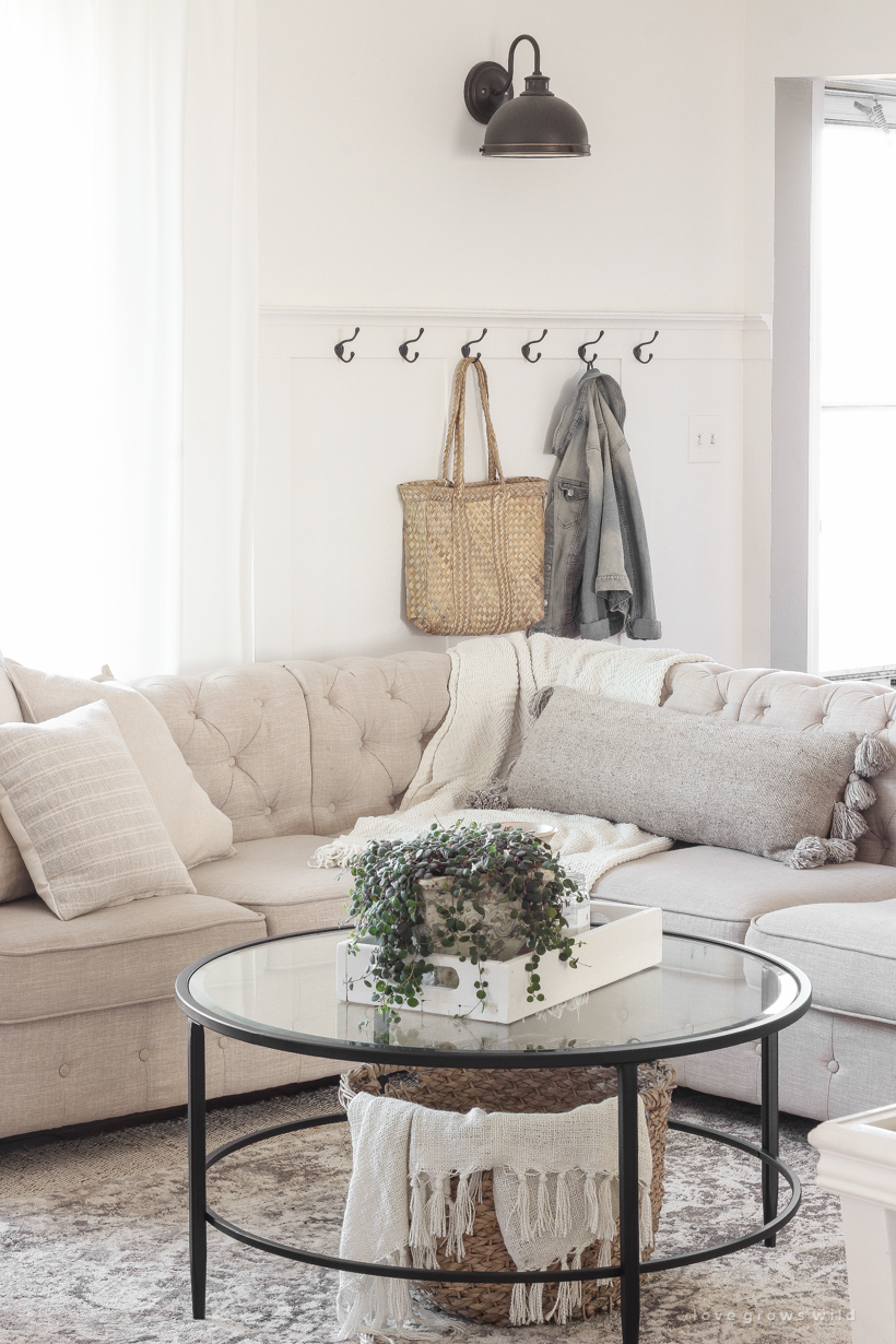
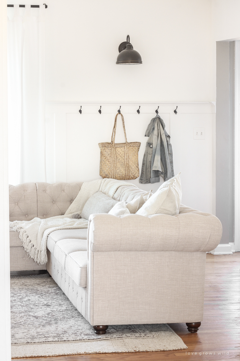
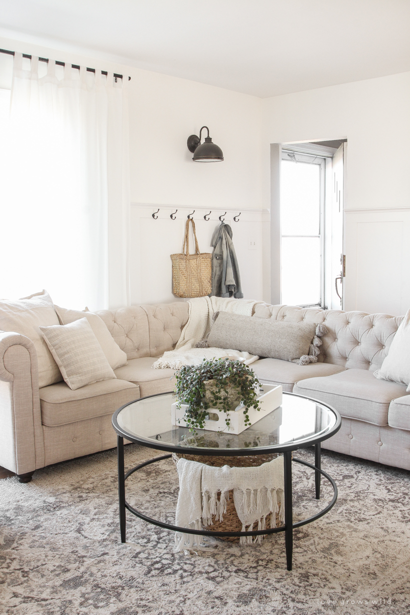
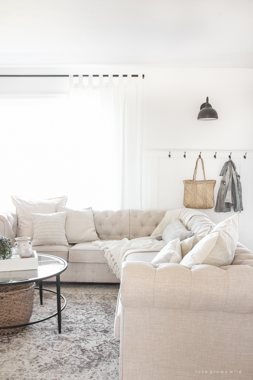
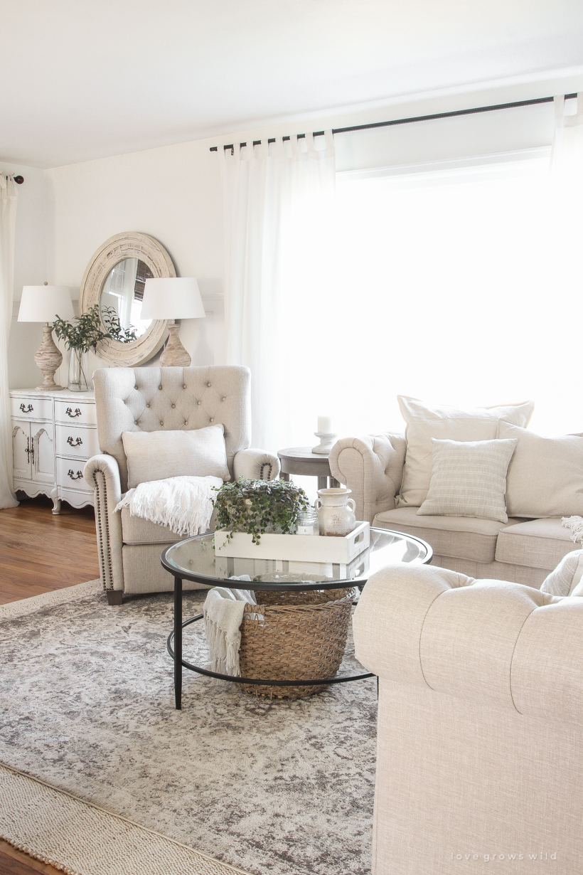
Our front door is right off the living room (shown on the right in the photo below), so I moved the sectional over just far enough to leave a walkway behind the sofa. The hooks I added on the wall last summer help create the function and feeling of an entryway, even though we don’t have a whole lot of space to work with.
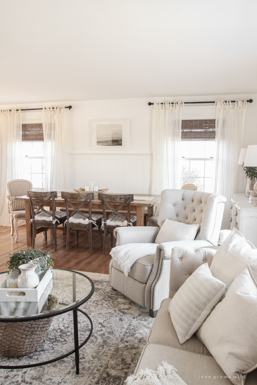
And our big farmhouse table (you can see the tutorial for how we built it here) moved from where the sectional now sits to the other side of the room, nestled between these two windows. I managed to fit one of my beloved Walmart recliners in the new layout, but after several failed attempts to fit two, I ended up selling the other recliner. The extra seating was nice, but it made the space extremely crowded, and no one wanted to sit in the chair that didn’t have the better view of the TV anyway.
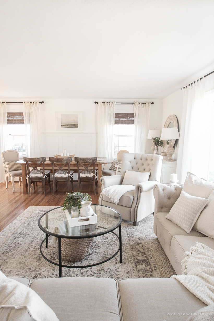
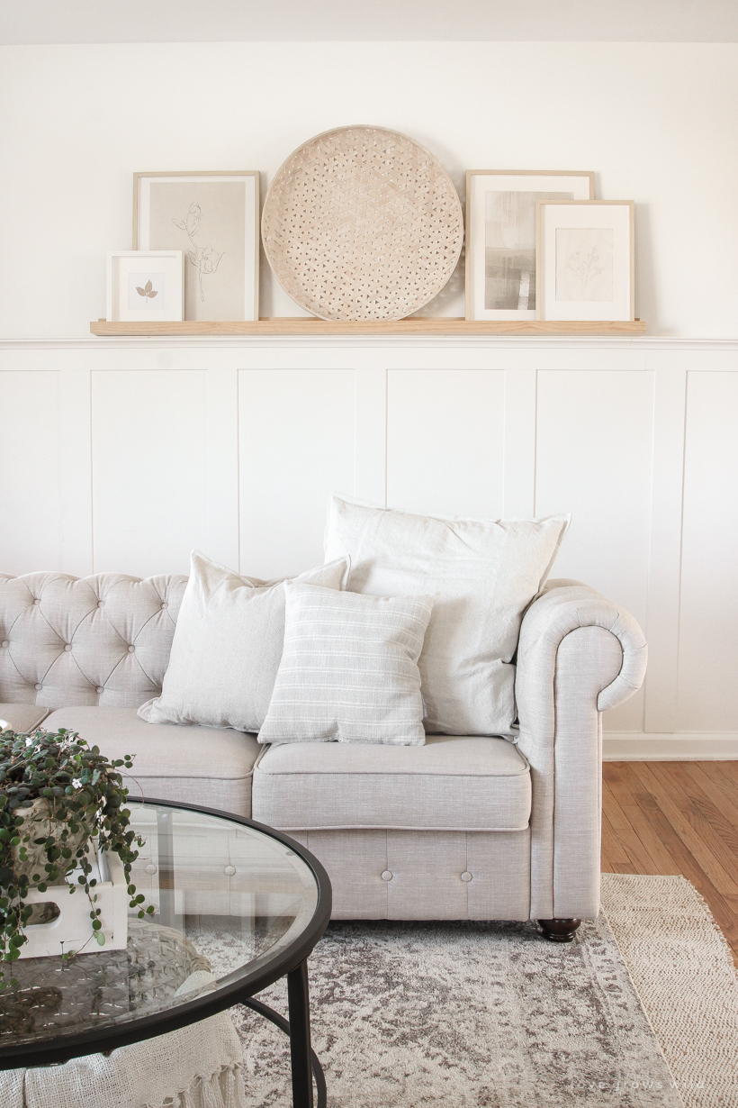
The majority of what you see in this space are things I already had, but I did get a few new pieces like the coffee table, some artwork, and a few pillow covers. If you would like to know where I bought anything you see in these photos, I’ve linked everything for you at the bottom of this post!
You might remember a few weeks back I shared a huge list of my favorite coffee tables, and I asked you to vote on Instagram which table you thought I ended up choosing for our living room. To even my own surprise, I went with this round black metal + glass coffee table, and I absolutely LOVE it. I chose this table for two reasons: 1) it was such a good price compared to the other coffee tables I had my eye on, and 2) I love how it breaks up all the soft, light, neutral elements in the room and ties into the darker color on the curtain rods, coat hooks, and wall sconce. I also like that the bottom is open instead of having a shelf underneath so I can tuck a pretty basket for blankets inside.
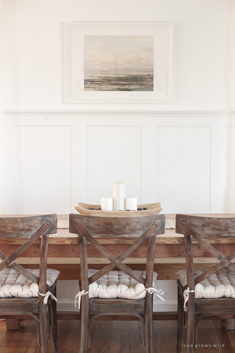
On the new dining room side, I ordered the prettiest landscape print to go in between the two windows and went with a white frame since so much of this space is wood. I love how simple and clean it looks! Not much else changed here because I’m still so happy with all the other elements… the cross back chairs and tufted cushions, those sweet tie-top curtains, and my favorite bamboo roman shades.

Did you notice anything else different or missing in here? The big antique cabinet I whitewashed years ago I contemplated selling, but in the end just couldn’t part with. I carefully slid it into a corner in my office (which I’ll share more of soon), and it’s been so nice having the extra storage in there and not having to let go of a piece I’ve loved for so long.
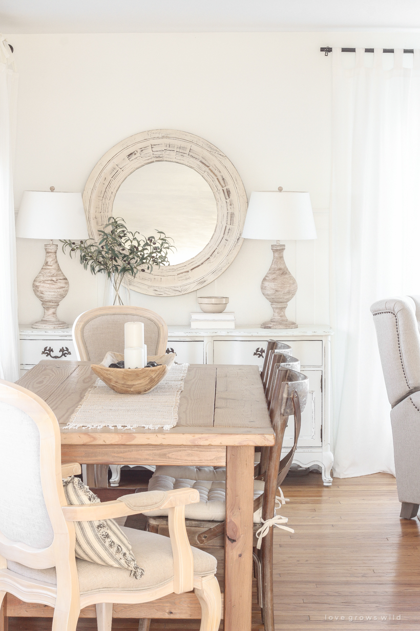
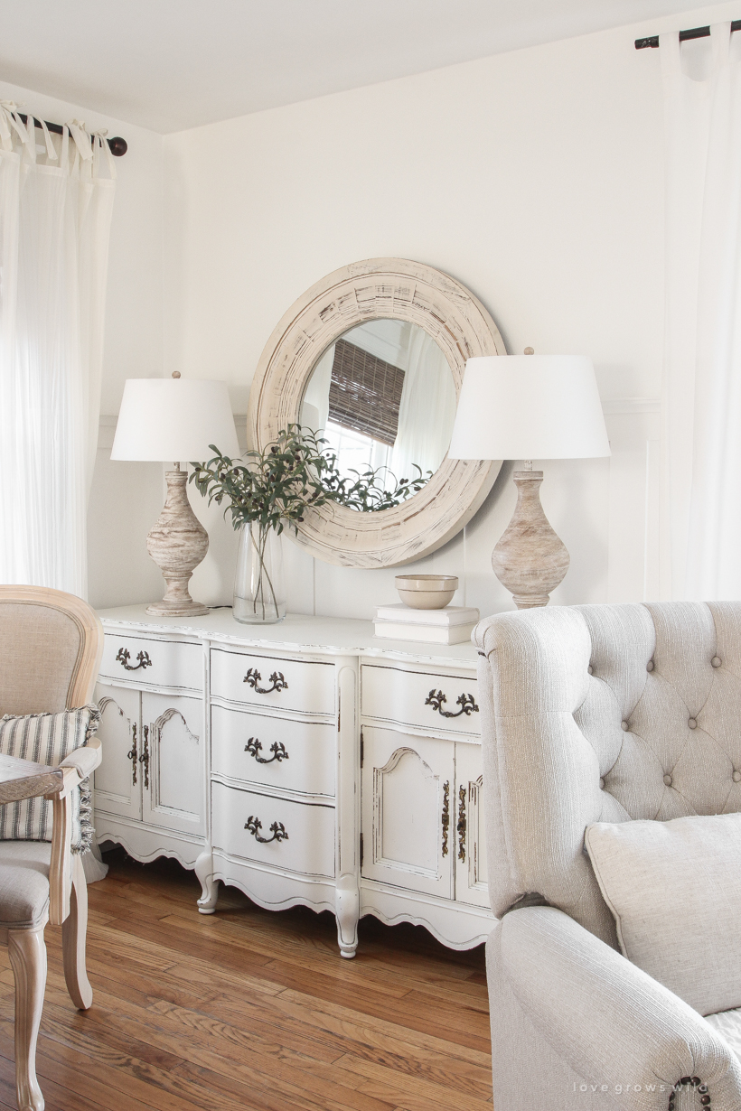
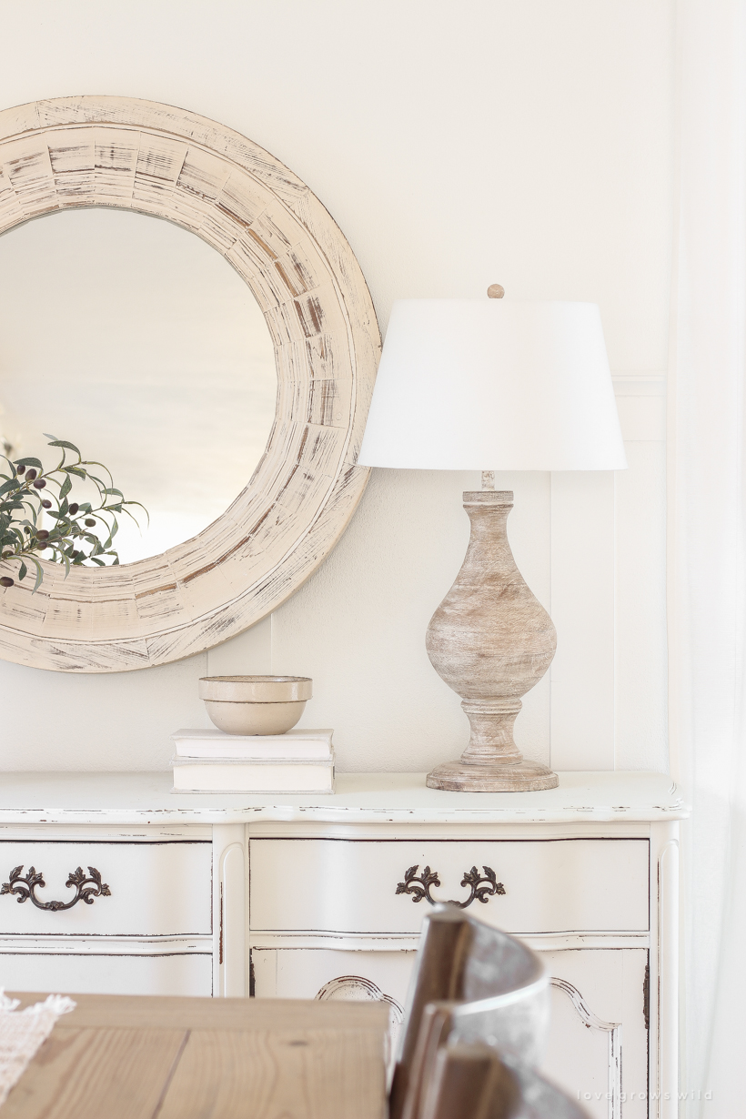
And the IKEA bookshelf I upgraded found a new home just around the corner from this space in the entryway, and the big antique buffet that was there moved behind the dining table. Right now I have it very simply styled with a beautifully distressed mirror, two large lamps, some olive stems, and a bowl set on covered books (see that diy here), but I’m so excited to play with this more as the seasons change.
One of the questions I get asked most from this room is about our rugs. I started with this larger handwoven jute + cotton rug and layered on this beige medallion rug for an extra layer of softness and some pattern. I get compliments all the time on just how soft this rug is under your feet! And it’s been very easy to keep clean and care for. This was the first time I’ve ever tried laying two rugs together, and I love how warm and inviting it’s made this space feel.
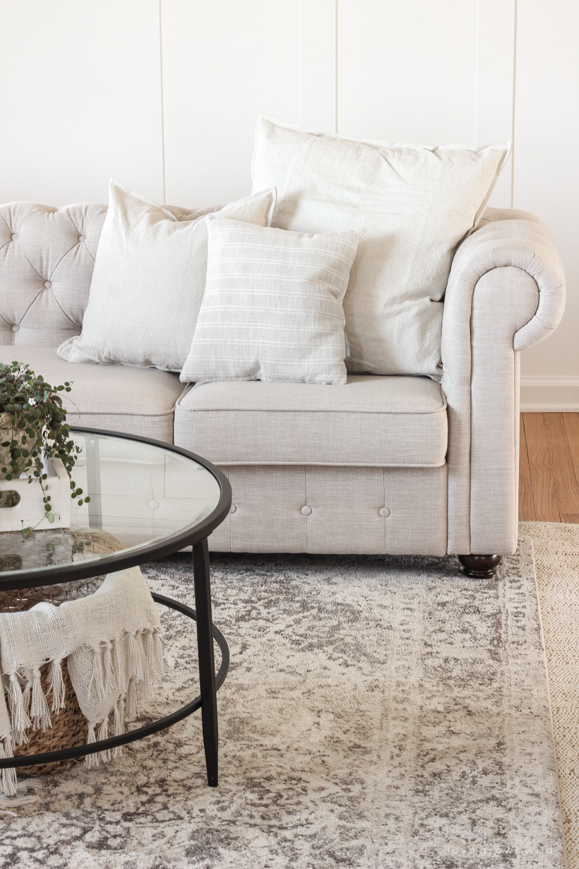
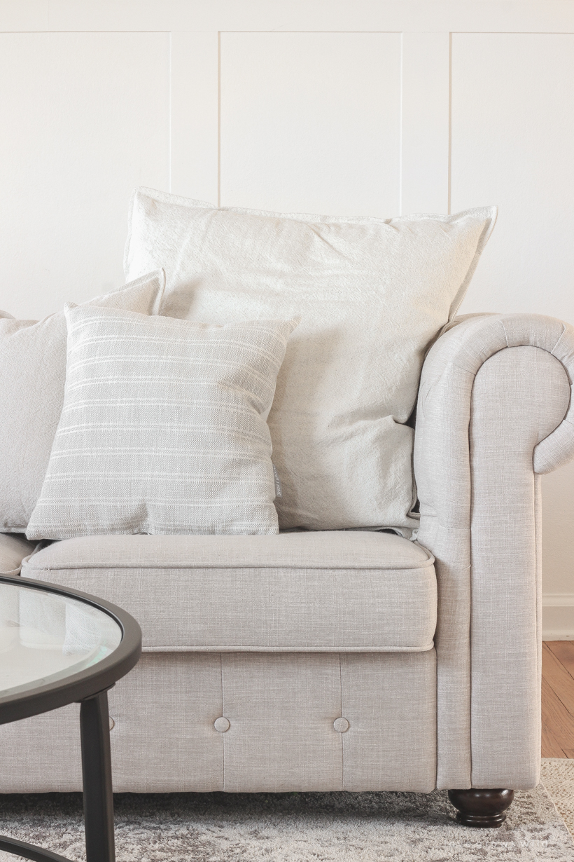
I’m a little picky about pillows for our sofa because I want something that is actually comfortable and durable enough for our family, but still has the look and style that I like. My criteria for the perfect sofa pillow:
- removable + machine washable cover
- at least one large enough to snuggle up comfortably with
- simple, neutral and not too busy, but with lots of texture for interest
- but texture that is soft enough to lay on and not hurt your face
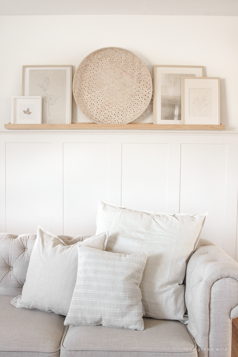
I told you I’m picky. But I was really happy with what I found, and the two larger solid color covers actually came from IKEA, so they were extremely affordable. The smaller stripe pillow cover I ordered from an Etsy shop I had never tried before called Hackner Home. The quality is amazing, and she has tons of beautiful options that fit in perfectly with my style. I wanted a grouping of pillows simple and neutral enough that they could stay out all year long, and I can just add an accent pillow or two seasonally that has a little more color or personality.
Did you spot the paper mache pressed flower art I recently made sitting up on the art shelf? I love how subtle and soft it looks next to my other art prints, and the wall basket I set in the center added SO much beautiful texture and interest.
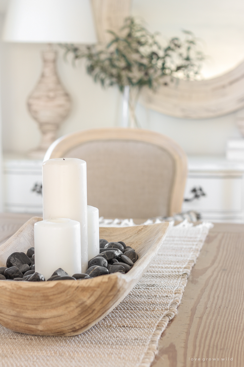
I made this simple centerpiece for the dining table by filling a large wooden bowl with pillar candles and rocks for an organic, earthy feel. I often get asked where I found this wooden bowl, and it was a Target find years ago unfortunately. But the good news is I just saw this year they brought back a very similar version you can find here!
What’s funny is I’ve had several friends and family over since I swapped the living and dining room, and they all commented on how much better this layout is. Sometimes you just have to try different things, even years after you’ve lived somewhere, to see what works best for the space and for your family! I can’t wait to hear what YOU think of this new look in our little farmhouse!
SHOP THE POST:
– SOURCES –
wall color: Du Jour by Valspar
sectional sofa: Wayfair
recliner: Walmart
glass + metal coffee table: Wayfair
medallion rug: RugsUSA
jute + cotton rug: RugsUSA
solid pillow cover: IKEA
stripe pillow cover: Hackner Home
long lumbar tassel pillow: Wayfair (in beige)
wall sconce: Wayfair
coat hooks: Amazon
dining table: tutorial
cross back dining chairs: World Market
tufted seat cushions: World Market
arm chairs: World Market (similar)
tie top curtains: World Market
bamboo roman shades: Home Depot
landscape painting wall art: Etsy
wooden bowl: Target (similar)
table runner: Pier 1
art shelf: tutorial
whitewash wall basket: McGee & Co.
paper mache pressed flower art: tutorial
watercolor botanical art print: Etsy
minimalist abstract art print: Etsy
whitewashed round mirror: Pier 1
olive stems: Amazon
lamps: Wayfair
As always, I sincerely appreciate you shopping through the links I share, which allows me to make a small commission from your purchase while your purchase price stays the same. When you use my affiliate links, I’m better able to create content for this blog as well as support my family, and I thank you from the bottom of my heart for supporting what I do! xoxo Liz


I’m confused as to where the kitchen is located from these photos! I love the layout tho.
Great question, Amy! There is a large opening just off the living room that leads into the kitchen. If you look at the photos looking straight into the living room where the art shelf is on the right, I was standing in the kitchen to take those photos. If you go back to this post from when I renovated the kitchen, you can see the wall we took out to make the living room and kitchen open to each other. Thank you for stopping by to see the new space!
Love it!!! Your house always looks so peaceful and clean!
I think it is beautiful! I love love love your choices of mostly white, neutrals and wood tones. I find it very calming — and not at all boring like you have said that others commented on… I read your book also, and loved it — it was the catalyst for me to change my decor to more of a farmhouse feel. However, there is so much out there that I love, it is difficult to keep it calm and “less is more”, you know?
That means the world to me… thank you, Gloria! And I totally understand what you mean about keeping the “less is more” mindset. It took me quite a few years to edit our home down to just the things I love most and really defining what my style is. It’s always an ongoing process, which makes it fun!
This space seems so similar to my house and your new arrangement is exactly what I was planning to try out. It looks stunning! What is the distance from the large window wall (behind the couch) and your TV wall? Thank you!
Hi Patricia! I have just shy of 13 feet between the large window wall and the TV wall. I hope this helps plan out your furniture arrangement!
Oh my gosh. Your new rooms are beautiful!! I have been so excited to see your new room designs and you have done an awesome job. I keep looking at the pictures and just marveling at how beautiful they are. You are so talented and you really know how to make a home elegant and cozy. Thank you for sharing. 🥰
It looks great! Good job finding a good layout for your life and your family.
We have a very small space for a “dining” area and what felt like too much space for the “living” area. I suggested to my husband that we swap the spaces because we already had a family room but he didn’t like the idea. Fast forward to finally getting around to painting the walls. I needed the table moved so I could paint in the “dining” area. It was moved to where the couch had been. He loved it there! Now there’s a love seat and 2 chairs where the table and chairs used to be and we can have guests for a meal without having to literally squeeze around the table! Glad to know that someone else thought of such an idea!
I love this! Sometimes it just takes a little bit of imagining and trial and error to see what works best for the space and for your family. Way to go!
💕💕 This is candy for the eyes! And soul! I want to jump into the photos and visit!
I wasn’t too familiar with the other layout, but from what I’m seeing now, this new one looks very well done! There’s a nice flow to the rooms and a spaciousness to it. Really love the new painting.
I want your house 😉. Love the new layout. Really opens it up!
Wow… beautiful home. And I love the changes.Everything looks so cozy!
Liz, do you happen to have a direct link to your lamps? I looked on Wayfair from your link, but I didn’t see them. I LOVE them! Thanks!
Thank you so much, Karen! It’s been a few years since I bought those lamps, and it doesn’t look like they carry those exact ones anymore unfortunately. I will keep my eye out for something similar!
Beautiful as usual!
I love this new layout – wow – it looks amazing.
Talk about re-thinking design – very well done, indeed!
I think I just fell in love with your house all over again. I know you did!! Great job. Lots of inspiration here.
Wow! The room looks so beautiful. Moreover, the room has a very cozy and relaxing vibe.
I love this new arrangement, Liz! Your home has such a timeless and elegant style, but also looks so comfy and “real”. So beautiful!!!
Absolutely gorgeous! I love the color scheme. Thanks for sharing.
I love your ideas! I have a fairly small, open floor plan similar to yours, and have been frustrated trying to get it to look and work the way I want. Now I am clearing everything out and looking at everything with fresh eyes.
And so glad Karianne at Thistlewood Farm featured you on her Saturday Random Thoughts blog 3/7/2020.