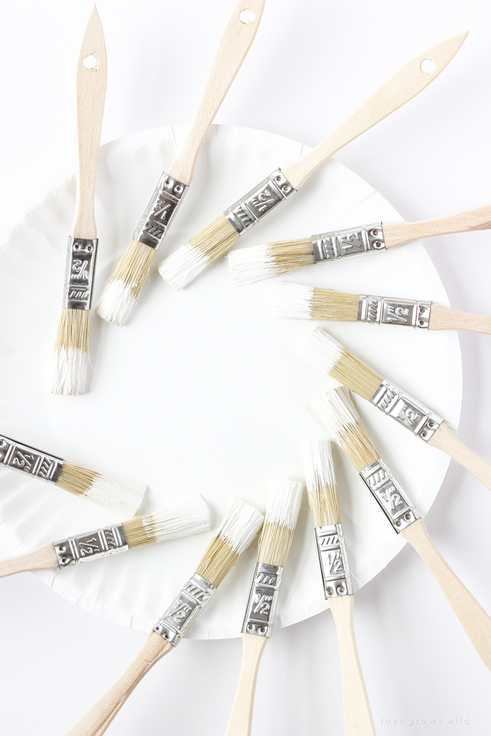
A few weeks ago I shared my favorite gray paint colors with you guys to make picking the perfect color for your home just a little bit easier. I got such a great response on that post that I’m continuing this paint series today with the next color I get asked most often about… white! I’ve slowly transitioned almost every room in our farmhouse to white walls because I love how bright, open, airy and light it makes the house feel. All the furniture and decor really stand out against the simple white backdrop, and our small farmhouse feels much larger than it really is because each room is kept light and bright.

Many people probably think a white room would be stark and cold, but white can be warm, cozy, modern, country, minimalist, traditional, and so much more. I personally like to use more of a bright, pure white on my trim and doors and paint the walls with a creamy, softer, slightly darker shade of white.
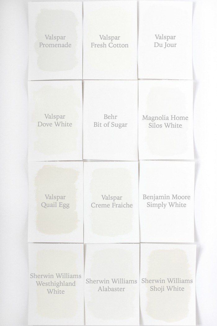
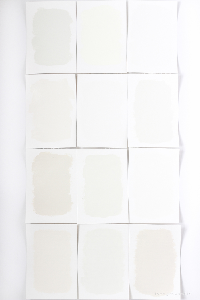
In theory, you would assume going to pick out a white paint would be simple… how many shades of white can there really be? But if you’ve ever stood in front of paint swatches with dozens and dozens of white options, you know how overwhelming it can be. Some are too yellow, some are too green, and it’s hard to find that “just right” shade. I tested out my top picks for white paint colors from various popular brands and painted a piece of paper with each color so you could see what the color looks like in real life next to the paint swatches from the store. So without further adieu, here are my favorite whites!
Disclaimer: It’s a little hard to capture in a photograph the subtle variations of such light paint colors, but the above photo of all the paints together really showcases how each color compares to the next. I would use this as your guide instead of the individual photos below.
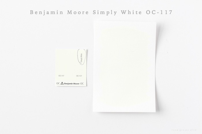
Simply White by Benjamin Moore
Simply White was named Benjamin Moore’s color of the year in 2016 and for good reason. This appropriately named simple shade of white is warm without being too cream or yellow and is crisp without being too chalky or blue. If you’re looking for a fail-proof shade of white, you can’t go wrong with this popular choice.
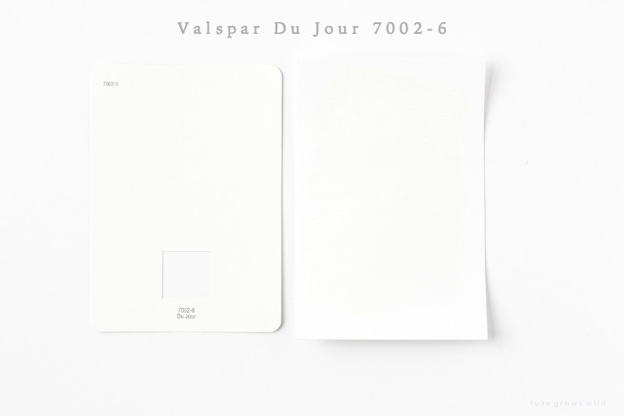
Du Jour by Valspar
Du Jour is the first white paint color I used in our farmhouse and has been a favorite of mine ever since. A touch warmer than pure white but still has enough blue to keep it cool, crisp and clean. I love using this color on trim and doors and also painted my office and living room walls with it.
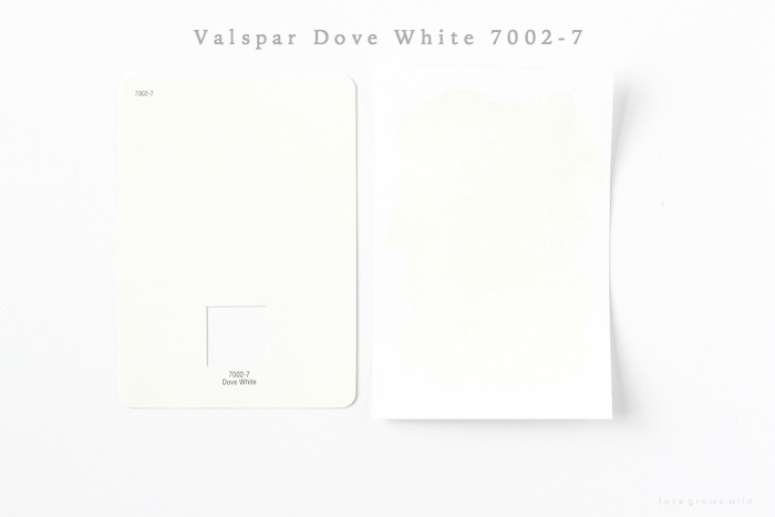
Dove White by Valspar
Dove White is my go-to when I want a softer, cozier, creamier white, and I used this shade in my bedroom when we added planks to the walls. It is warmer and a bit darker than Simply White, which reads softer on the eyes.
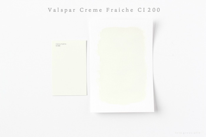
Creme Fraiche by Valspar
This soft white is right in between the lightest and darkest whites I chose and has just the slightest hint of green-gray. Perfect for someone wanting a more modern off-white that doesn’t feel warm.
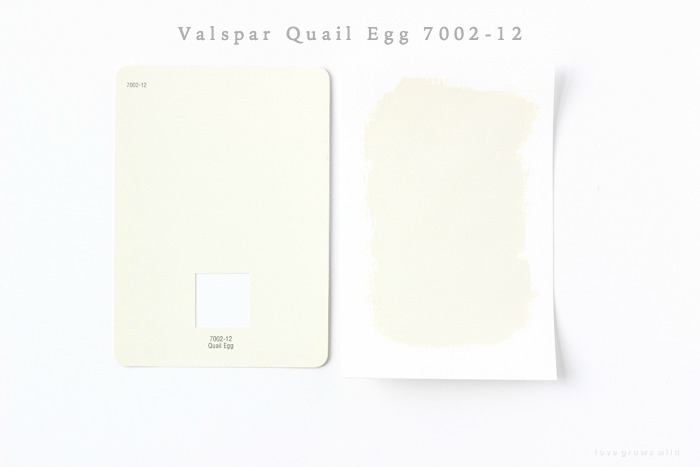
Quail Egg by Valspar
Quail Egg is a darker warm white that leans a little closer to tan. It is still very soft and pretty, but has more orange undertones that makes it feel extra cozy.
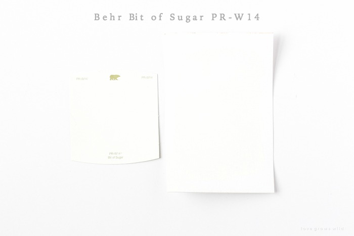
Bit of Sugar by Behr
Bit of Sugar is a beautifully balanced bright white that is similar to Du Jour, but slightly lighter. Not too warm or cool, which makes it perfect for trim and doors.
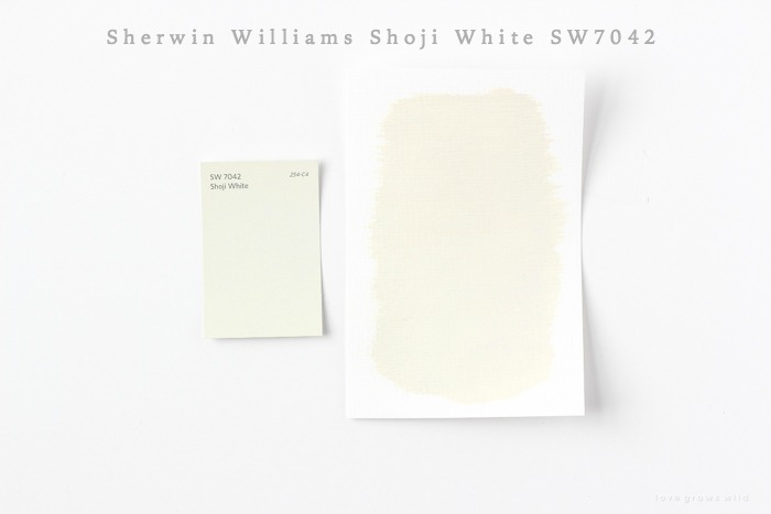
Shoji White by Sherwin Williams
This is a gorgeous warm white with a subtle gray undertone. A little darker than Dove White but not quite as saturated as Quail Egg. Not too beige or too gray… just right.
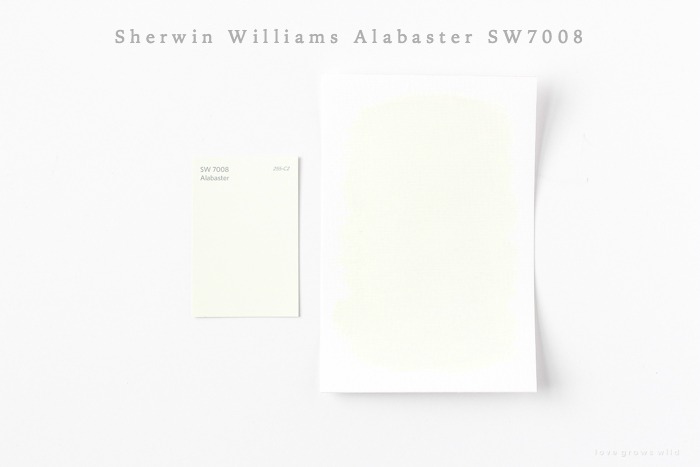
Alabaster by Sherwin Williams
Named color of the year by Sherwin Williams in 2016, this natural white reads as a very very light gray. Perfect for adding just a whisper of color to a room, and would look beautiful next to bright white trim.
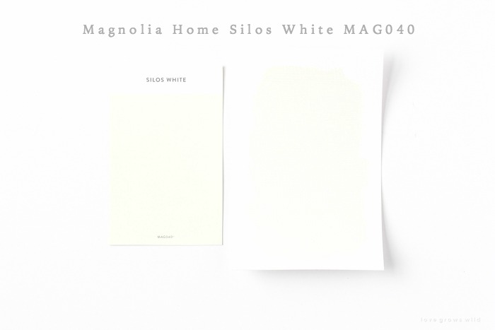
Silos White by Magnolia Home
Very similar to Alabaster, but just a touch darker. This cool gray-white is perfect for keeping a room light and bright without feeling too stark.
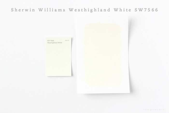
Westhighland White by Sherwin Williams
This warm white reminds me of Dove White and has just enough gray to keep from feeling overly tan. Light, creamy and very dreamy.
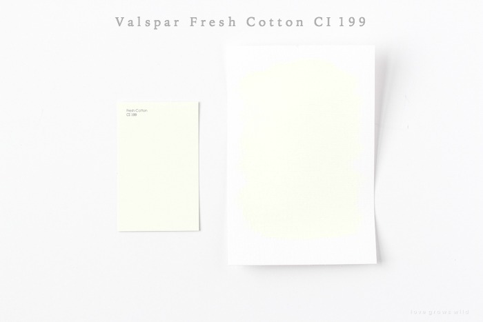
Fresh Cotton by Valspar
This light white is cheerful and sunny with green and yellow undertones. If you are looking for a really creamy ivory, this would be a great option.
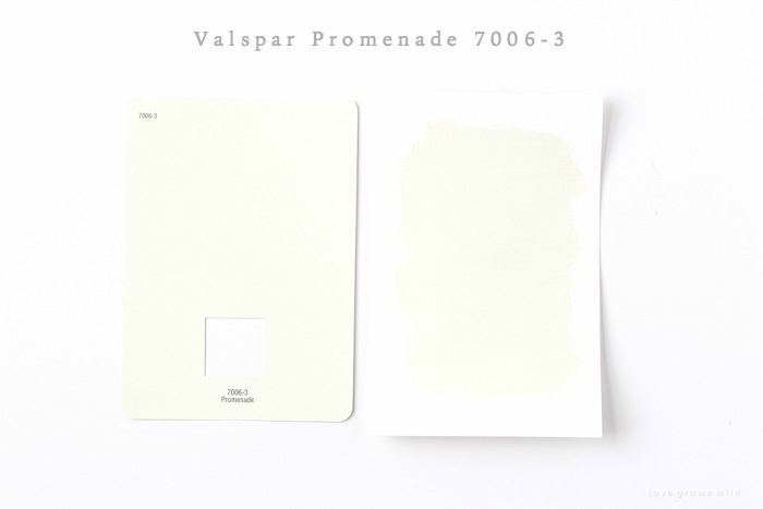
Promenade by Valspar
Similar to Alabaster and Silos White in keeping with the cooler neutral white-gray tones, but just a touch darker.
P.S. I would recommend always testing out paint samples in your own home before committing to a color because there are a lot of factors that can alter the way a color looks. I hope this guide gives you a starting point to pick out beautiful paint colors that will work well in your home, and I’d love to hear what your favorite white paints are! Now that we’ve covered gray and white, what colors would you like to see me test out next?
LET’S KEEP IN TOUCH!
Subscribe to Blog | Follow on Instagram
Follow on Pinterest | Follow on Facebook


Simply White has my heart. I did not know there was such a beautiful shade. Never use anything else. ever.
Thank you for taking the time to do this! I am planning on using Sherwin Williams paint and have been trying to narrow it down. Too many whites too choose from. I’m leaning toward West Highland or the Shoji white. I’m looking for a light warm white that goes well with earthtones. My accents in the family room are sage green. My kitchen cabinets will be sage with countertops that are mainly black granite with some small rivers of cream running throughout. I still plan to paint a large sample board with the creamy whites just to make sure- I may even have to try some of the other brands. Thank you again! I’m new to your blog- I love your taste!
Funny how just about every colour looks yellow. I am in the process of painting my newly built home in white. And I mean white..straight out of the can white and I love it. In fact, due to the different sheens (pearl on baseboards and all trims and doors) and (eggshell on the walls ) the walls actually look like a very soft baby grey. Every nook and crannie is a different variation, looks good to me. I stressed out so much trying to find the white I wanted and this was it!
You should do blue next then greens 🙂
This was so informative – who knew there could be so many different shades of white? Now I would really like to see a comparison of shades of blue (hint: I don’t like very dark blue; I prefer the light to medium colors with a soft muted or shaded look). Thanks for the great tips. Have a lovely day!
I just painted my family room fresh cotton and love it. It’s the first time my first pick was the right choice!
Hi Liz –
What about the color “green”? The vintage green shades are my favorite.
Very helpful advice in this particular post! It’s the little changes that make the largest changes. Thanks for sharing!
I was JUST talking to a girl at work about this! She’s painting her cabinets and I had to explain to her the difference between white and eggshell white. They are different, people! Thanks so much for sharing!
My favorite is the Downton Abbey Collection in Alabaster, Princess Blue, and Metallic Gold. So regal!!
These look really good.
Thank you for taking the time to do this! I am planning on using Sherwin Williams paint and have been trying to narrow it down.
My favorite is the Downton Abbey Collection in Alabaster, Princess Blue, and Metallic Gold. So regal!!
Simply White has my heart. I did not know there was such a beautiful shade. Never use anything else. ever.