
I did it. I finally pulled the trigger on updating our living room seating and bought two of the most beautiful, comfy couches I have ever seen or sat on. I even surprised myself and picked a brown leather sofa and ottoman… and it ended up being my favorite thing in this whole room. The new couches required a new furniture layout, which meant a new rug was needed for the expanded space, which inspired me to finally upgrade to double-wide blackout curtains for our big picture window… typical “if you give a Liz mouse a cookie”.
I’m so excited to show you all the details! Welcome to our new upgraded living room…
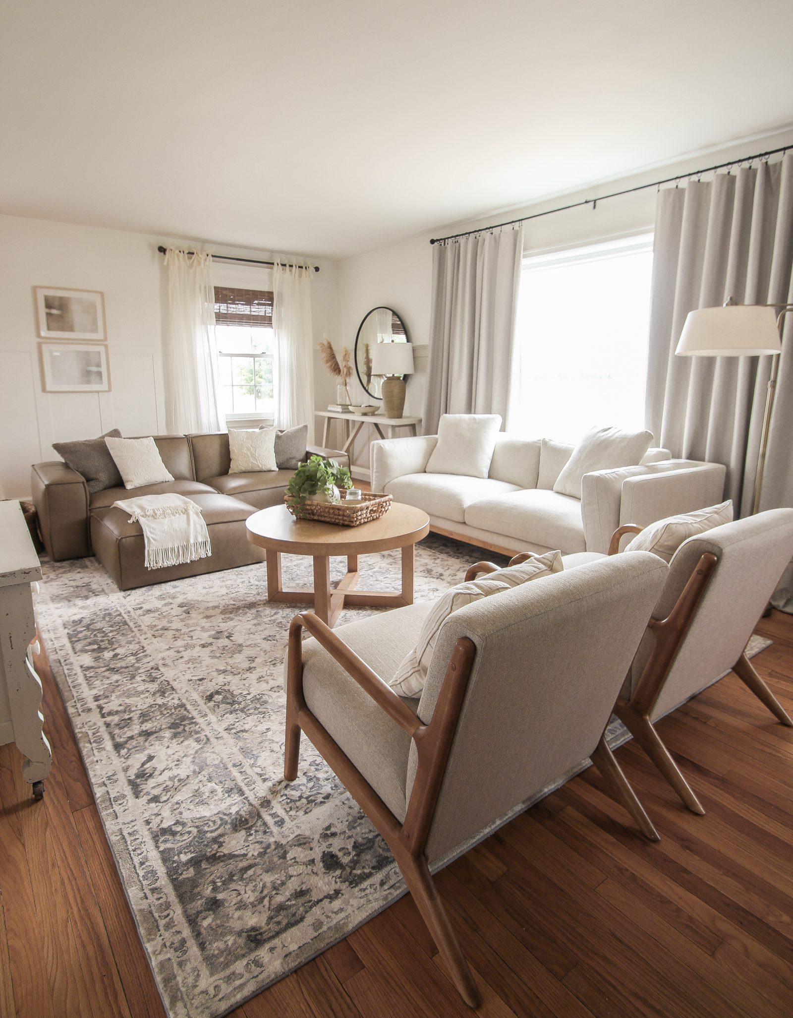
Beige Linen Sofa | Brown Leather Sofa | Brown Leather Ottoman
Previously I had a big tufted sectional sofa in here for the last 4+ years, and although I did truly love the look and quality of that sectional, it limited our options for arranging furniture. I sold the sectional and stumbled on a company I have never ordered from before (this is not sponsored in any way – I paid full price for everything, but I do have a discount offer you can take advantage of!), but their furniture immediately caught my eye. The designs were modern, yet cozy, and delivery times weren’t months and months out, which is a common issue at the moment. Have you run into that yet with anything you’ve ordered?
Note: I have everything linked under photos with either the exact item I have or one as similar as possible. You can find all the links together at the bottom of the post as well!
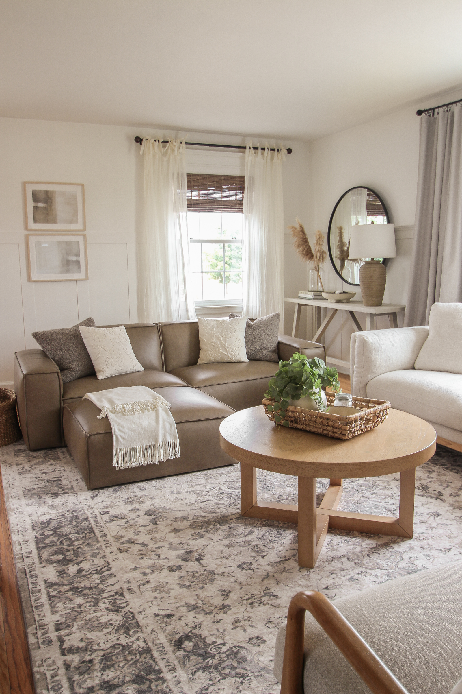
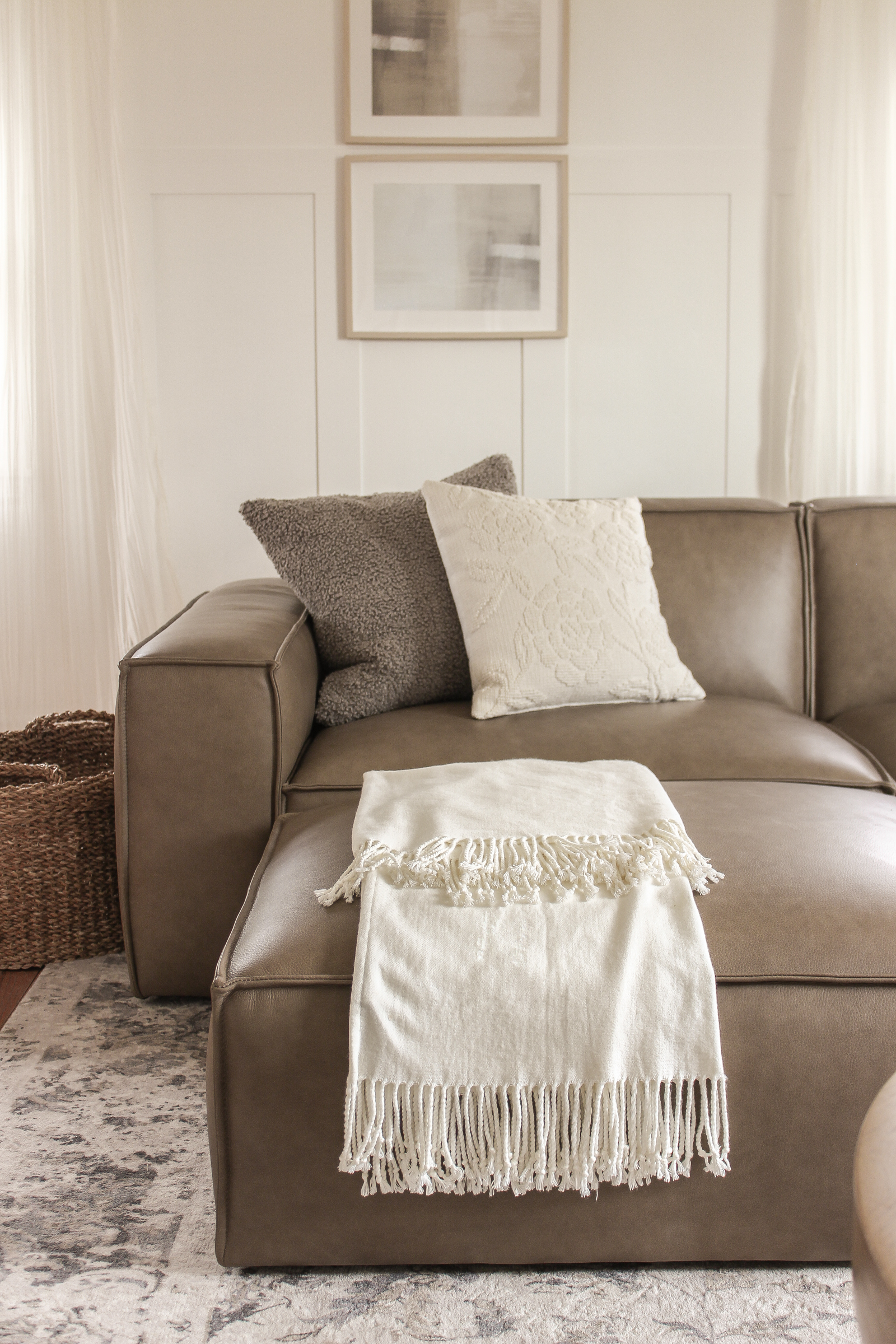
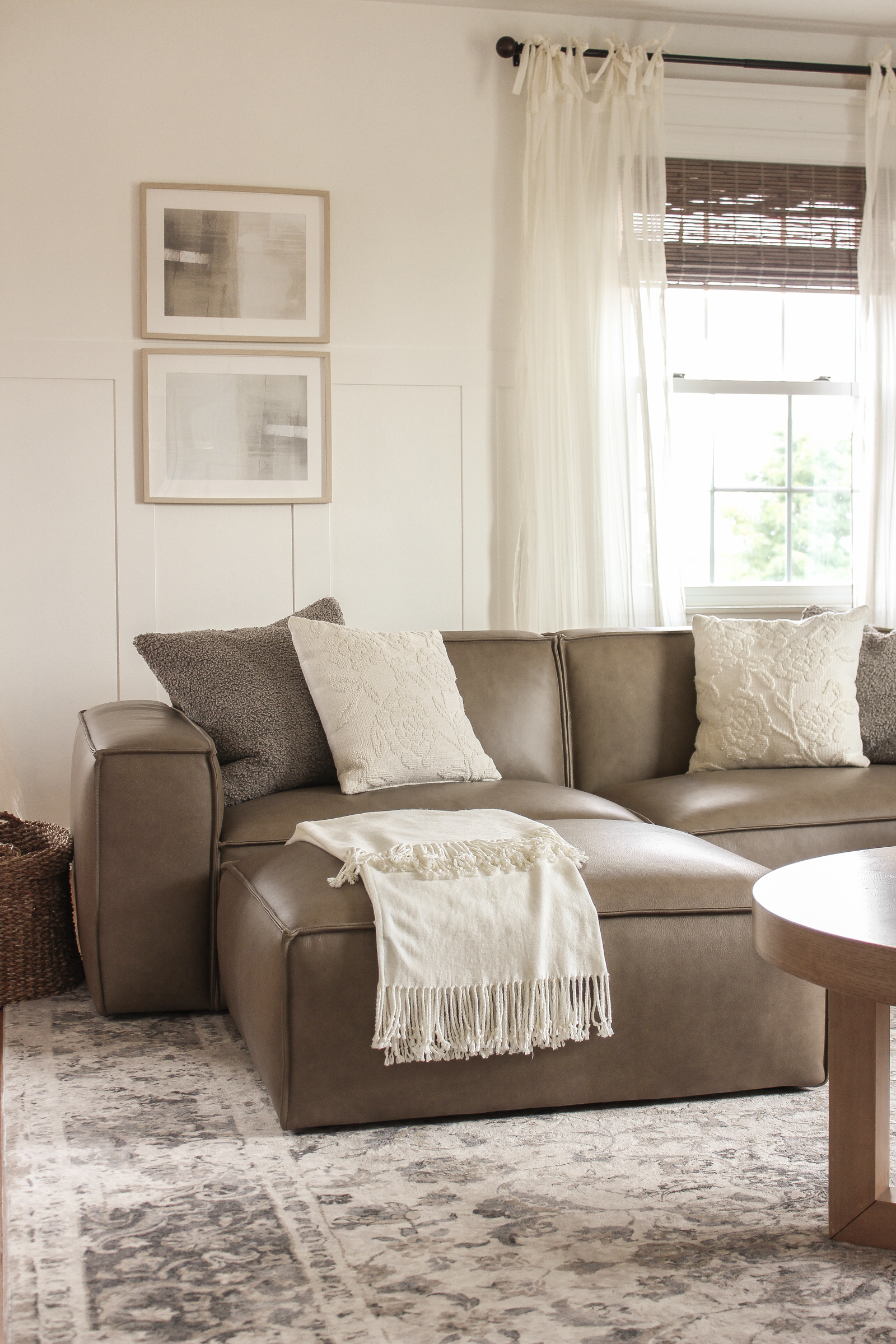
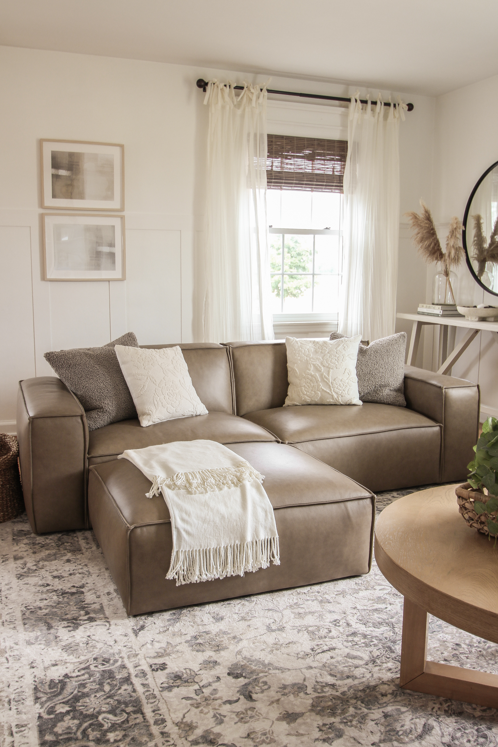
leather sofa | leather ottoman | teddy faux fur pillow | white floral pillow | tassel throw blanket
Get $50 OFF your furniture purchase of $500+ from Castlery: click here!
The first piece that caught my eye was, to my surprise, a dark taupe-brown leather sofa and matching leather ottoman. I’ve never been drawn to leather seating, but this particular sofa had several details I loved:
- two color options: a brighter orange-caramel color and this softer, darker, more gray-toned taupe-brown that totally won me over
- a simple, chunky square design that is perfect for lounging… those extra wide square arms 😍
- a low back/profile so it doesn’t overcrowd the room
- super deep seating
- and no visible legs, which means the sofa appears to sit all the way on the floor = ultra coziness + my robot vacuum can’t get stuck under it!
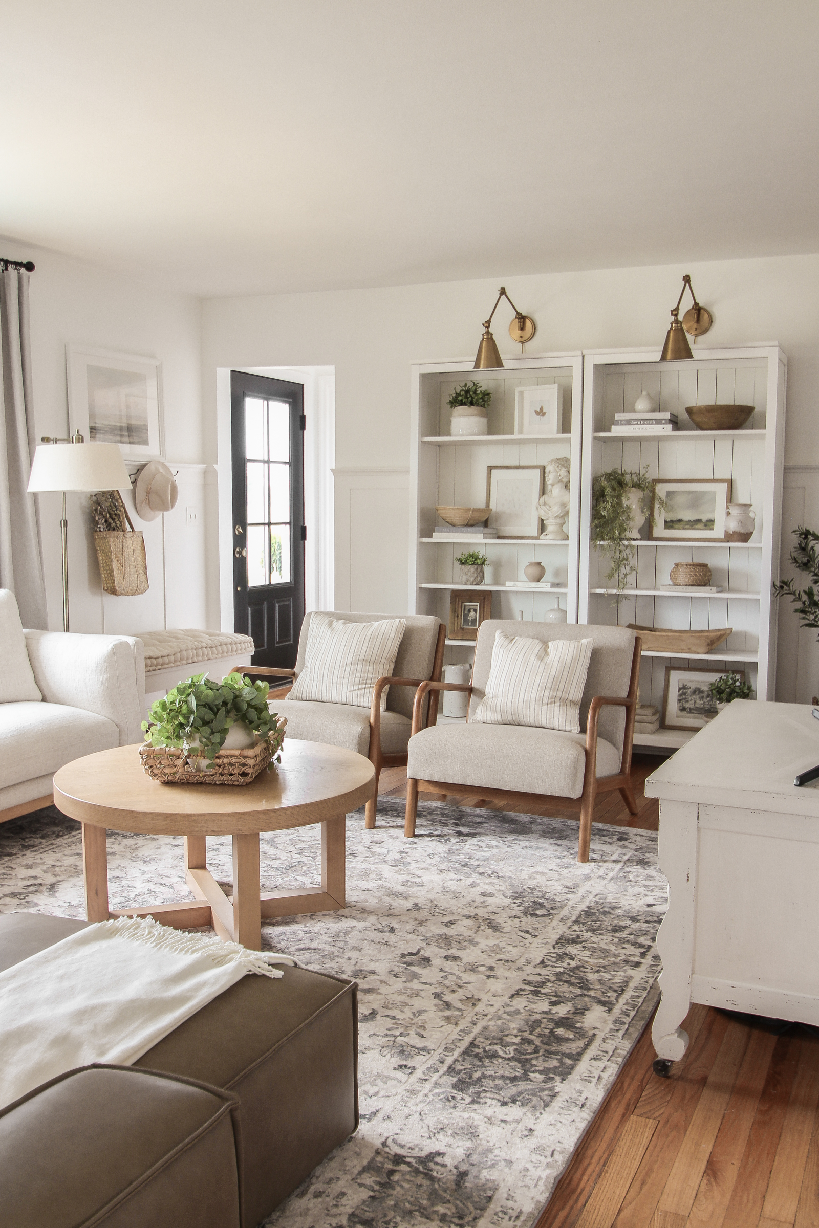
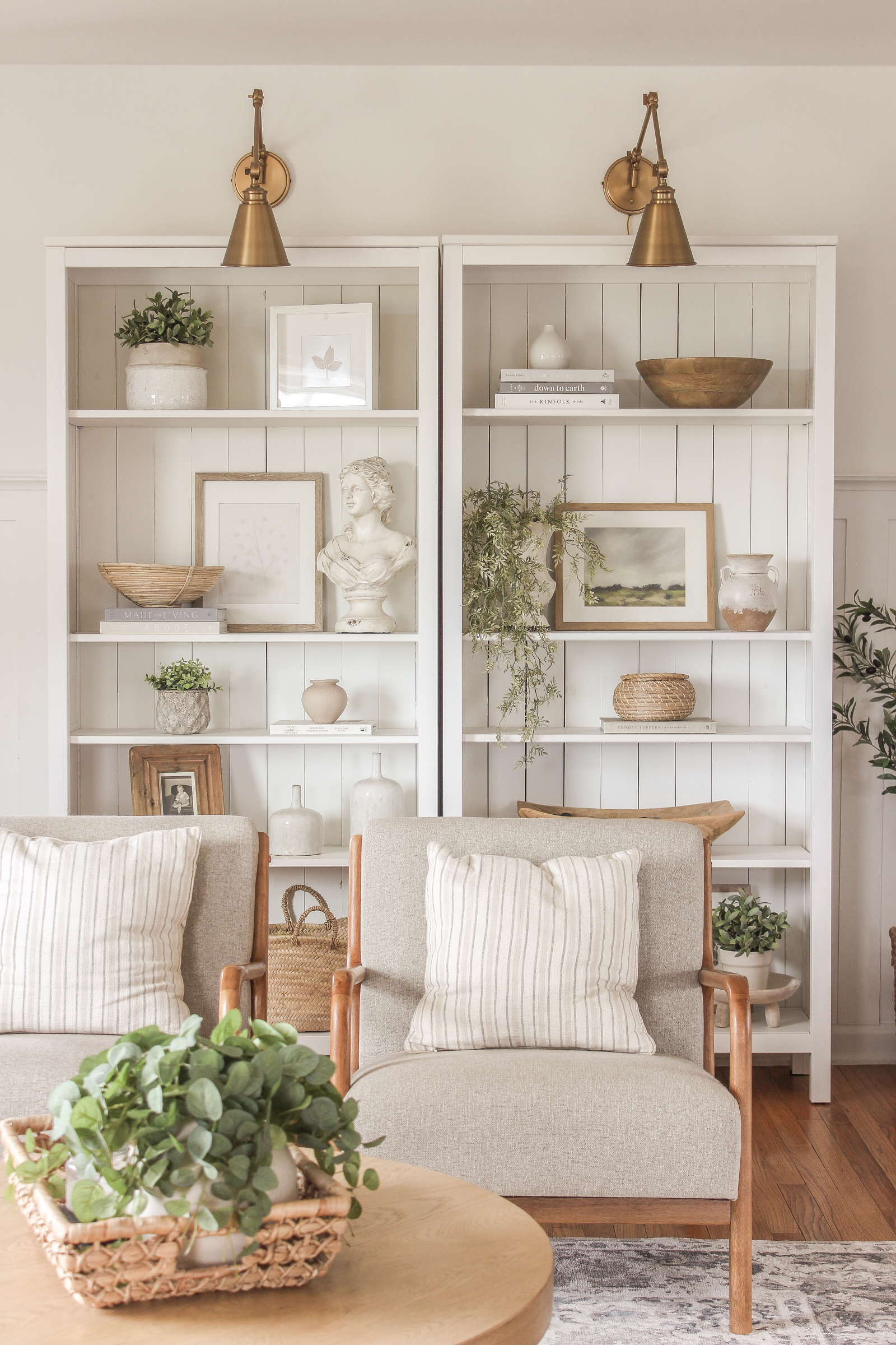
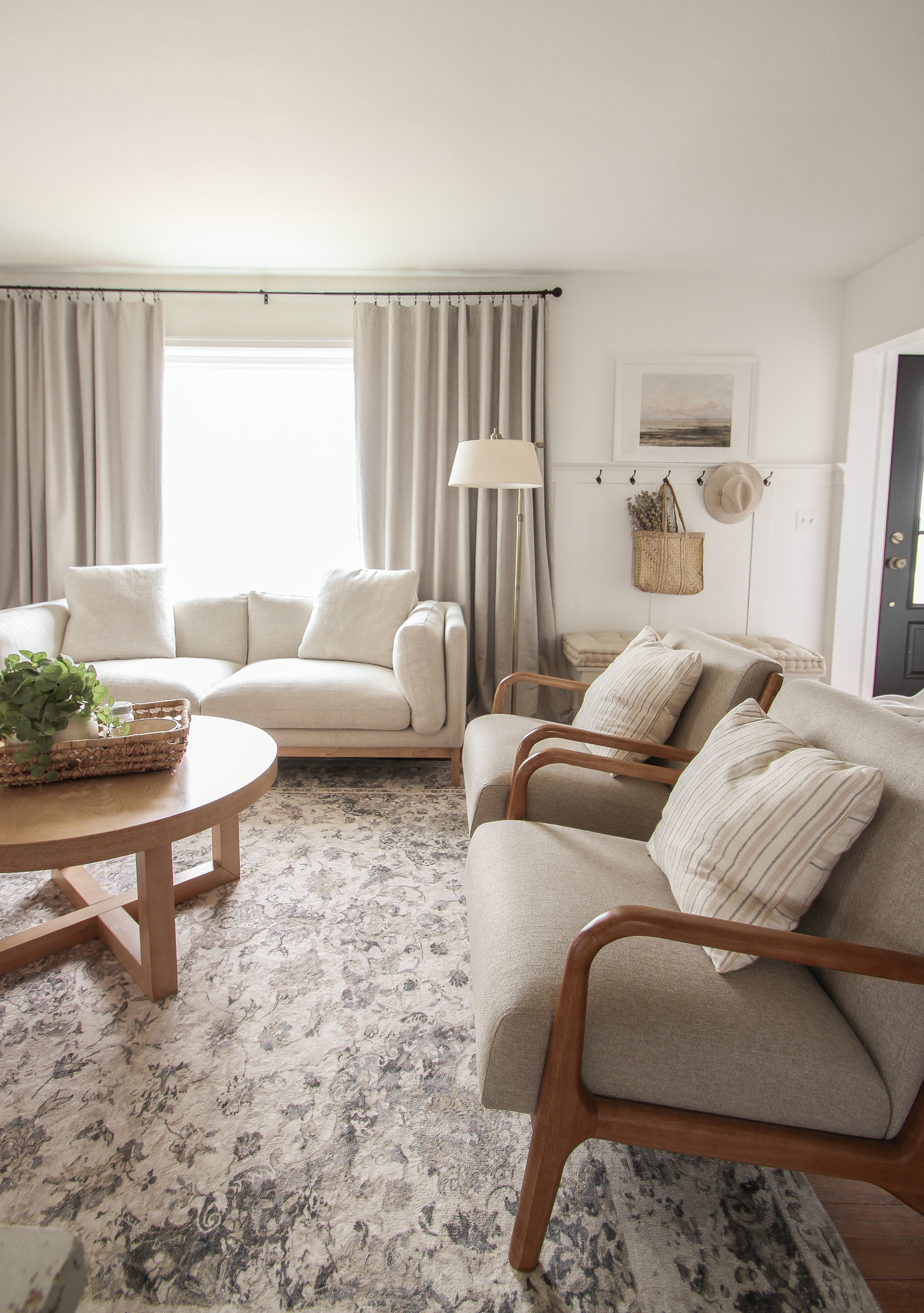
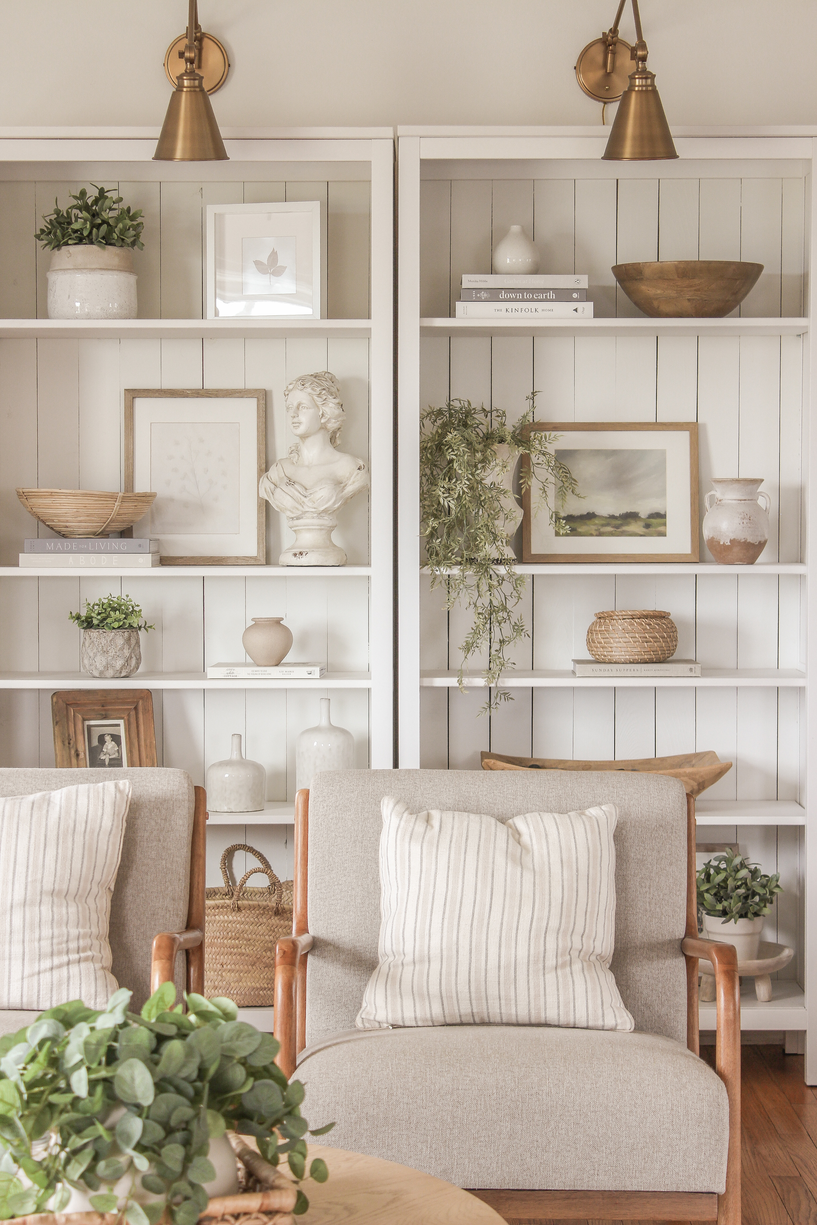
bookcase | armchair | stripe pillow | gold wall sconce
The leather sofa ended up being the one everyone wants to cuddle up on, but the second sofa I picked is quite a showstopper. Here’s what I loved about this guy:
- a simple square frame with soft curves and contours for a modern, yet cozy look
- textured earthy fabric and light natural wood legs/base
- side cushions and two matching pillows for tons of comfort
- low back/profile so it doesn’t block the view outside the window
- plenty of clearance underneath for the vacuum
- deep seating
- … it’s just so pretty
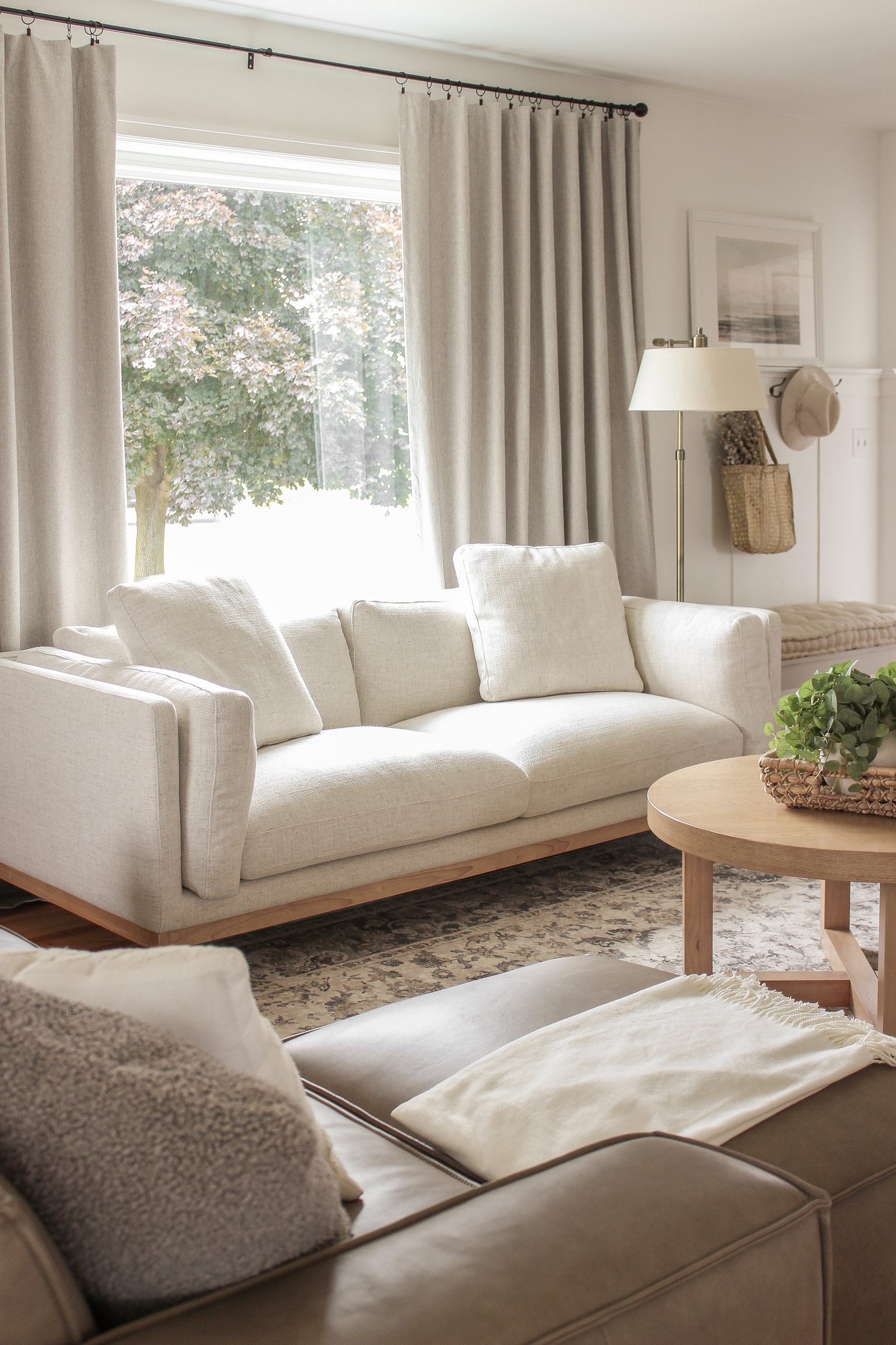
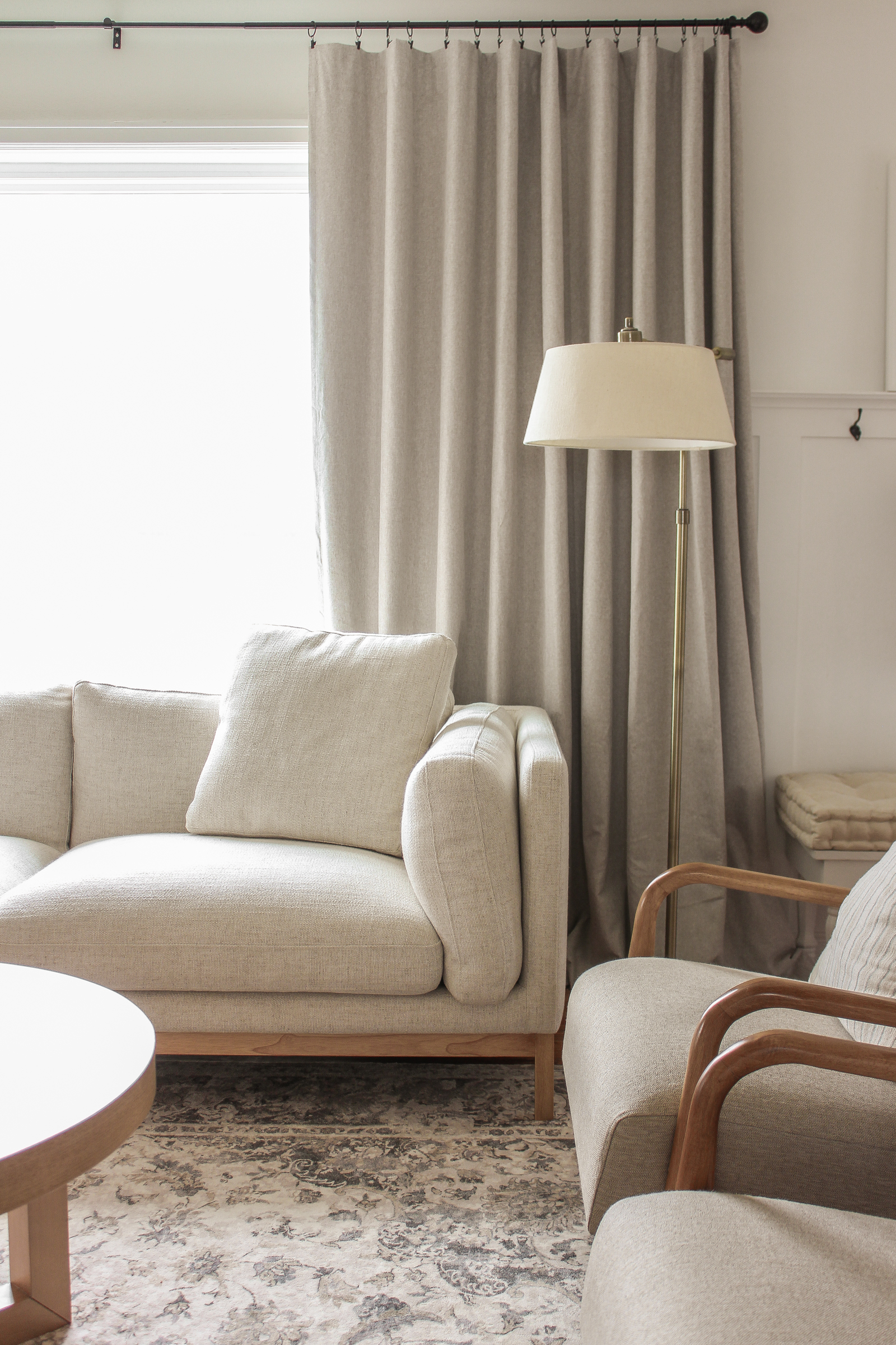
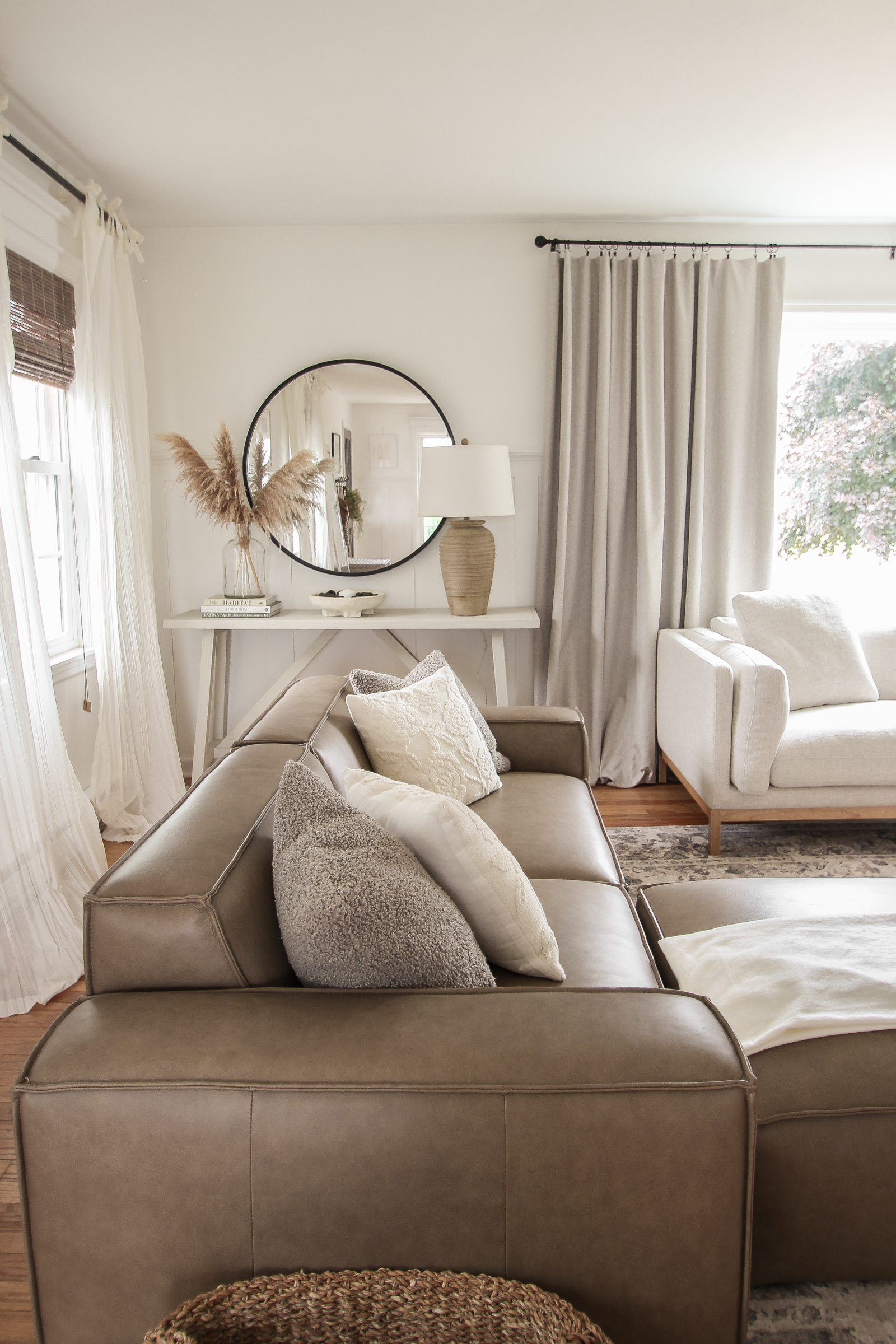
I utilized a ton of decor, lighting, and smaller furniture pieces I already had, like the console table and armchairs that coordinate beautifully with the new sofas.
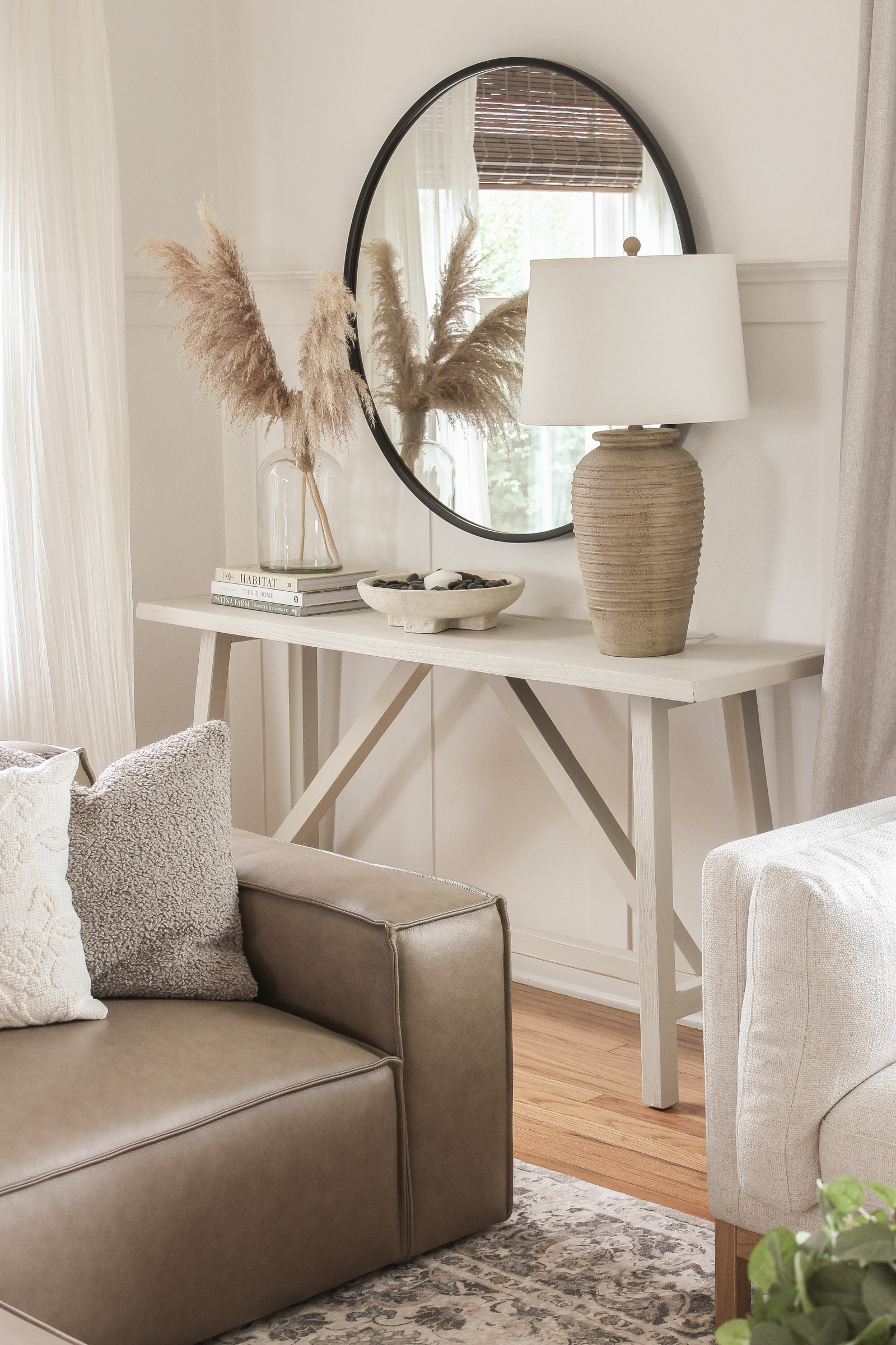
console table | lamp | round mirror | pampas grass | glass jug | design books | footed bowl
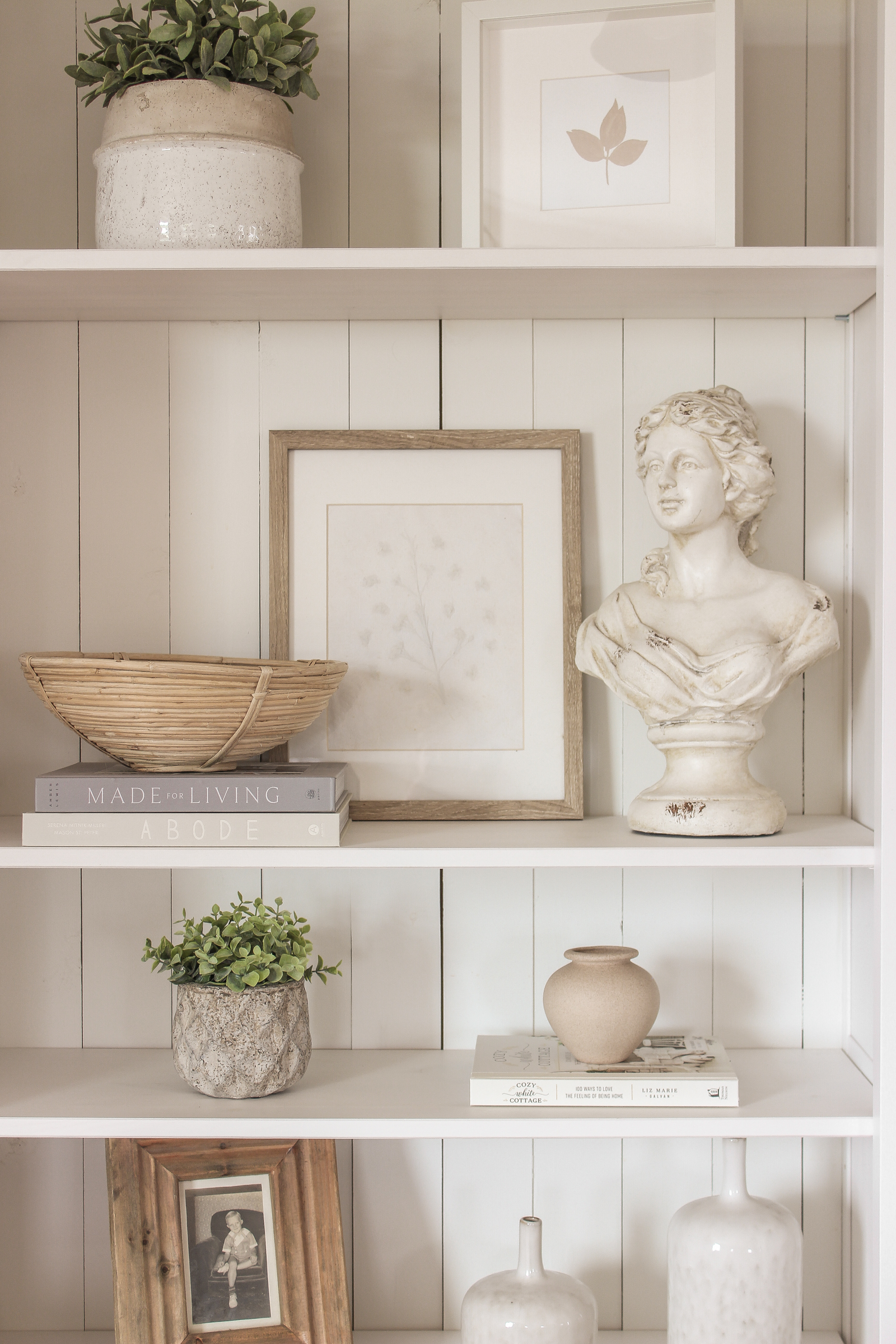
leaf print | botanical paper mache art | bust statue | design books | small/large white vase
Now let’s talk about this rug.
Previously I had two rugs layered in here: a larger natural woven jute-blend rug on bottom and a vintage medallion pattern rug on top.
Side note: If you’ve ever wondered what my top-selling product referral of all time is… it is hands-down that natural woven jute-blend rug!
I love look of the medallion rug and how soft it is under your feet, so I ordered a new one in a larger size to put under the new couches. When it arrived, I was surprised that it looks slightly different than the one I ordered a few years ago. The coloring is a little different, but still neutral and beautiful, and this one is SO plush and soft. Highly recommend!
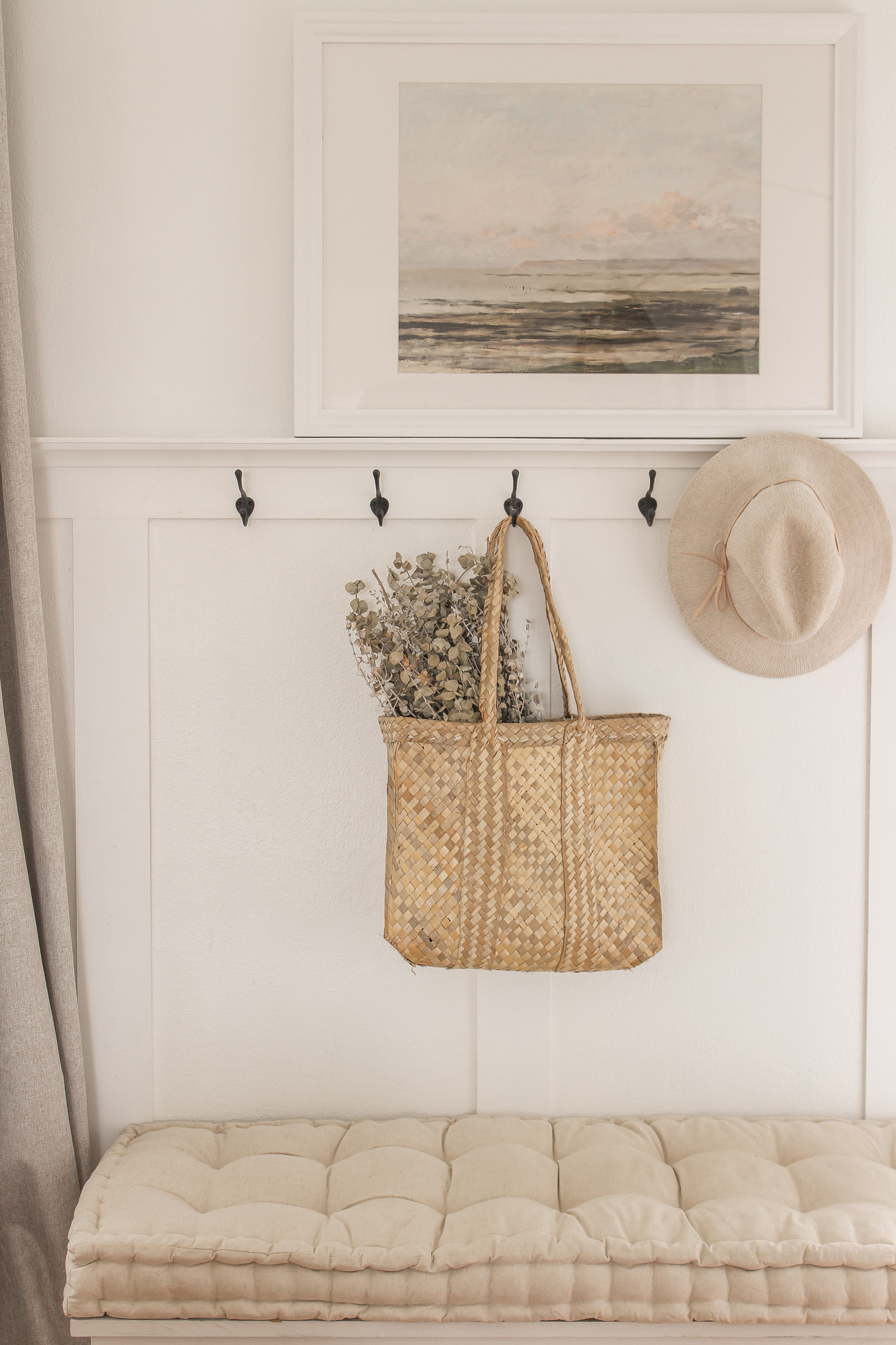
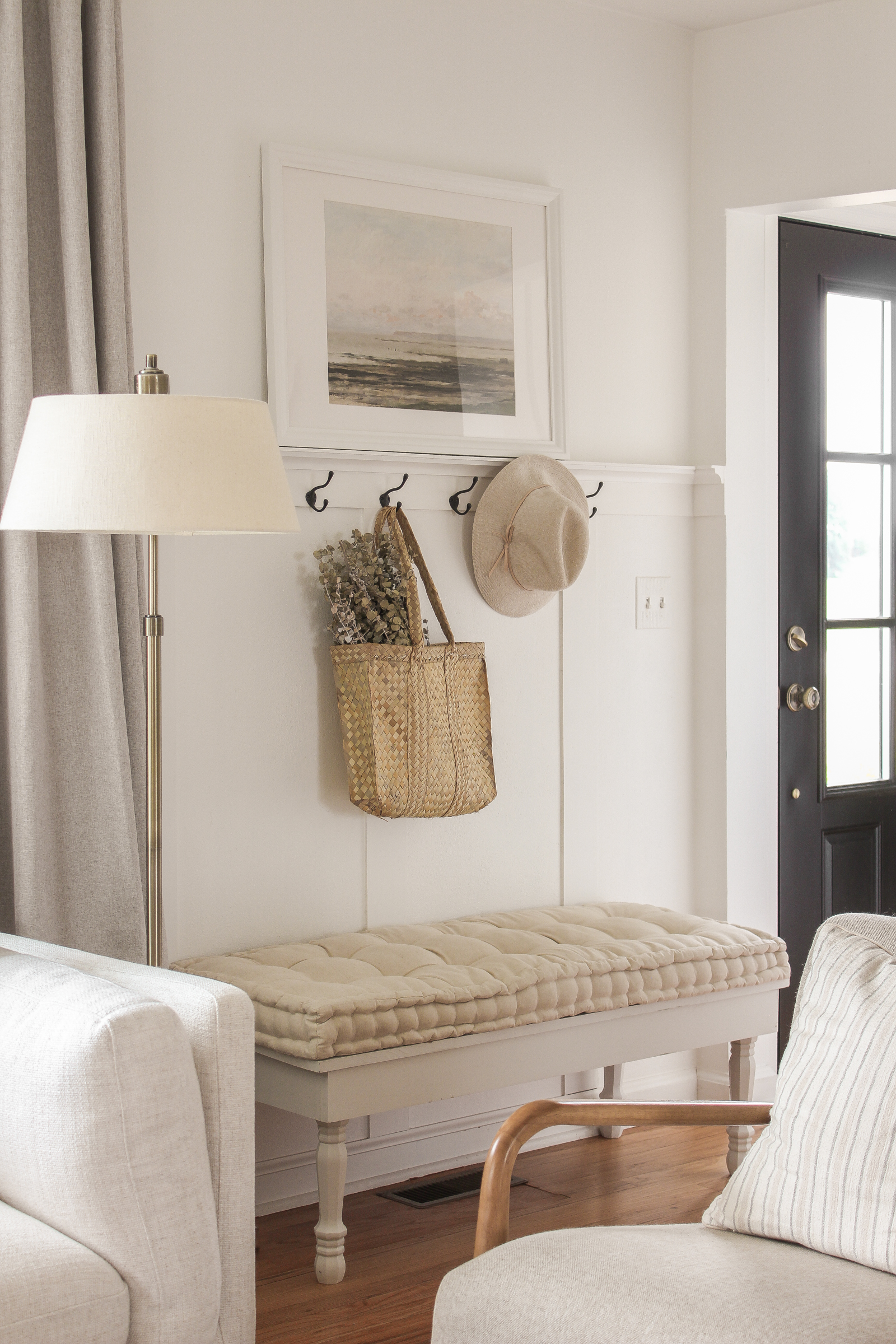
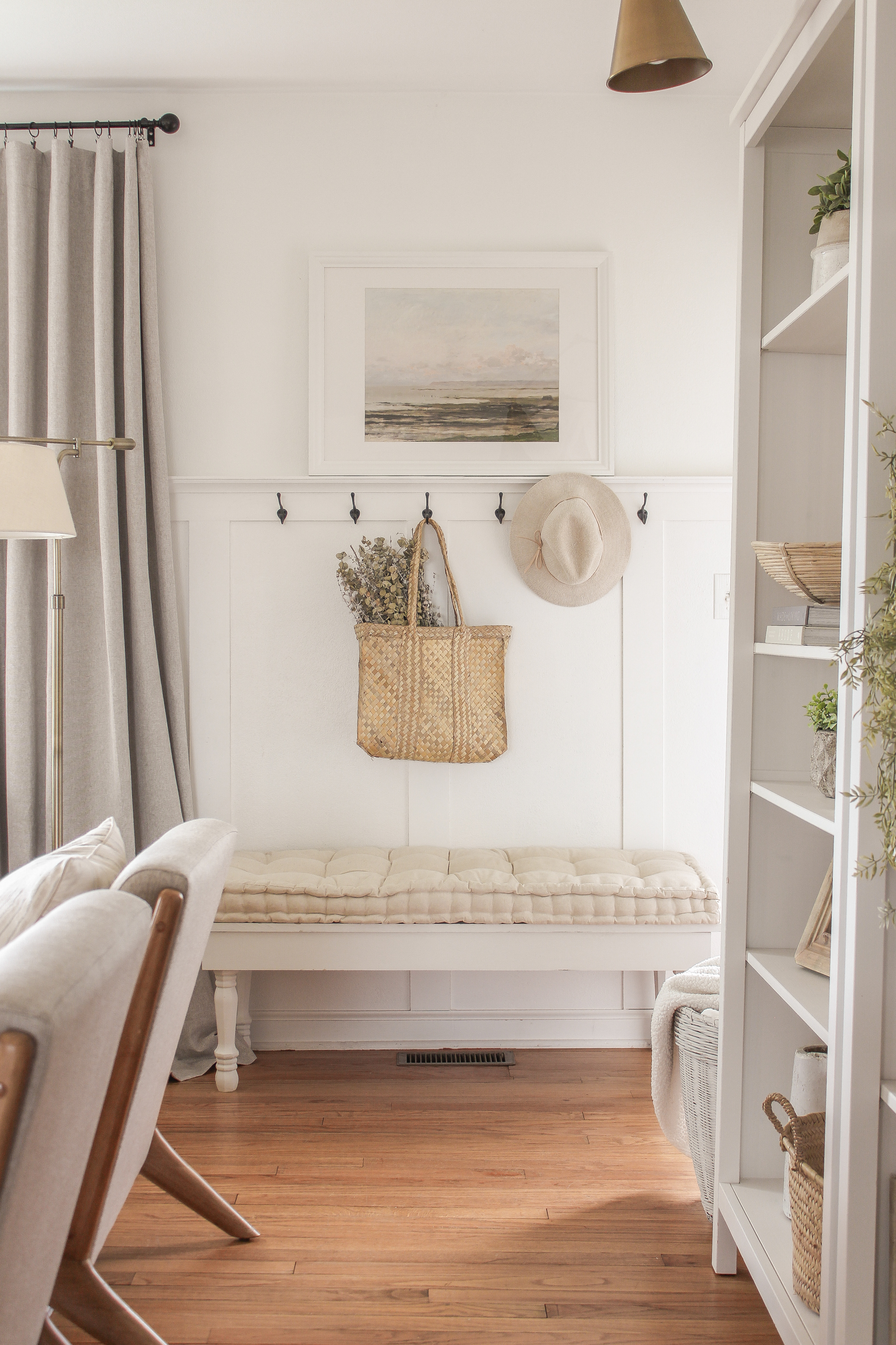
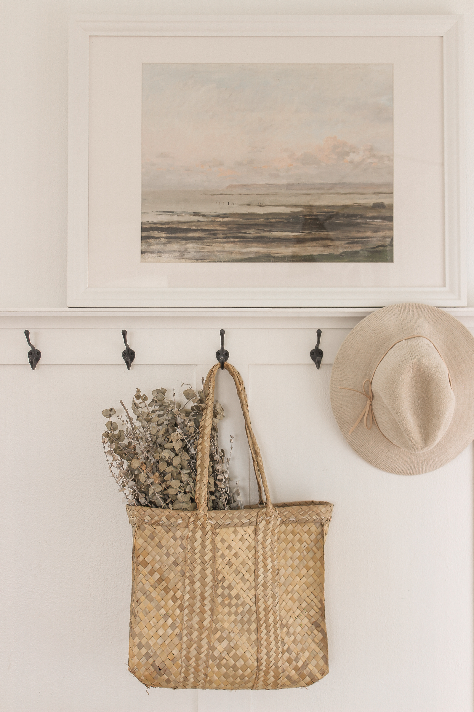
white bench | tufted cushion | art print | woven bag | hat
The last thing I upgraded in the living room was new blackout extra-wide curtains for the big picture window behind the sofa. WHAT a difference this made.
Before I had 4 basic white curtain panels hanging here that were light filtering, but definitely not light blocking. I know you can’t see it in these pictures, our TV sits across from the big window, so this is been something I’ve wanted to upgrade for quite awhile to eliminate any glare. The problem is, this window is SO big – plus I hang my curtain rods higher and wider than the window (you can read why here) – that I needed multiple standard panels on either side, and I hated how it wasn’t all one seamless piece of fabric.
I searched till the end of the internet to find a curtain that:
- is extra-wide – this one is actually made for a sliding patio door
- has a nice linen texture & neutral color
- 100% blackout
- machine washable
- is pinch-pleated or could be hung with ring clips – this one includes 20 clips!
- doesn’t cost a fortune
I actually ordered curtains from two different places because I didn’t have a lot of confidence I would find everything I was looking for at a decent price point. But I’m happy to report the first ones to arrive that were less expensive ended up being perfect, and I didn’t even bother opening the second set!
I also got a new curtain rod because I still had a piece of spray painted electrical conduit up there from a cheap DIY project I did probably back in 2014. I installed a center support bracket to help hold the weight of the heavy curtains, and I can’t believe how much of a difference this change made in the overall look of the room. The heavy extra wide curtains look so elegant, and the ring clips make it so much easier to open and close them. I couldn’t be happier with them!
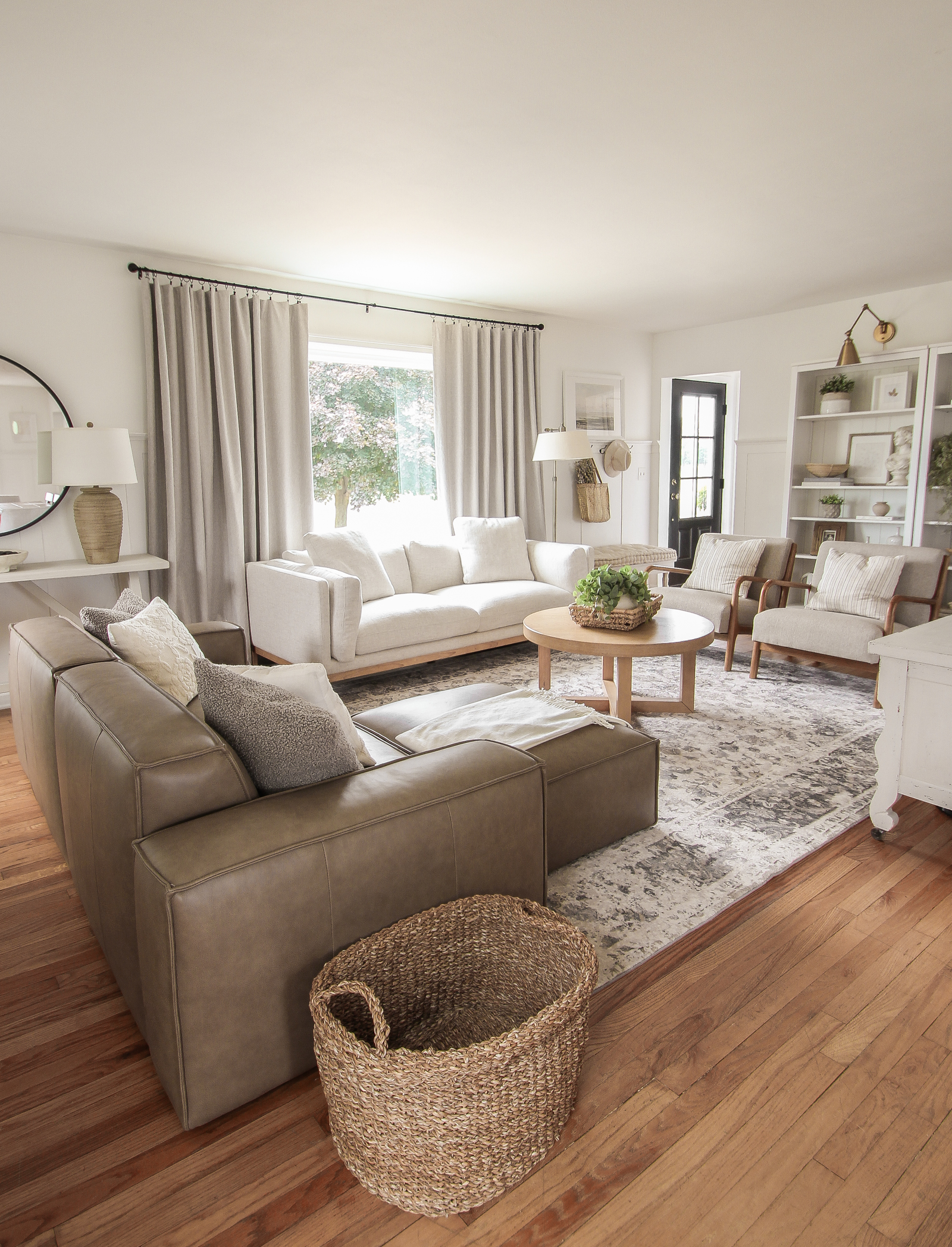
extra wide blackout curtains | curtain rod
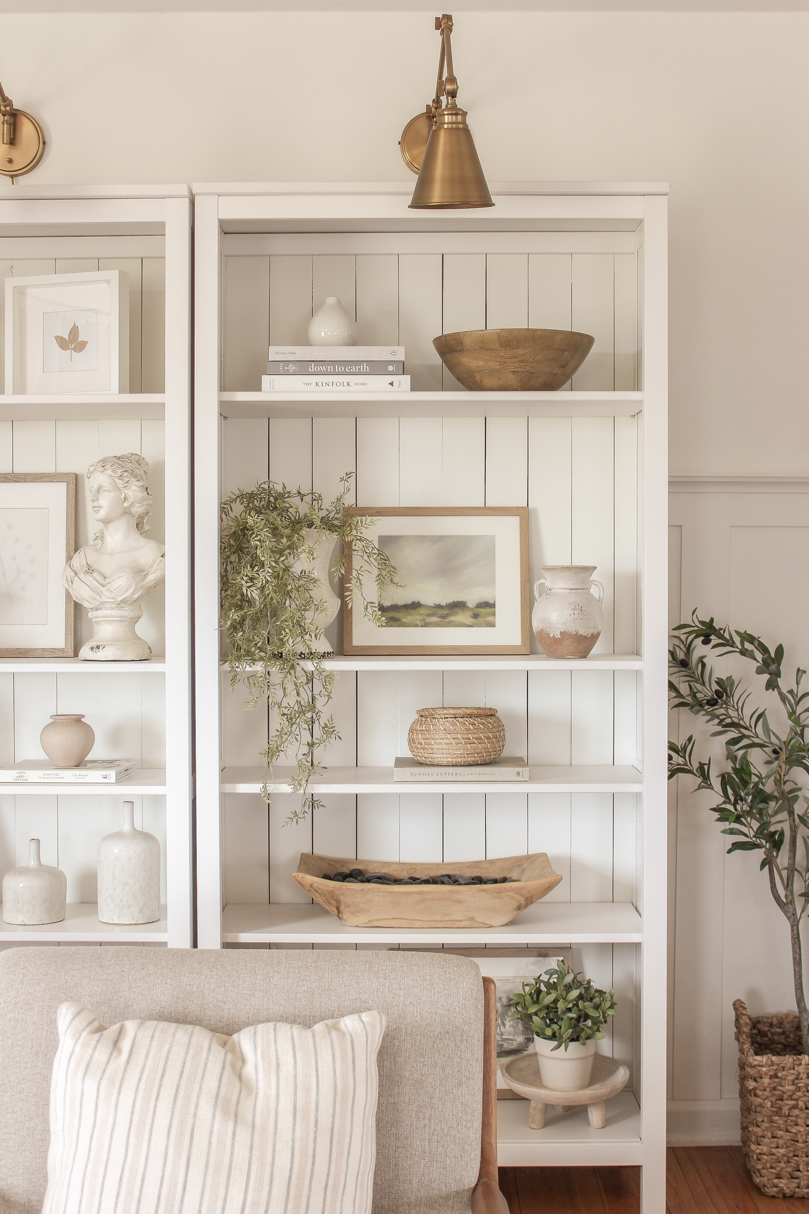
faux olive tree | landscape art | wood pedestal
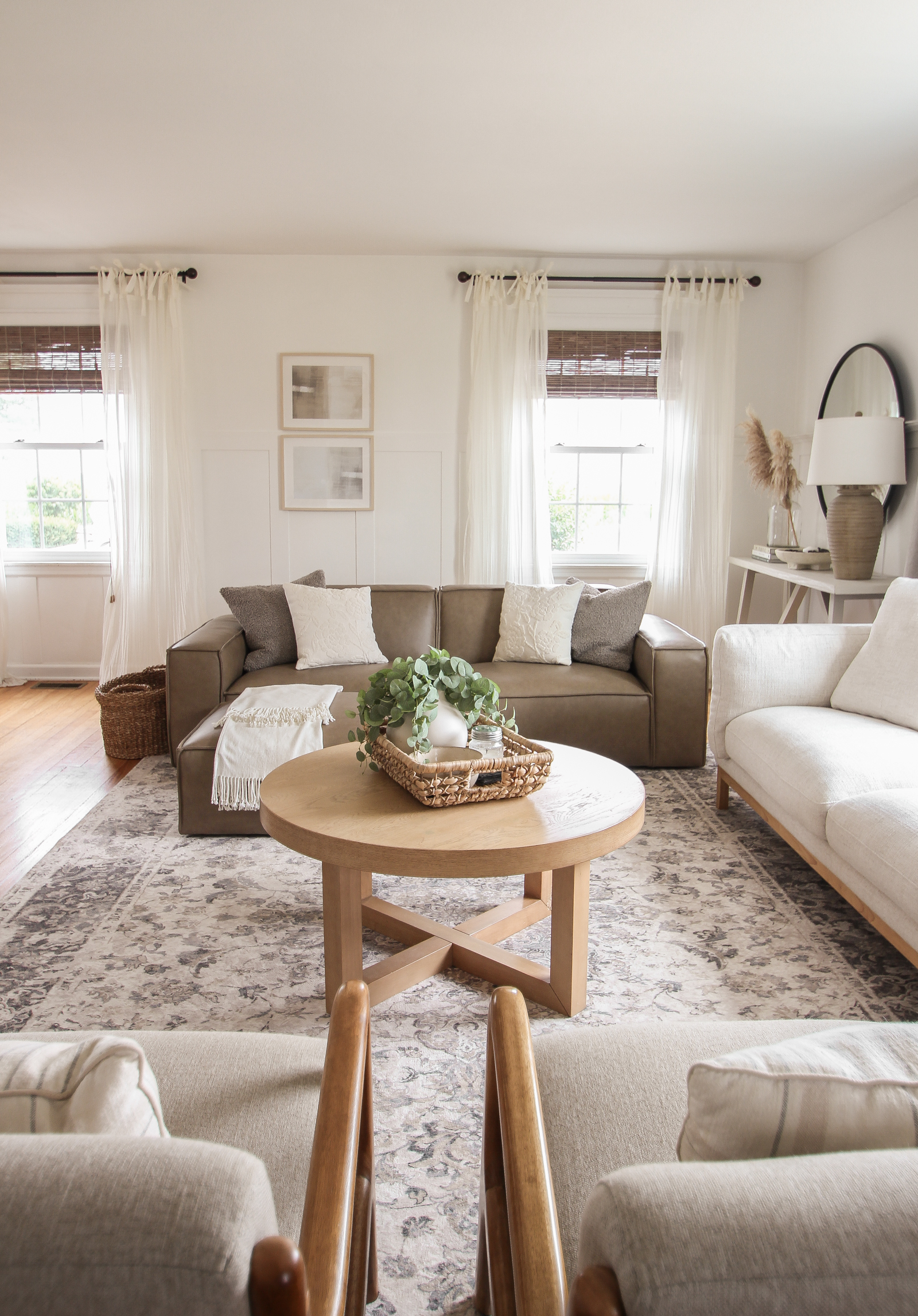
abstract art prints | sheer tie top curtain | bamboo roman shade | coffee table | woven basket
Remember this little entryway bench I built back in 2018? I found the perfect spot for it up by the front door.
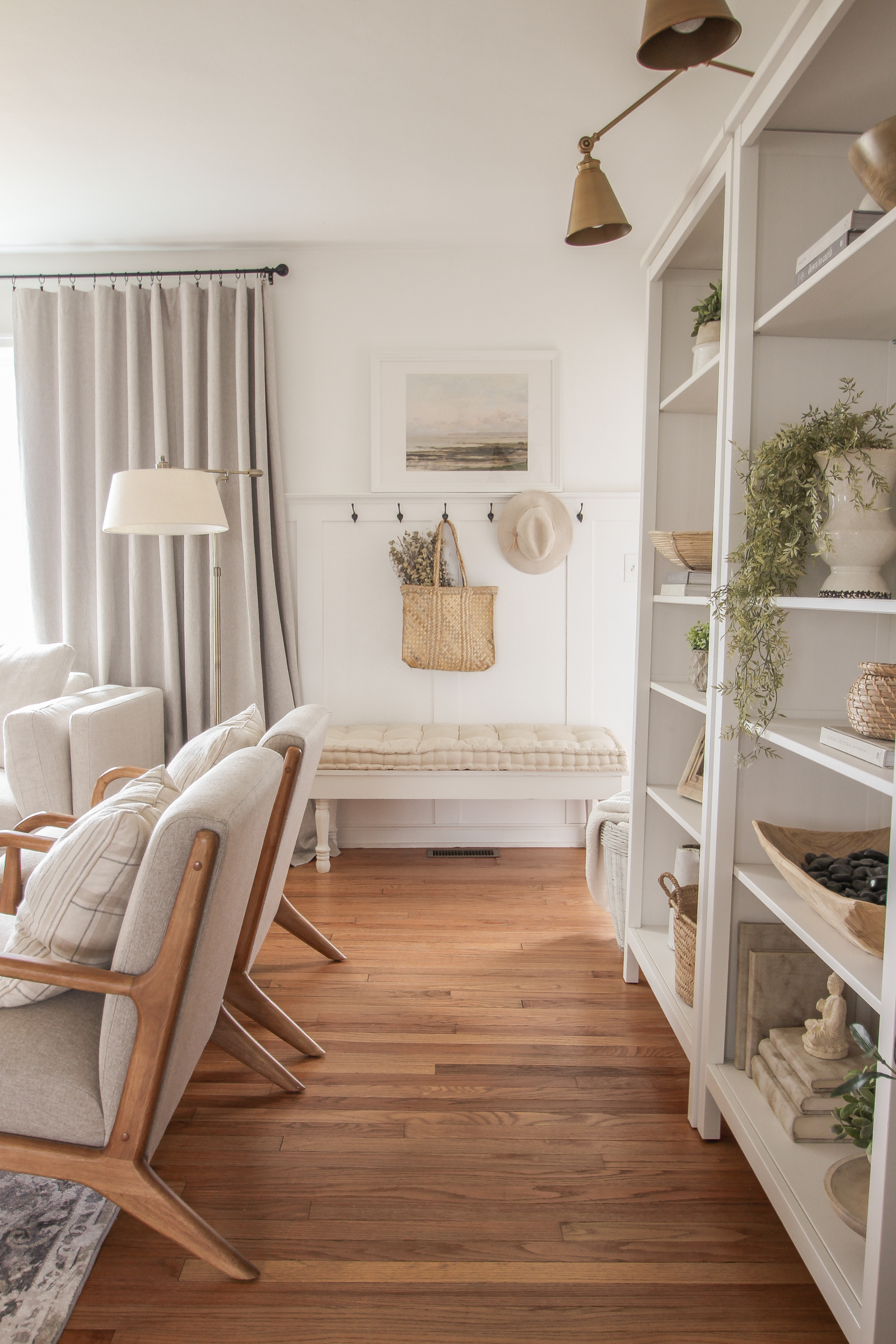
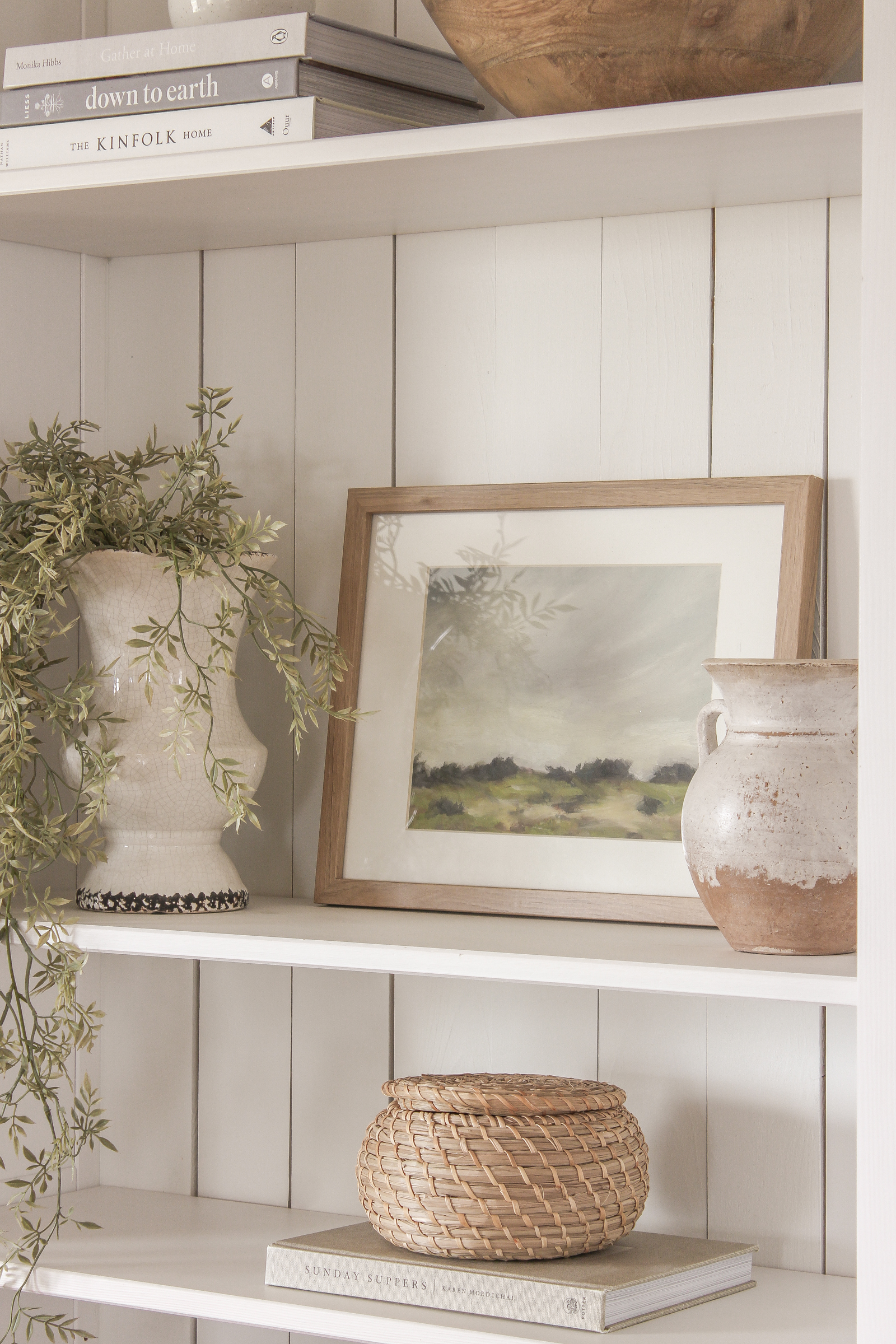
I think what I love most about the way the living room looks now is all subtle contrast that feels so soft and cozy. Dark brown leather, light natural wood, black accents, bright white walls, soft beige fabrics… they all flow together beautifully, but create enough interest on their own to make each little area feel special and unique.
Don’t you just want to curl up with a big blanket in here?
LET ME KNOW ANY QUESTIONS YOU HAVE!
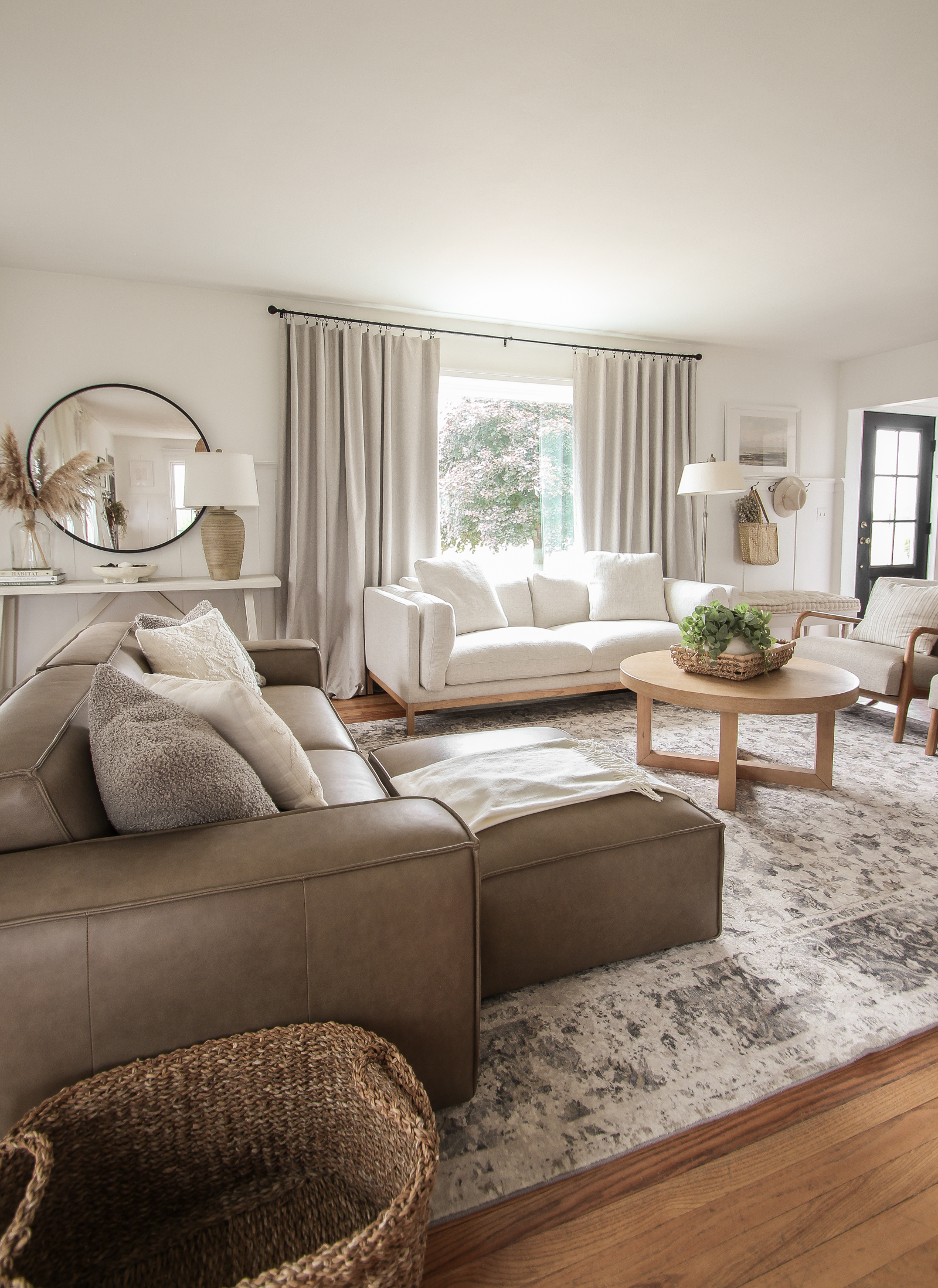
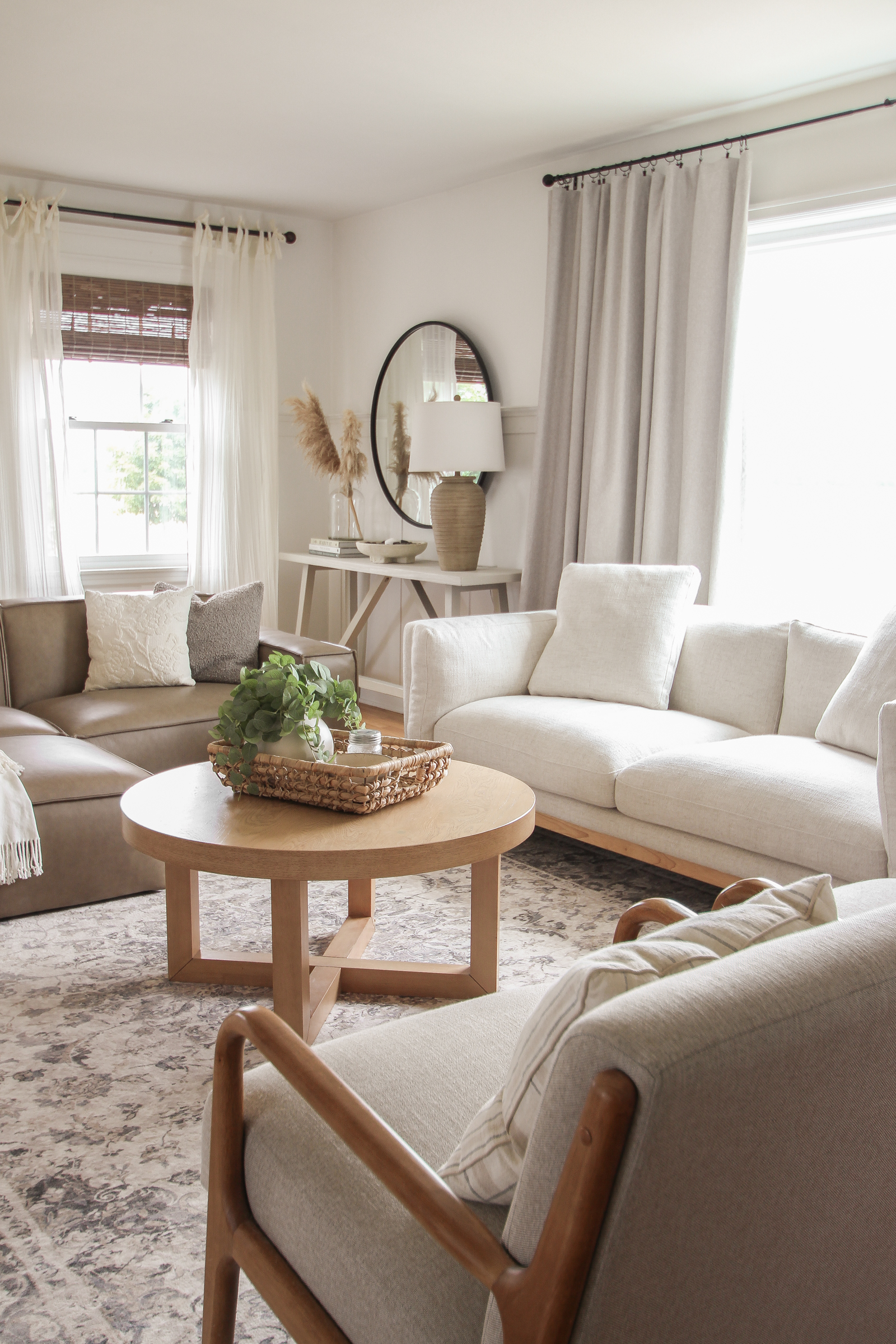
P.S. let this be your reminder, that no one’s home is always as pretty and perfect as the photos you may see. A certain pup of ours decided to chew on one of the legs of my beautiful coffee table, so for now I just hide it facing the back of the room… 🤦🏼♀️ And she has an entire basket full of fun toys she could have chewed on instead! That’s life. 😊
– SHOP THE POST –
As always, I sincerely appreciate you shopping through the links I share, which allows me to make a small commission from your purchase while your purchase price stays the same. When you use my affiliate links, I’m better able to create content for this blog as well as support my family, and I thank you from the bottom of my heart for supporting what I do!


Your living room looks amazing now! You did a great job. It looks huge also, did you remove you dining table perhaps? Or did I miss it?
Thank you! I’m so happy with the change. And yes, I did move the dining table towards the entryway to open up the living room more. I have a highlight on my IG @lizlovegrowswild that shows all the details!
Your space is perfection❣️
Beautiful!
Rug, yes, new furniture, no.