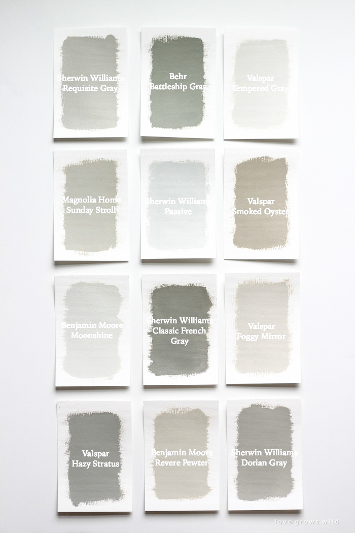
Have you ever spent weeks picking out a paint color, painted an entire room with it, and then realized you don’t like the color? I certainly have been there, and it makes picking out another color even that more daunting. My sister and I were chatting recently about picking out a paint color for her living room, and after looking through dozens of colors, I realized part of the problem is the overwhelming number of options there are. Lots of choices are great, don’t get me wrong, but narrowing down so many different shades and hues can be difficult to pin down that perfect color you’re looking for.
Our conversation really started making me think about how I go about picking paint colors, what some of my favorite go-to paints are, and ways I could help make it simpler for you to go through the color selection process. For the last ten years I’ve been trying out paint colors and plenty of the wrong ones, and I decided it would be a really fun series to start this year sharing my favorite paint colors so you won’t have to sort through hundreds of paint swatches at the store!
For me personally, I love simple white walls, and my little farmhouse is full of them. They make the house feel so clean and bright and are the perfect backdrop for just about any style decor. But I know that white walls aren’t for everyone and that many of you would love some help picking out other colors too. So this will be a great way for me to recommend a bigger variety of paint colors that will hopefully spark some decorating inspiration for you!

Before our farmhouse was all white, I painted a beautiful warm gray in all the rooms, and I still get lots of questions on that color. So that’s where I figured I would start! These twelve gray paints cover everything from a soft whisper of gray to bold, deep grays and cool, modern grays to warm beige grays. I don’t like to use the word “greige” (beige-gray), but many of the colors I use and am drawn to have a bit of warmth to them to feel less cold and more cozy. I went to paint stores all over and gathered samples from many of the top brand names to give you plenty of options. Most of these are timeless and designer used and approved, but a few of them are colors that really grabbed my attention while I was sorting through all my hundreds of swatches.
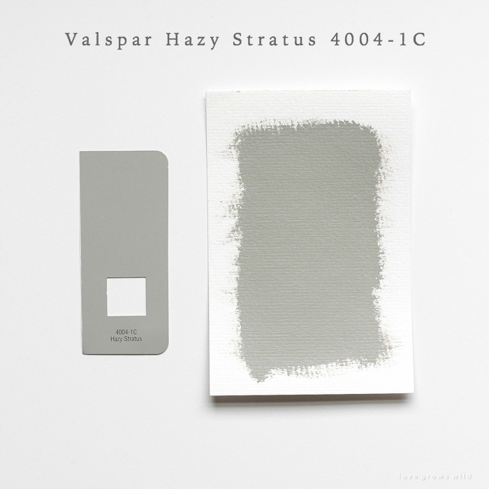
And because I love you dearly, I went ahead and painted a piece of paper with each color so you could see what the color looks like in real life next to the paint swatches from the store. Sometimes I’m surprised how different they can look from what you see online to the paint swatch to what ends up on your wall!
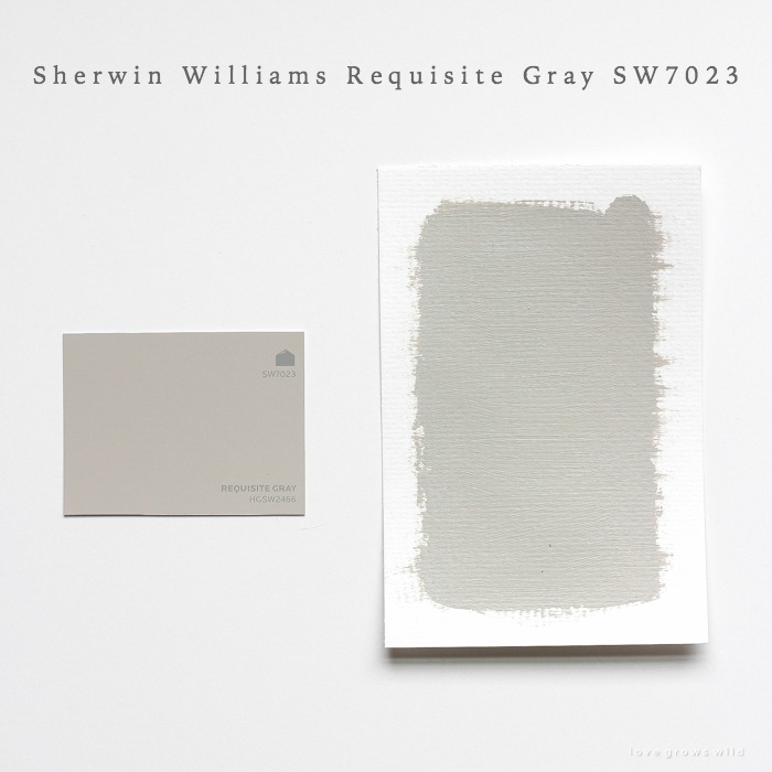
Requisite Gray by Sherwin Williams
A gorgeous beige gray that plays well with purples and warm whites. This gray is warm and welcoming without being too warm.
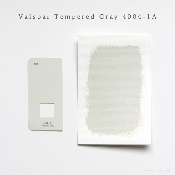
Tempered Gray by Valspar
This cool gray feels light and crisp and would be perfect for large, open spaces.
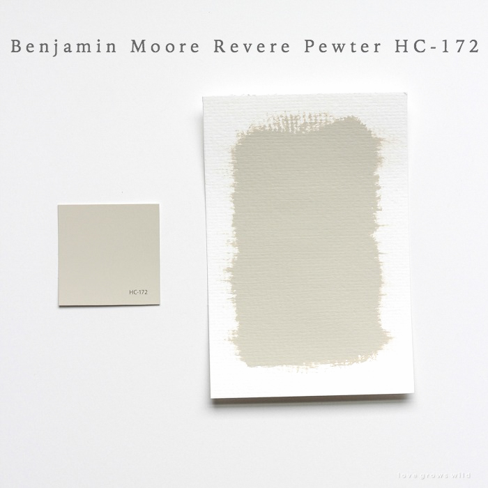
Revere Pewter by Benjamin Moore
Revere Pewter is a best-selling color for Benjamin Moore for a reason. This warm gray is neutral without being too beige and would work well in a whole house.
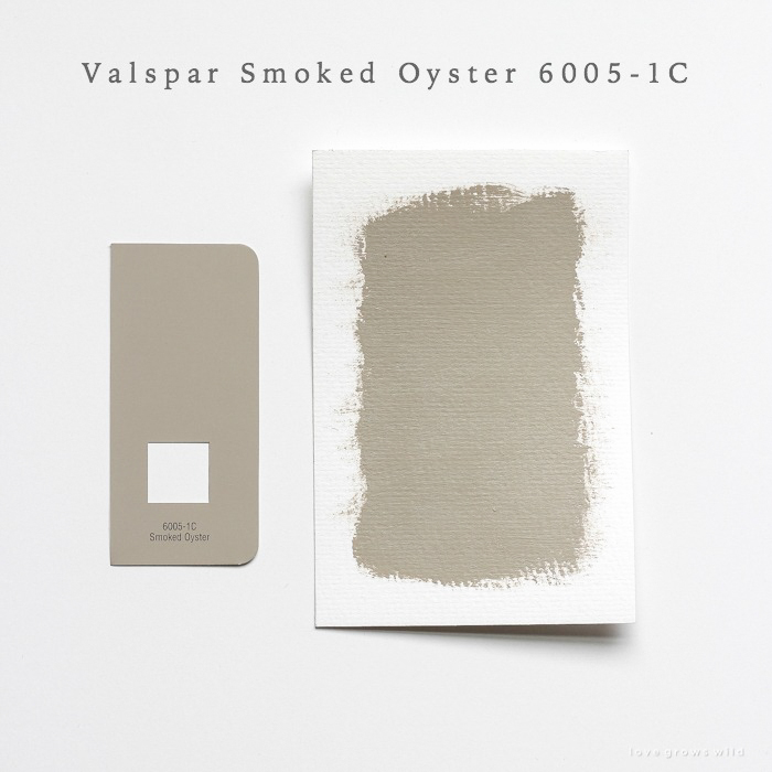
Smoked Oyster by Valspar
Smoked Oyster is one of the warmest grays that grabbed my attention, and the yellow undertones make this color very welcoming without being overly beige. If you’re looking for something a little lighter, Valspar Villa Grey 6005-1B is one shade lighter and very beautiful as well.
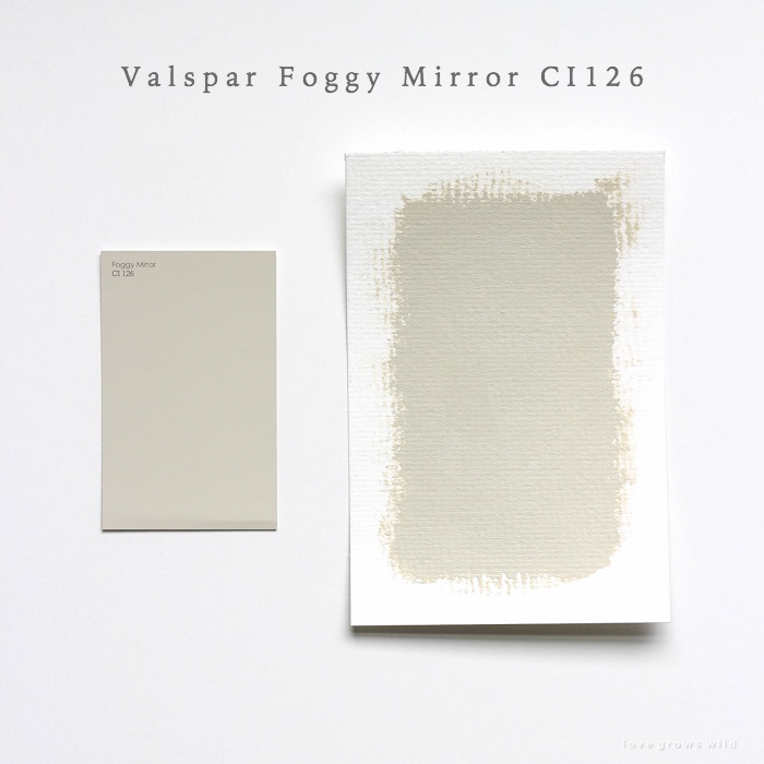
Foggy Mirror by Valspar
This color is a personal favorite, and Foggy Mirror’s warm neutral base with a barely there violet undertone makes it feel feminine without going pink. Blush or purple against this wall color would be gorgeous.
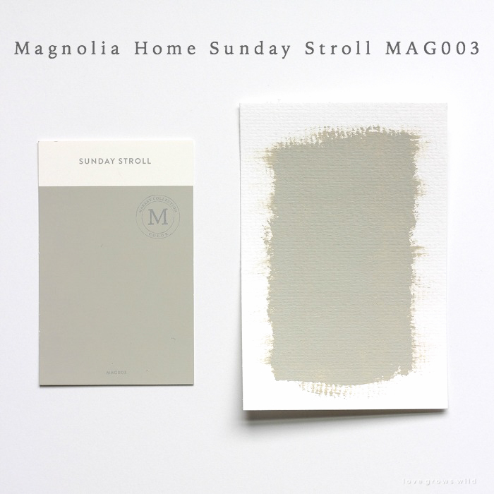
Sunday Stroll by Magnolia Home by Joanna Gaines
A beige gray that is a beautiful mid-range color. Not too dark and not too light. Cozy and a perfect neutral.
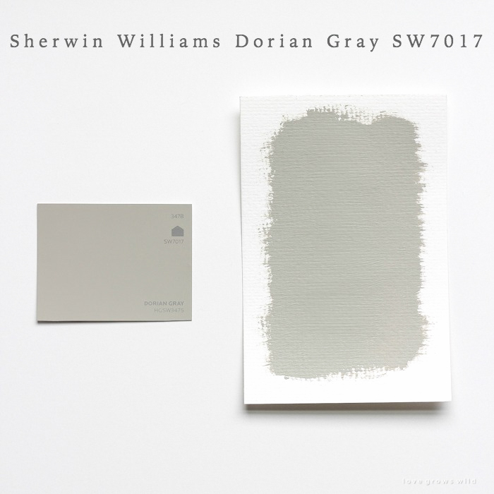
Dorian Gray by Sherwin Williams
Similar to Requisite Gray, but slightly cooler. This gray would work well throughout the whole house, and blue-greens look beautiful against it. If I had to pick one color that would match what we used to have in our farmhouse, this would probably be it.
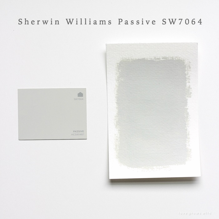
A soft, cool gray that feels modern, yet classic. Sage green would be a perfect pairing with this light, airy color.
Hazy Stratus by Valspar
A darker version of Tempered Gray, this middle-of-the-road color is not too cool and not too warm. A perfect compromise.
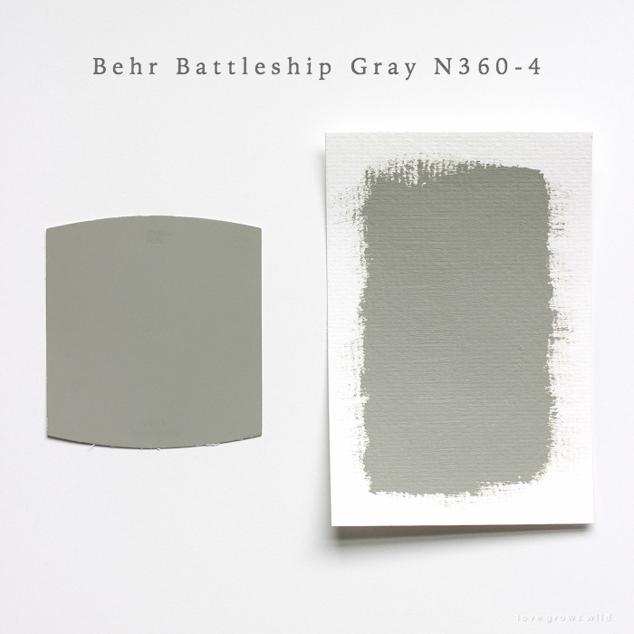
Battleship Gray by Behr
This muddy gray might be a little dark for walls but would look amazing on an island or bottom cabinets in the kitchen or on painted pieces of furniture. A little bit green and just the right amount of moody.
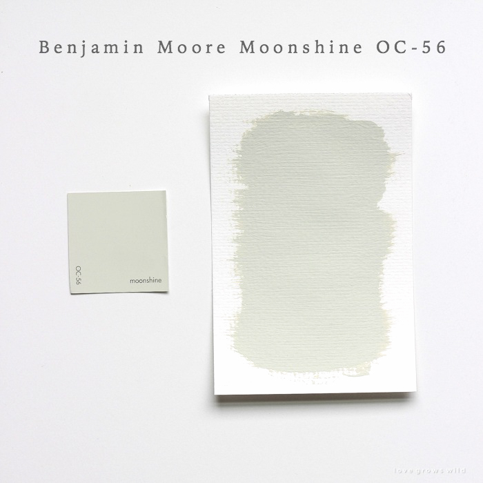
Moonshine by Benjamin Moore
This versatile pale gray is an off-white with a very slightly green undertone. Create a soothing color palette with this color paired with soft blues.
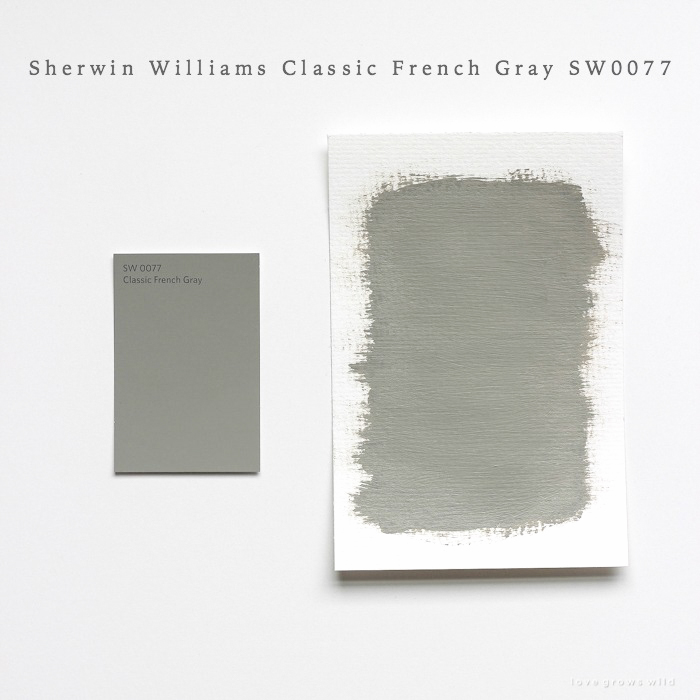
Classic French Gray by Sherwin Williams
If you’re looking for a dark, neutral gray, this is it. Not too cool or warm, and you can lighten it up with accents of light gray and white or make it feel rich and luxurious with deep navy blues.
Honorable Mentions…
Benjamin Moore Stonington Gray HC-170
Sherwin Williams Agreeable Gray SW7029
Sherwin Williams Modernist Gray HGSW1495
Valspar Soulful Grey 6004-1B
Valspar Notre Dame 5006-1B
Valspar Madison White 5008-1A
Magnolia Home Quaint Cottage MAG064
Magnolia Home Gatherings MAG006
P.S. I would recommend always testing out paint samples in your own home before committing to a color because there are a lot of factors that can alter the way a color looks. I hope this guide gives you at least a starting point to pick out beautiful paint colors that will work well in your home, and I’d love to hear your thoughts on this new series! What gray paints have you used and loved? What other color families would you like to see me share in future posts?
LET’S KEEP IN TOUCH!
Subscribe to Blog | Follow on Instagram
Follow on Pinterest | Follow on Facebook


Great Post! I am wanting to paint my master bedroom. We moved in about 2 years ago and its still the color from the previous owner!!! Can I ask what grey you had used???
I was hoping to get the name of the store where you bought the wooden chairs on your patio, rockers I think.
LOVE!! Thank you for this post.
Liz I just painted my den a soft grey,it was Halation by Behr paint and I love it. It is soft and light but still has depth. Our room only has two Windows and they are large but we have a wonderful front porch off that room and that really cuts out the light coming into that room. I tried three colors on the walls on three three walls since I wanted to be sure which one looked the best in all the different times of the day and it won out. But there is also one named
Hush and I loved it also and I really wanted that one for one cute reason. I wanted to be able to say “Hush” and then just smile when asked!
Love these colors, gray works better for me than all white. We once painted our cathedral wall w a warm mid btown, got it up and whoops! Looked like the wall was painted w baby poop! It looked so great in the can. Then we had to prime it to repaint! Now if I’m doing something different, i paint a piece of foam core and hang it up. It helps!
Also, i would tell my paint store customer to figure out if the room is warm or cool, also, when do you use the room the most, night or day? All these things come into play. It’s worth getting the sample colors now to test. Again, paint a board, it’s easier to move it around than a wall!
Thanks for sharing! Very beautiful gray colors! And since there are soooo many variations of whites – it would be very interesting and helpful to see a variety of whites colors too! Thanks!
I love Glidden’s Smooth Stone for a soft warm gray and I would LOVE to see a post on whites. Whites are the most difficult to pick in my opinion!
What is your favorite white paint? Thanks!
Thankyou! Sooo helpful!
I’m very excited about this series. You started with my favorite design color. My family bought a “flip” & the #1 draw was this gorgeous blue color it was painted inside. After living in base housing and being forced to have all white walls, I Never want to wake up in an all white room again. The funny thing is that the color turned out to be grey and not blue. A fact that shows just how hard it it to pick colors. If I wasn’t trying to match this color, I wouldn’t ever have looked in the grey swatches.