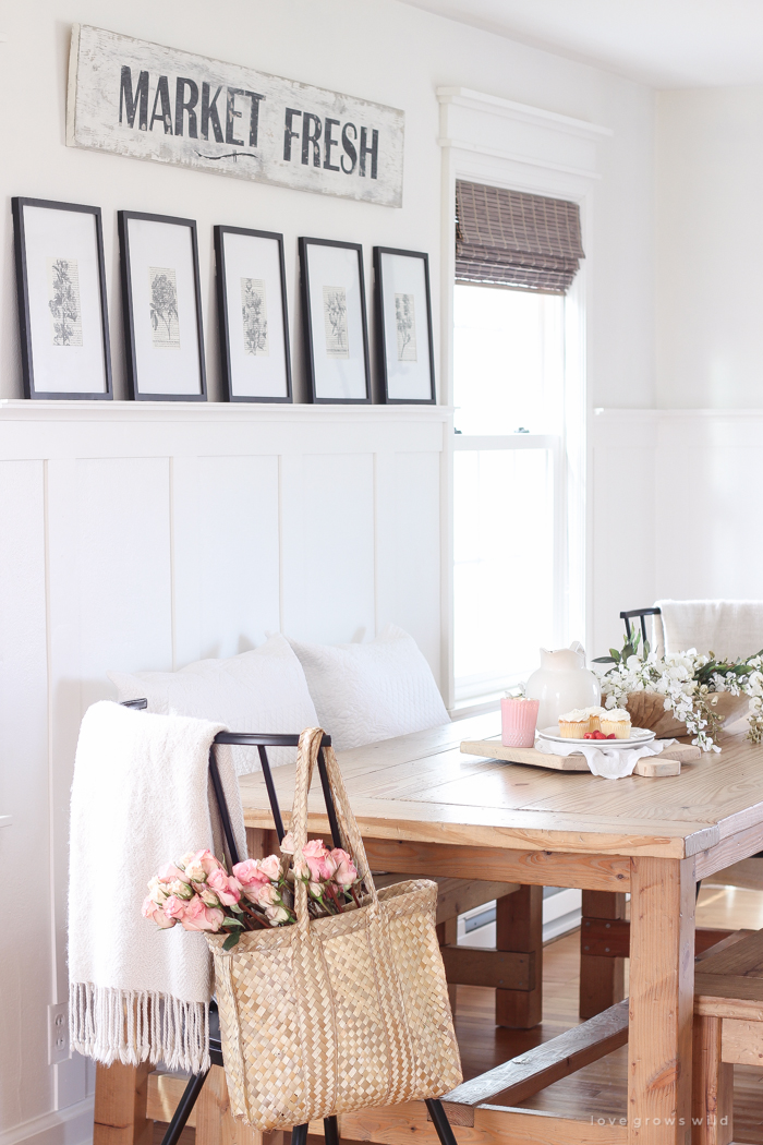
Hi, my loves! You may remember last week when I shared the current state of our dining room and the floral-inspired decor I have going on in here right now for spring. If not, you can check that post out here! I’ve slowly been working on adding a little more personality to this pretty plain space, and I spent a couple hours one night making a vintage-inspired sign to hang on the wall behind the dining table. I’ve made quite a few hand painted signs like this over the years, and each one always seems to have its own unique look and personality. I’ll usually start with the basic idea of what I want the sign to say and the colors I want to use, but then once I start playing with fonts for the lettering and the way I paint and distress the piece, it sort of takes on a life of its own. That’s my favorite part about creating art… there are no rules or wrong way to do it. Let the canvas (or in this case, a piece of wood) do the talking, and often times I find that the finished product is even better than the original idea I had in my head!

Note: Some of the links in this post are affiliate links, which allows me to make a small commission from your purchase, but your purchase price stays the same. Thank you for helping support our blog!
So for this particular sign, I followed the tutorial in my book, A Touch of Farmhouse Charm, which was just published a few months ago. If you haven’t picked up a copy yet, there are 70 home decor tutorials packed into this book, including how to make this sign!
I started with a 1 x 10 board that I picked up from the home improvement store and cut it down to 5 feet using my miter saw. Since I’m just making a sign with this piece of wood, I didn’t have to splurge on a high quality board that I might need if I was building a piece of furniture or something that would require perfectly straight, square boards. The standard quality is just fine for making signs like these, and I only spent $4.99 for a 6 foot board.
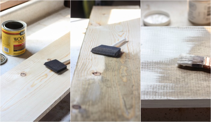
I first used Minwax wood stain in Driftwood that I applied with a foam brush and left on the wood for about 5 minutes before wiping off, followed by two layers of DecoArt Chalky Finish paint in Everlasting.
For the Market Fresh lettering, I used the Britannic Bold font on my computer and DecoArt Chalky Finish paint in Carbon. Again, you can find detailed instructions for creating this project in my book! When I was painting on the letters, the R K E & T started to slope upward without me even noticing until it was too late. I was SO bummed when I stepped back and looked at how crooked the letters were. It was pretty obvious, and I knew it would drive me crazy if I left the sign as it was. So at that point I had two options… I could either paint over all my hard work and start again, or I could try to make my mistake less noticeable somehow. After staring at the sign for another few minutes, I decided to paint a little curved line underneath the crooked letters to make it look more intentional than a mistake. And honestly… I think it’s even cuter this way!
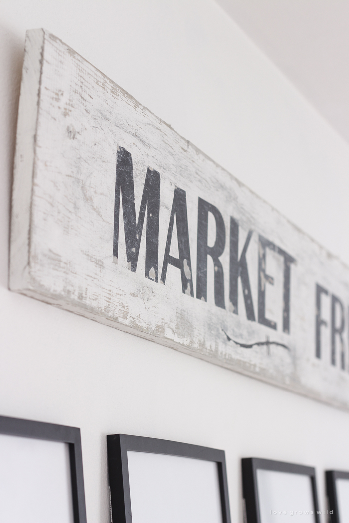
This little hiccup is exactly what I was talking about earlier… even though I never had any intention of adding that little line, I went with the flow and adapted my design as I went along.
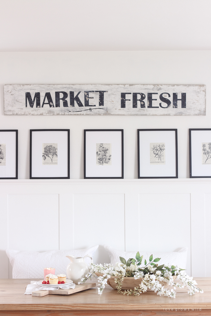
After all the paint was dry, I distressed the sign pretty heavily using a sanding block.
Here’s a little tip that I didn’t include in my book:
Typically when you are painting multiple layers like this, you should gently sand the piece in between each coat so the layers are able to adhere to each other really well. But when I make signs like this that I know I want to have that vintage, distressed look, I skip the sanding between coats. It makes it really simple and fast to distress the finish, and that’s why you see little chunks of paint missing from some of the letters. I really think it makes the sign look like it’s been around for ages!
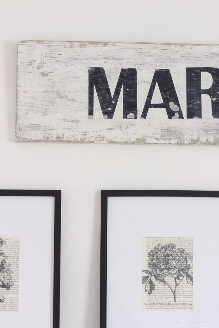
As I mentioned in my last post, I have plans to update this space a little again (possibly some furniture rearranging and maybe even new dining chairs!), and I promise I’ll share updates on the blog as soon as it’s ready! Oh and by the way, those vintage-looking botanical prints are a DIY project from my book too!

LET’S KEEP IN TOUCH!
Subscribe to Blog | Follow on Instagram
Follow on Pinterest | Follow on Facebook


Love your sign! Just curious what font size you ended up using?
Fabulous, and I adore it all. Wow!!!